The Art of Discovery
Exploratory Data Analysis
Department of Computer Science
University of the Philippines Cebu
Discover Patterns & Insights
The WWII Bomber Problem
World War II. American bombers are getting shot down at alarming rates.
The military examines bombers that return from missions and maps where the bullet holes are:

Where should you add armor?
The Obvious Answer... Is Wrong
Most engineers said: "Reinforce the fuselage and wings — that's where all the holes are!"
Abraham Wald (Statistical Research Group, Columbia)
"No. Reinforce where the holes AREN'T."
The military was only studying planes that survived. Planes hit in the engines and fuel tanks never came back to be studied — they crashed.
The bullet holes on returning planes showed where planes could take damage and still fly.
Source: Wikipedia: Survivorship Bias
Survivorship Bias
Survivorship Bias: Drawing conclusions from data that survived a selection process, while ignoring the data that didn't make it through.
Other examples:
- "Most successful CEOs dropped out of college" — ignores millions of dropouts who didn't succeed
- "Old buildings are better built" — poorly built ones already collapsed
EDA isn't just about what the data shows. It's about what's missing from your data.
Quick Review: Key Statistics
Before we go further, let's make sure we understand three terms:
Mean (Average): Add up all values, divide by count. Example: [2, 4, 6] → mean = (2+4+6)/3 = 4
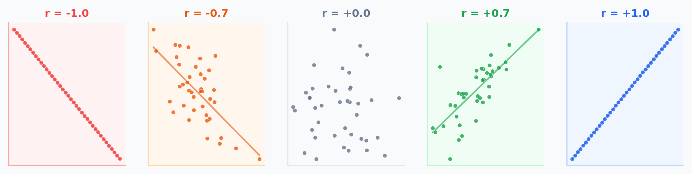
Correlation (r): How closely two variables move together. Ranges from -1 (perfect opposite) to +1 (perfect together). 0 = no linear pattern.
Regression Line: The best-fit straight line through data. Written as y = a + bx — lets you predict y from x.
The Four Identical Datasets
In 1973, statistician Francis Anscombe created four datasets. Every single one of these numbers is exactly the same:
They must look the same... right?
(We'll find out later in this lecture.)
Learning Objectives
By the end of this lecture, you should be able to:
- Perform Univariate Analysis to understand distributions and outliers
- Conduct Bivariate Analysis to uncover relationships between variables
- Identify confounding variables and Simpson's Paradox in data
- Apply Feature Engineering techniques (encoding, binning) for modeling
- Explain why visualization is essential — not optional — in EDA
Why EDA?
"You can't model what you don't understand."
EDA is the detective work before the trial:
- Spotting anomalies (fraud, errors)
- Testing assumptions (normality, linearity)
- Generating hypotheses
Philippine FIES 2021
Family Income and Expenditure Survey
- Average family income: PHP 307,190
- NCR: PHP 417,850 vs BARMM: PHP 184,940 — a 2.26x gap
- Gini coefficient: 0.4119 (one of highest in East Asia)
- Poverty incidence: 18.1% of population
Source: PSA FIES 2021
Univariate Analysis
Understanding one variable at a time
What Are Descriptive Statistics?
Descriptive statistics summarize the main features of a dataset quantitatively — central tendency (where?), dispersion (how spread?), and shape (what pattern?).
Descriptive = summarize what IS
Mean, median, std dev, histograms
Inferential = predict what COULD BE
Hypothesis tests, confidence intervals
Central Tendency: Where Is the Data?
Given 5 UP Cebu student GWAs: [1.5, 2.0, 2.0, 2.5, 4.0]
Notice: the mean (2.4) is higher than the median (2.0) because the 4.0 pulls it up. Mean is sensitive to outliers; median is robust.
Spread: How Different Are the Values?
Same 5 GWAs: [1.5, 2.0, 2.0, 2.5, 4.0] — Mean = 2.4
Range = Max - Min = 4.0 - 1.5 = 2.5
Variance = average of squared deviations from mean:
= [(1.5-2.4)² + (2.0-2.4)² + (2.0-2.4)² + (2.5-2.4)² + (4.0-2.4)²] / 5
= [0.81 + 0.16 + 0.16 + 0.01 + 2.56] / 5 = 0.74
Standard Deviation = √Variance = √0.74 = 0.86
Std dev is in the same units as the data (GWA points), making it more interpretable than variance (GWA points²).
Shape: What Does the Distribution Look Like?
The shape tells you whether data is balanced or has a long tail in one direction.
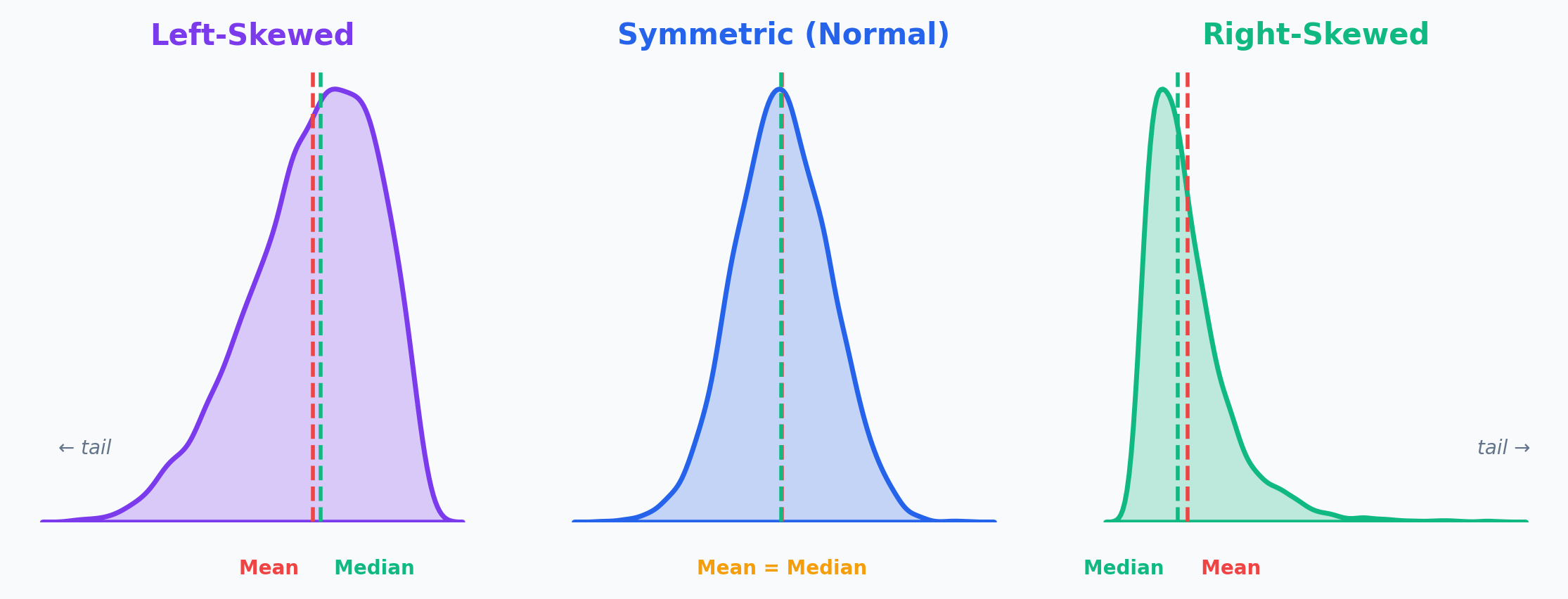
The tail tells the story: Income is right-skewed (few billionaires pull the mean up). Age at death is left-skewed (few die very young).
Worked Example: Philippine Family Income
| Region | Avg Family Income (PHP) |
|---|---|
| NCR | 417,850 |
| CALABARZON | 361,030 |
| CAR | 350,430 |
| Region III | 328,540 |
| Region VII (Cebu) | ~270,000 |
| BARMM | 184,940 |
Range = NCR - BARMM = 417,850 - 184,940 = PHP 232,910
National Mean = PHP 307,190 — but this represents almost nobody (NCR is far above, most regions are below)
Source: PSA FIES 2021
What Does the Average Actually Mean?
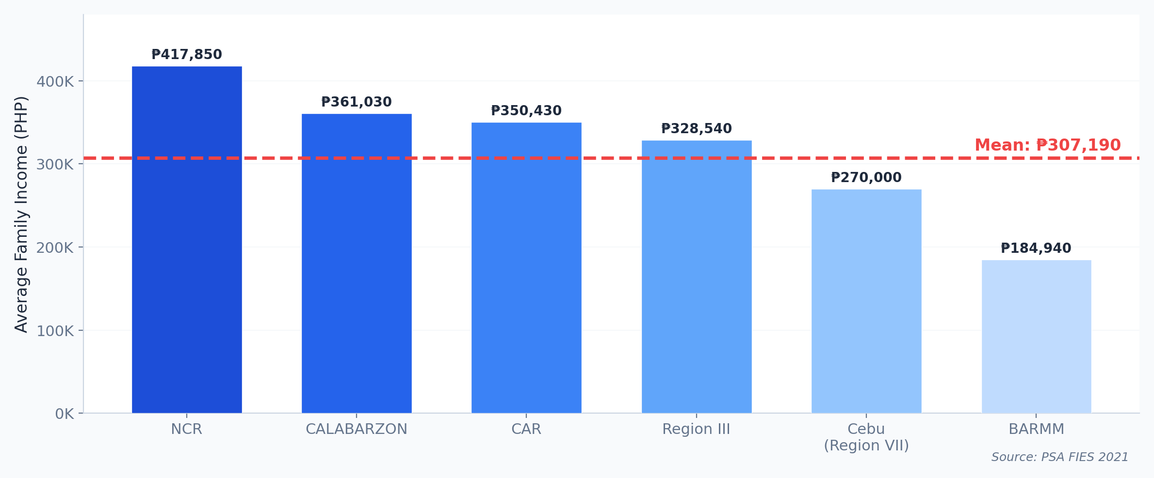
NCR is 36% above the average. BARMM is 40% below. The "average Filipino family" essentially doesn't exist. This is why we need distributions, not just averages.
What Is a Histogram?
A histogram divides data into bins (ranges) and counts how many values fall in each bin. Unlike a bar chart, the x-axis is continuous.
Histograms show the shape of your data — something a mean or median alone cannot reveal.
Histograms: Income Distribution
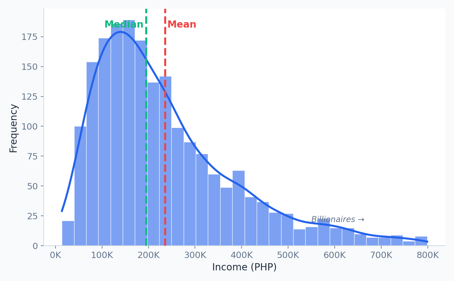
- Right Skewed: Tail extends right (e.g., Income). Mean > Median.
- Left Skewed: Tail extends left (e.g., Age at death). Mean < Median.
What Is a Box Plot?
A box plot shows the five-number summary: minimum, Q1 (25th percentile), median, Q3 (75th percentile), and maximum. The box spans the middle 50% of data, called the IQR (Interquartile Range).
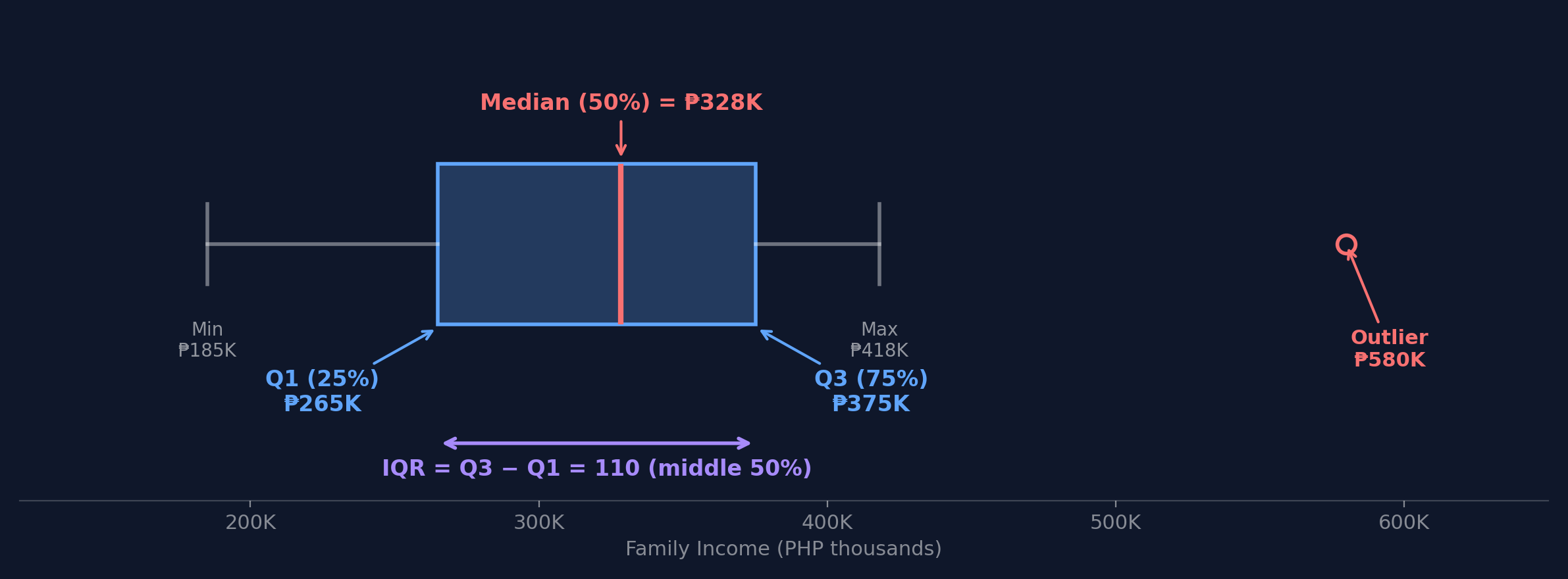
How to Read a Box Plot: Step by Step
Using FIES regional income data (PHP thousands): [185, 250, 270, 307, 350, 361, 418]
Step 1: Q1 (25th percentile) = 250
Step 4: IQR = Q3 - Q1 = 361 - 250 = 111
Step 2: Median (50th percentile) = 307
Step 5: Lower fence = 250 - 1.5(111) = 83.5
Step 3: Q3 (75th percentile) = 361
Step 6: Upper fence = 361 + 1.5(111) = 527.5
NCR (418K) is within fences — not an outlier! Any value above 527.5K would be flagged.
Based on PSA FIES 2021; simplified for illustration
Finding Outliers with the IQR Method
A data point is an outlier if:
value < Q1 - 1.5 × IQR
or
value > Q3 + 1.5 × IQR
The 1.5 × IQR rule catches values that are unusually far from the middle 50%.
Here's the Actual Data
Remember: all four have identical statistics (mean, correlation, regression line).
Can you spot anything unusual just by reading the numbers?
What Do You Think They Look Like?
Prediction Challenge
If four datasets have the same mean, same spread, same correlation, and same best-fit line...
- Do they all look the same when plotted?
- Could they look different? How?
Sketch your prediction: Draw what you think one of these scatter plots looks like. Just a rough sketch on paper or your tablet.
2 minutes
The Reveal
Same statistics. Completely different patterns.
Why Does This Happen?
Each dataset fools the summary statistics in a different way:
Dataset I: A genuine linear relationship. The statistics are telling the truth.
Dataset II: A curved (quadratic) relationship. The linear regression line completely misses the pattern. r=0.816 is misleading.
Dataset III: A perfect linear trend with one outlier. That single point pulls the regression line and inflates r.
Dataset IV: All points at one x-value except one leverage point that single-handedly creates the illusion of correlation.
Summary statistics are averages of behavior. They can't tell you about individual patterns, outliers, or non-linear relationships.
It Gets Wilder: The Datasaurus Dozen
In 2017, Autodesk researchers extended Anscombe's idea to 13 datasets — including one shaped like a dinosaur.
All 13 share the same:
- Mean of X and Y
- Standard deviation of X and Y
- Pearson correlation
Same mean. Same std dev. Same correlation. Completely different shapes.
The Lesson: Always Visualize
If you had only looked at summary statistics, you would have treated all four of Anscombe's datasets identically.
EDA — specifically visualization — would have caught the difference instantly.
Practical Rule:
Before fitting any model, always:
- Plot your data (scatter plots, histograms, box plots)
- Look for patterns the numbers can't capture (curves, clusters, outliers)
- Then — and only then — choose your modeling approach
This is WHY we do EDA before modeling.
Activity: EDA Detective
Scenario: You receive 500 UP Cebu student GWAs. Your boss says: "The average GWA is 2.5 — students are doing fine."
- Task 1: What does mean < median tell you about the distribution shape? Sketch it.
- Task 2: Is the boss's conclusion justified? What additional EDA would you do?
| Statistic | Value |
|---|---|
| Mean | 2.50 |
| Median | 2.80 |
| Std Dev | 0.90 |
| Min | 1.00 |
| Max | 5.00 |
3 minutes
Bivariate Analysis
Discovering relationships between variables
What Is Correlation?
Correlation measures how strongly two variables move together:
- Positive: Both go up together (e.g., height and weight)
- Negative: One goes up, the other goes down (e.g., price and demand)
- Zero: No linear pattern
Pearson's Correlation Coefficient
Intuition:
- Numerator: Do x and y deviate from their means in the same direction? If yes, product is positive.
- Denominator: Normalize by their individual spreads so r is always between -1 and +1.
Critical limitation: r only measures linear relationships.
r = 0 doesn't mean "no relationship" — remember Anscombe's Dataset II had r = 0.816 despite being curved!
Correlation ≠ Causation
The Ice Cream Paradox
Ice cream sales and drowning deaths are positively correlated. Does ice cream cause drowning?
Of course not — both are caused by hot weather (a confounding variable).
Correlation tells you: "These variables move together."
Correlation does NOT tell you: "One CAUSES the other."
To establish causation, you need controlled experiments or causal inference methods — correlation alone is never enough.
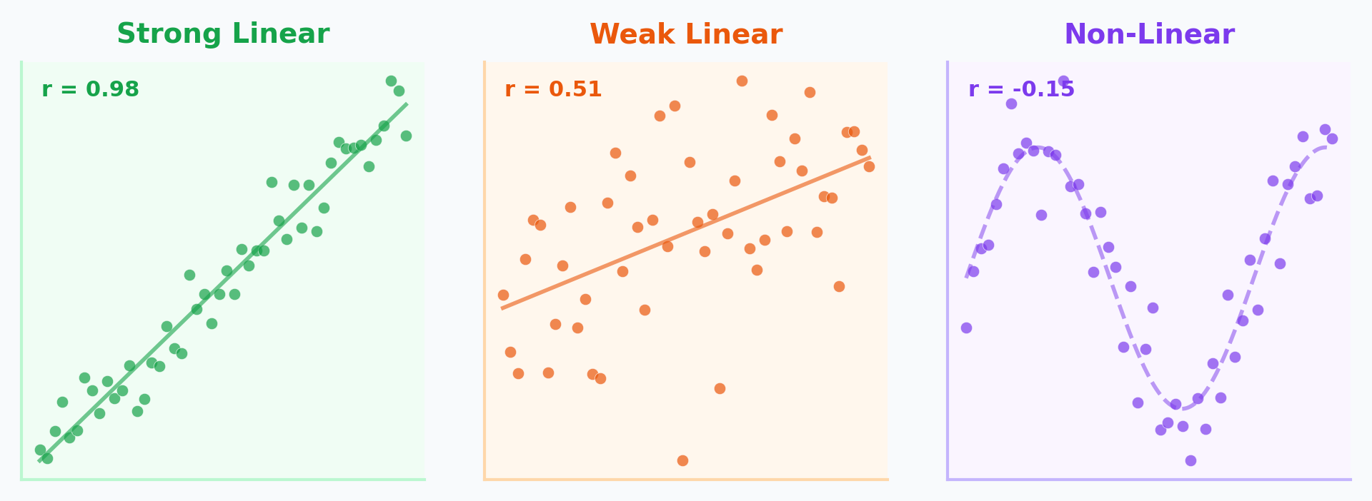
Scatter Plots: What to Look For
When examining a scatter plot, check three things:
- Direction: Positive (up-right) or Negative (down-right)?
- Strength: How tightly do points cluster around a line?
- Shape: Linear, curved, or no pattern?
Scatter Plots & Correlation in Python
| income | education | hh_size | |
|---|---|---|---|
| income | 1.00 | 0.72 | -0.31 |
| education | 0.72 | 1.00 | 0.05 |
| hh_size | -0.31 | 0.05 | 1.00 |
Income & education: strong positive. Income & household size: weak negative.
Categorical vs Numerical
How does a numerical variable change across categories?
Grouped Box Plots
Compare distributions side-by-side.
Example: Income distribution by Philippine region.
This is where FIES data reveals the NCR vs BARMM gap visually — numbers alone don't show the full picture.
Categorical vs Categorical
Cross-Tabulation (Crosstab)
Frequency counts for combinations of categories.
Example: Education Level vs. Employment Status.
Visualized via Heatmaps or Stacked Bar Charts.
A Lawsuit at Berkeley
UC Berkeley, Fall 1973. The university was accused of sex discrimination in graduate admissions.
Is Berkeley biased against women?
What Would You Conclude?
Based on these numbers alone — 44.5% vs 30.4% — what would you conclude?
Most people — including the legal team — concluded discrimination.
But statistician Peter Bickel was asked to look deeper...
He broke the data down by department.
The Department-Level Truth
| Dept | Men Applied | Men Admitted | Women Applied | Women Admitted |
|---|---|---|---|---|
| A | 825 | 62% | 108 | 82% |
| B | 560 | 63% | 25 | 68% |
| C | 325 | 37% | 593 | 34% |
| D | 417 | 33% | 375 | 35% |
| E | 191 | 28% | 393 | 24% |
| F | 373 | 6% | 341 | 7% |
In 4 of 6 departments, women had equal or HIGHER admission rates!
Source: Bickel et al. (1975), Science
Simpson's Paradox
Simpson's Paradox: A trend that appears in aggregated data reverses when the data is separated into groups. Caused by a lurking confounding variable.
Why Did This Happen?
The Mechanism
Women applied to competitive departments (English, Humanities) with low admission rates for everyone.
Men applied to less competitive departments (Engineering) with high admission rates for everyone.
When you aggregate across departments, it looks like bias — but it's actually about where people applied.
The lesson for EDA:
Always ask: "Is there a third variable I'm not seeing?"
Bivariate analysis must consider confounding variables. Aggregated data can create illusions.
Discussion: Data Ethics in EDA
Your company asks you to analyze employee performance data. You find that women have lower average performance scores. Your boss says to include this finding in the report.
Consider:
- What confounders might exist? (Department? Manager bias?)
- Could this be Simpson's Paradox?
Discuss:
- Should you present the aggregate finding?
- What additional EDA would you do first?
- How would you push back ethically?
4 minutes
Feature Engineering
Transforming raw data into predictive power
What Is Feature Engineering?
Feature engineering is the process of using domain knowledge to create, transform, or select variables (features) that make machine learning algorithms work better.
"Coming up with features is difficult, time-consuming, requires expert knowledge. Applied machine learning is basically feature engineering."
— Andrew Ng
The best model in the world can't compensate for bad features. EDA tells you which features to engineer.
Nominal vs Ordinal: Why It Matters
Nominal = categories with NO natural order (Region, Color, Course Program)
Ordinal = categories with a meaningful order (Low/Medium/High, Year Level, Star Ratings)
Why this matters for encoding:
If you encode nominal data with numbers (NCR=1, Cebu=2, Davao=3), your model thinks Davao > Cebu > NCR. That's a fake ordering — and it will learn wrong patterns!
The encoding method you choose depends on which type of categorical data you have.
Encoding Categorical Data
One-Hot Encoding (for Nominal)
| Region | is_NCR | is_Cebu | is_Davao |
|---|---|---|---|
| NCR | 1 | 0 | 0 |
| Cebu | 0 | 1 | 0 |
| Davao | 0 | 0 | 1 |
Label Encoding (for Ordinal)
| Income Level | Encoded |
|---|---|
| Low | 0 |
| Medium | 1 |
| High | 2 |
Why Bin Continuous Data?
Binning (Discretization): Converting a continuous numerical variable into discrete categories.
When is binning useful?
- When exact values have too much noise
- When you care about categories more than exact numbers
- When the relationship is non-linear and steps would help
Example
Instead of predicting with exact income (PHP 307,190), group into Low / Medium / High.
Reduces noise, captures broader patterns.
Equal-Width vs Quantile Binning
Equal-Width Bins
Data: [185K, 220K, 270K, 307K, 350K, 418K, 1.2M]
Bins: [185K-524K] [524K-862K] [862K-1.2M]
6 of 7 values in first bin!
Quantile Bins (Equal Count)
Data: [185K, 220K, 270K, 307K, 350K, 418K, 1.2M]
Bins: [185K-260K] [260K-350K] [350K-1.2M]
~Equal items per bin
Equal-width binning fails with skewed data. Quantile binning preserves distribution information.
Interaction Features
Combining two features to capture joint effects.
Philippine Examples
- Income Per Capita = Household Income / Members
- Savings Rate = (Income - Expenditure) / Income
- Education Efficiency = Income / Years of Education
Activity: Feature Engineering Challenge
Scenario: You're building a model to predict which UP Cebu students need academic support.
- Task 1: Classify each "?" feature as nominal, ordinal, or numerical. How would you encode each?
- Task 2: Create 2 interaction features that might be more predictive than the originals. Explain why.
| Feature | Type | Example |
|---|---|---|
| GWA | Numerical | 2.5 |
| Attendance % | Numerical | 85% |
| Year Level | ? | 3rd Year |
| Course Code | ? | BSCS |
| Province | ? | Cebu |
| Scholarship | ? | Yes |
5 minutes
The Complete EDA Pipeline
Key Takeaways
- Descriptive statistics (central tendency, spread, shape) summarize your data — but can be misleading without visualization
- Histograms and box plots reveal distributions, skewness, and outliers that averages hide
- Scatter plots and correlation show relationships between variables — but correlation ≠ causation
- Confounding variables and Simpson's Paradox can reverse conclusions when you disaggregate data
- Feature engineering (encoding, binning, interactions) transforms raw data for machine learning
The Big Picture
- Abraham Wald proved that what's MISSING from data matters as much as what's there
- Anscombe showed that identical statistics can hide completely different realities
- Berkeley's admissions proved that aggregation can create the illusion of bias
- The FIES data shows PHP 307K average income — but that number represents almost nobody
EDA is not optional. It's the difference between discovering truth and confirming assumptions.
Next Lecture
Week 5: Data Visualization Principles
- Visual Perception and Cognition
- The "Grammar of Graphics"
- Choosing the Right Chart
- Lab 5: Advanced Visualization with Seaborn & Plotly