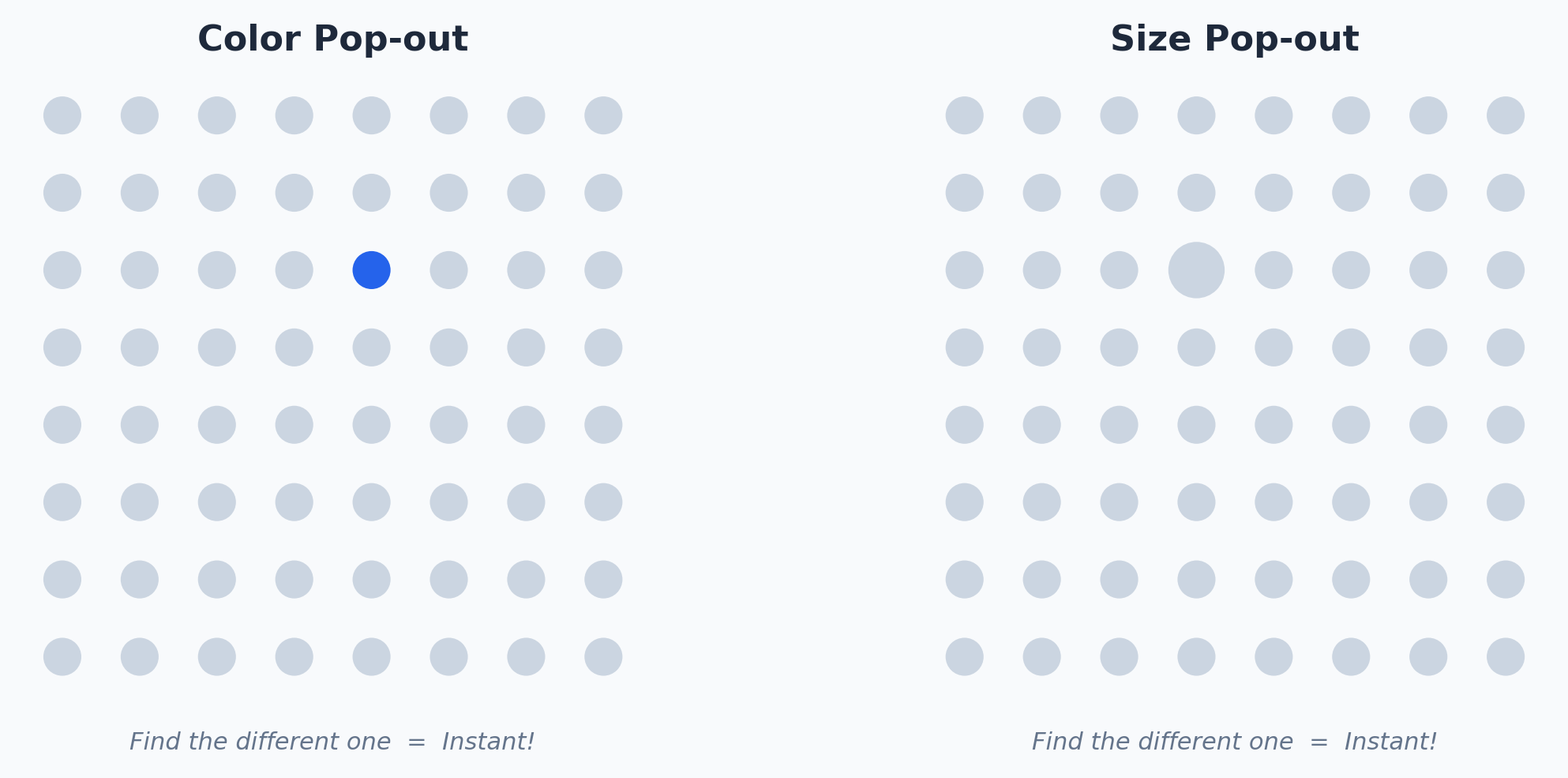
Pre-attentive Processing
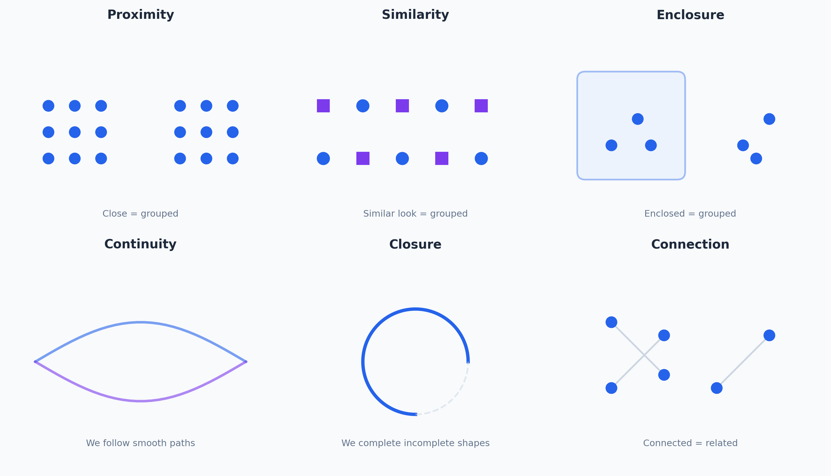
Gestalt Principles
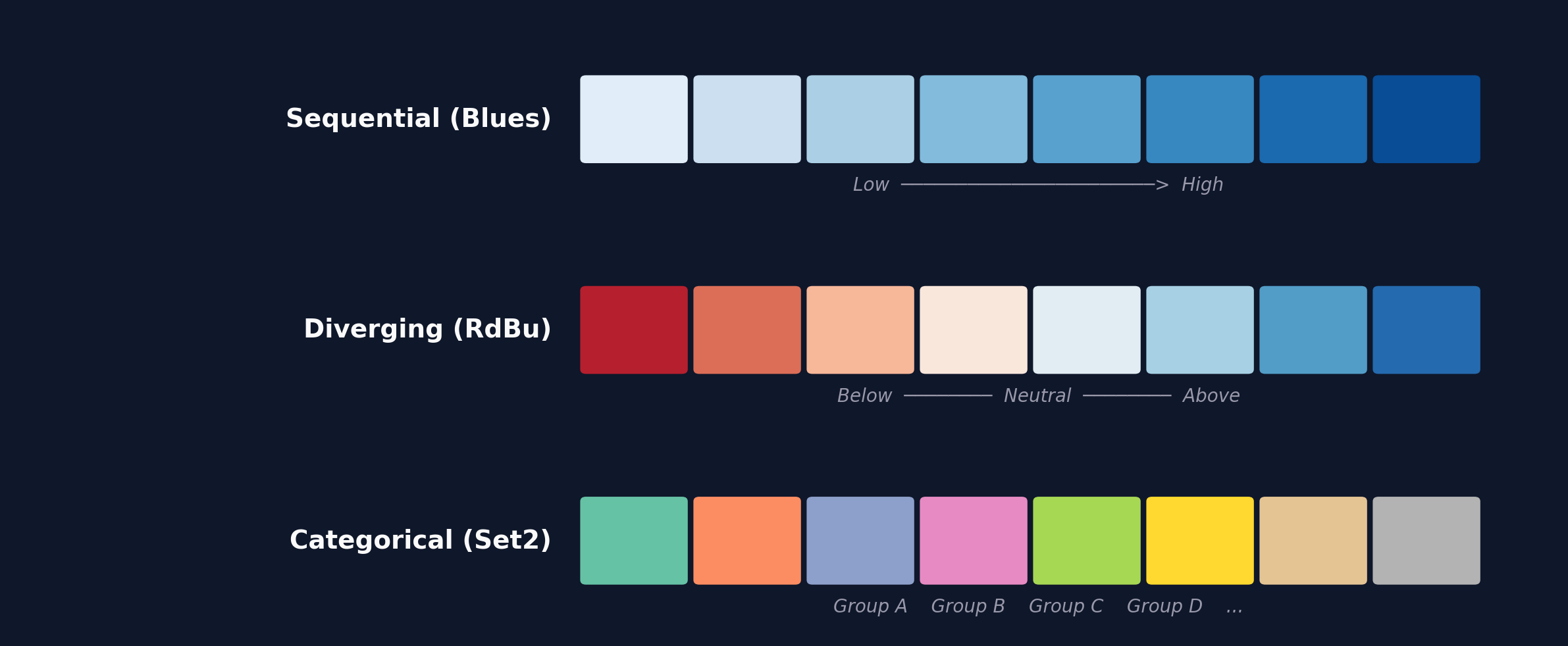
The Three Color Palettes
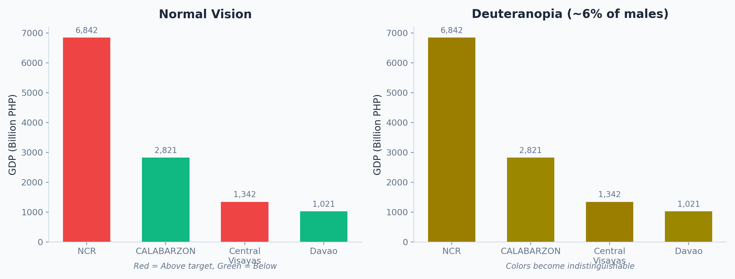
Inclusive Design
Tufte's Data-Ink Ratio
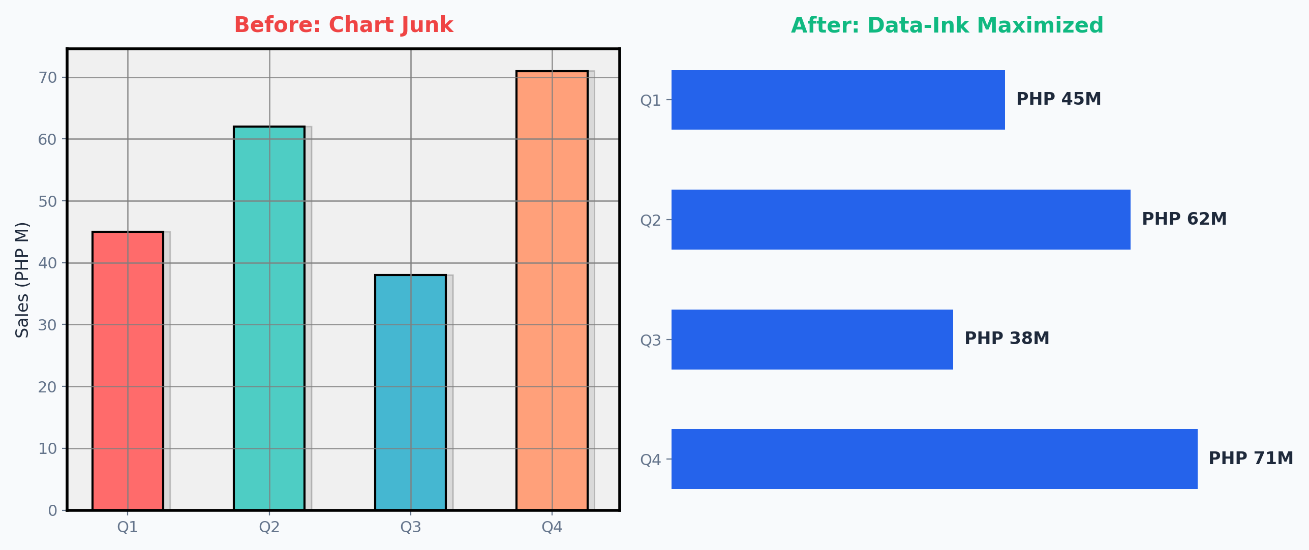
Chart Type Gallery
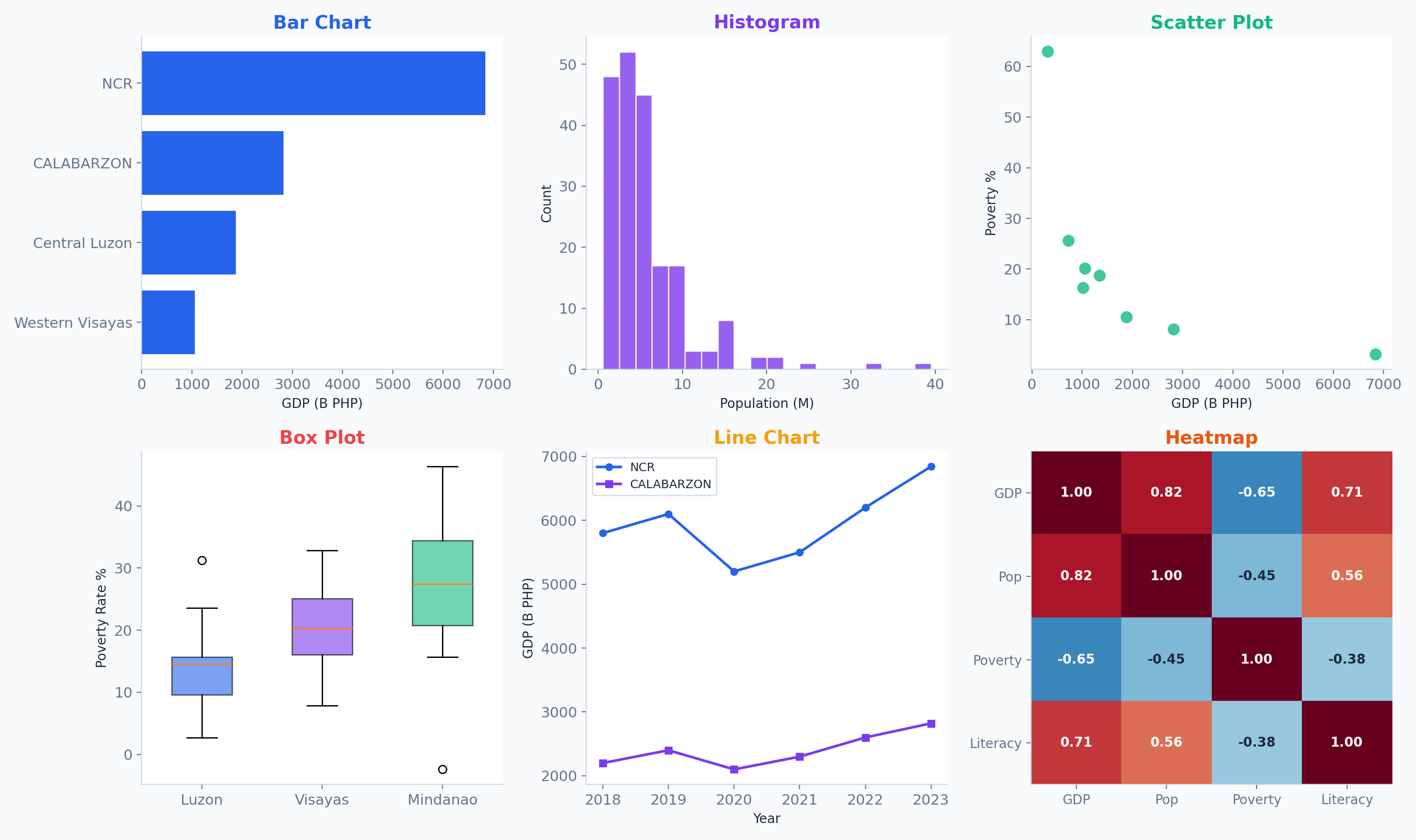
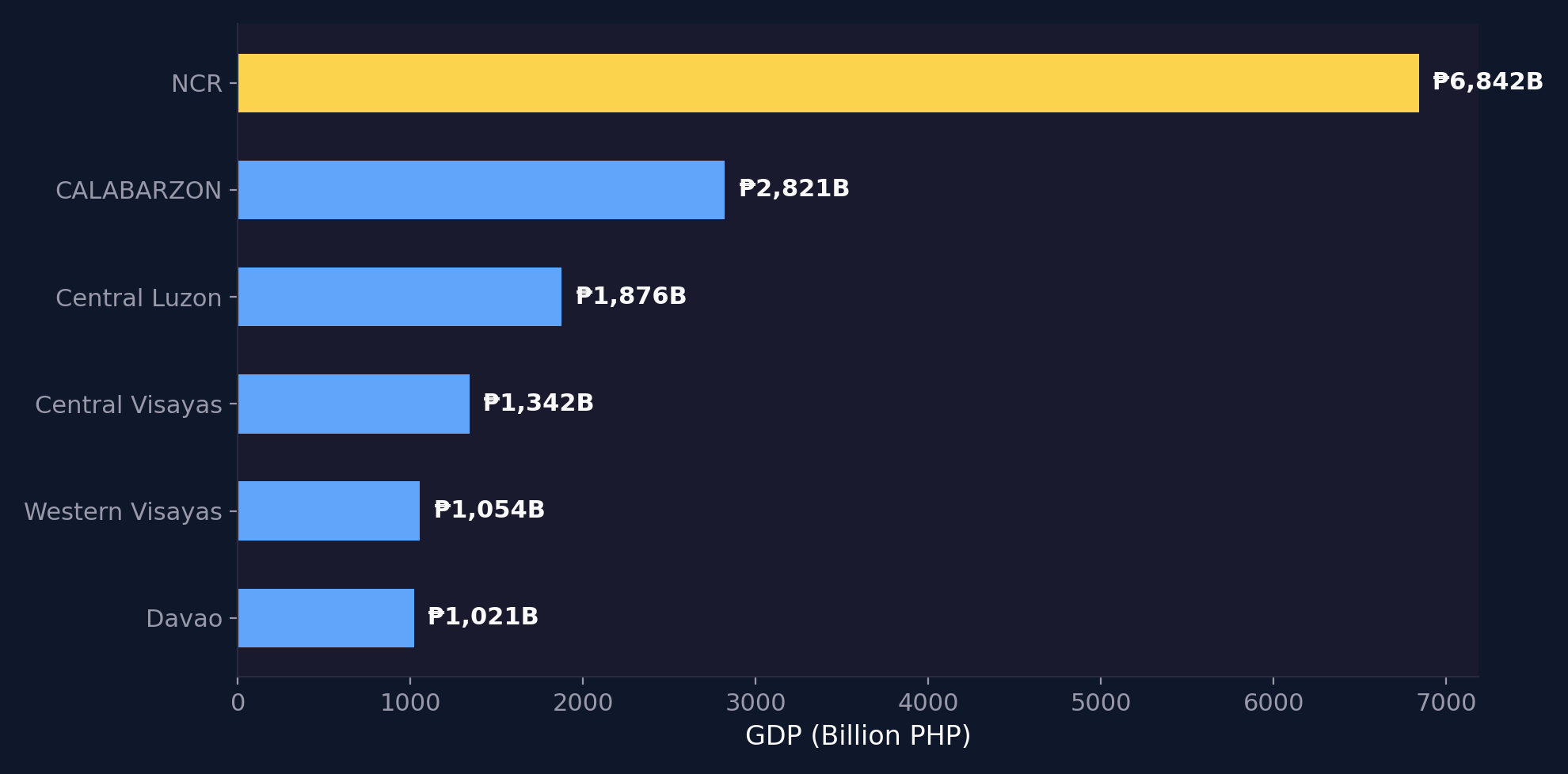
Precise Comparisons
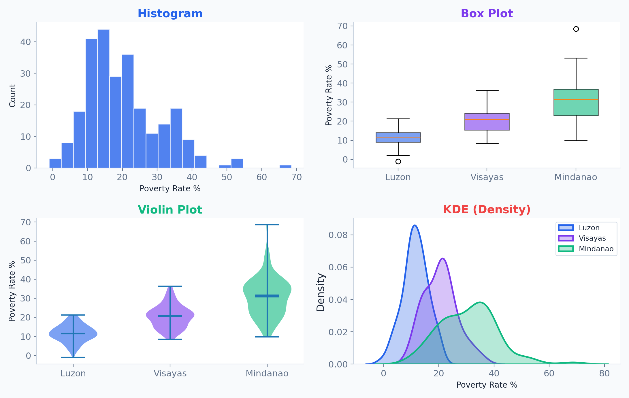
Distributions & Spread
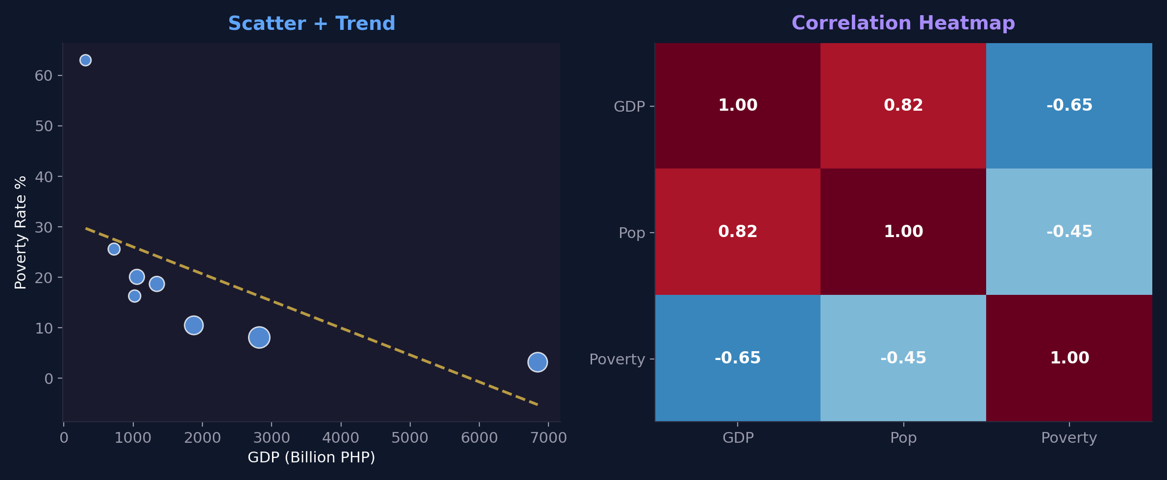
Scatter Plots & Correlation
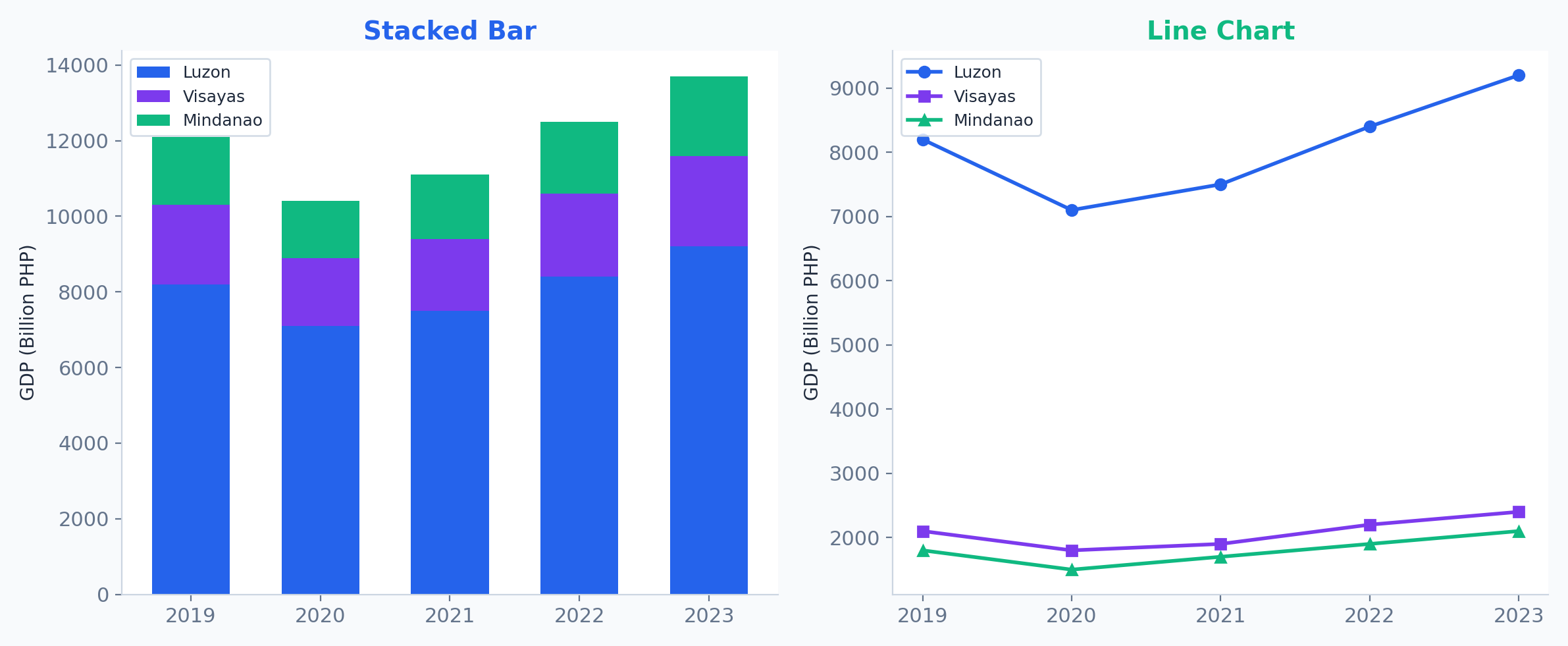
Composition & Trends
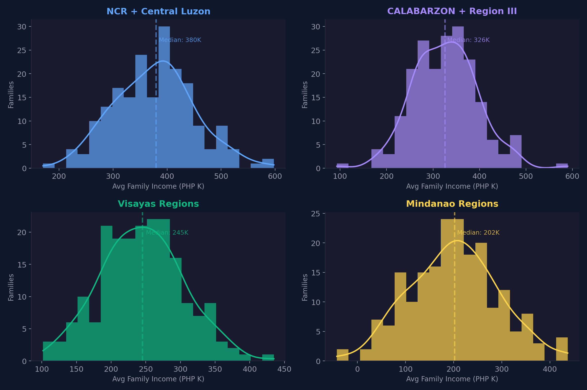
Small Multiples (Faceting)
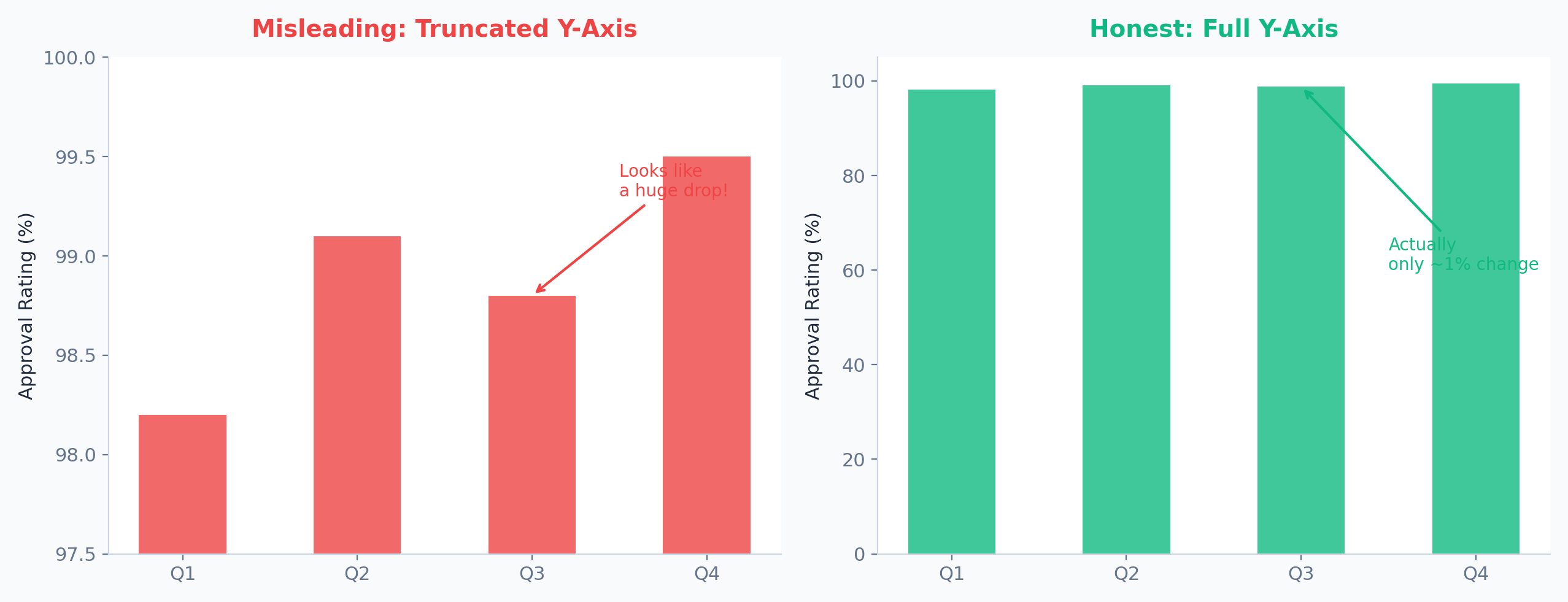
The Truncated Axis Trick
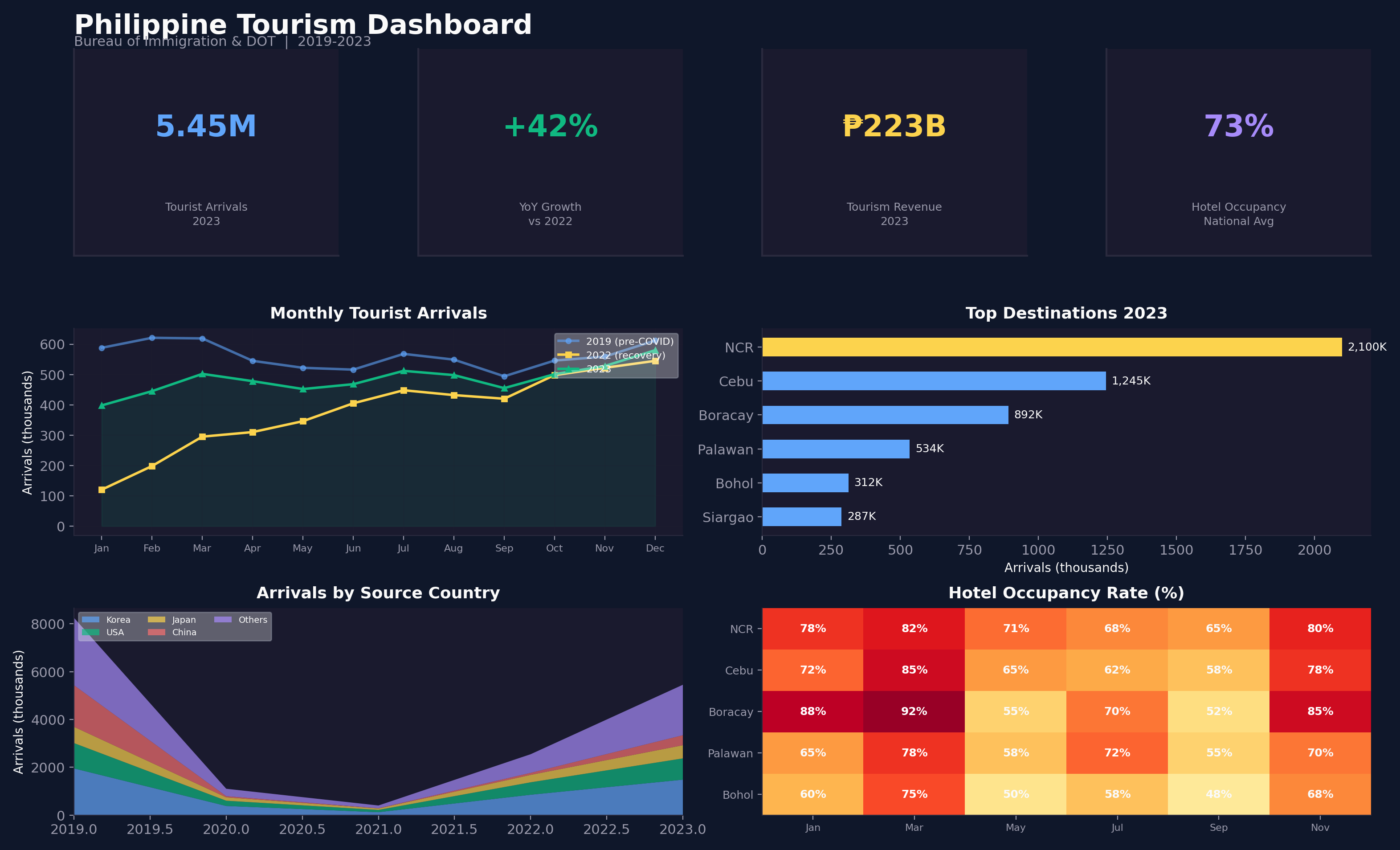
Strategic Dashboards
Seaborn: Statistical Visualization
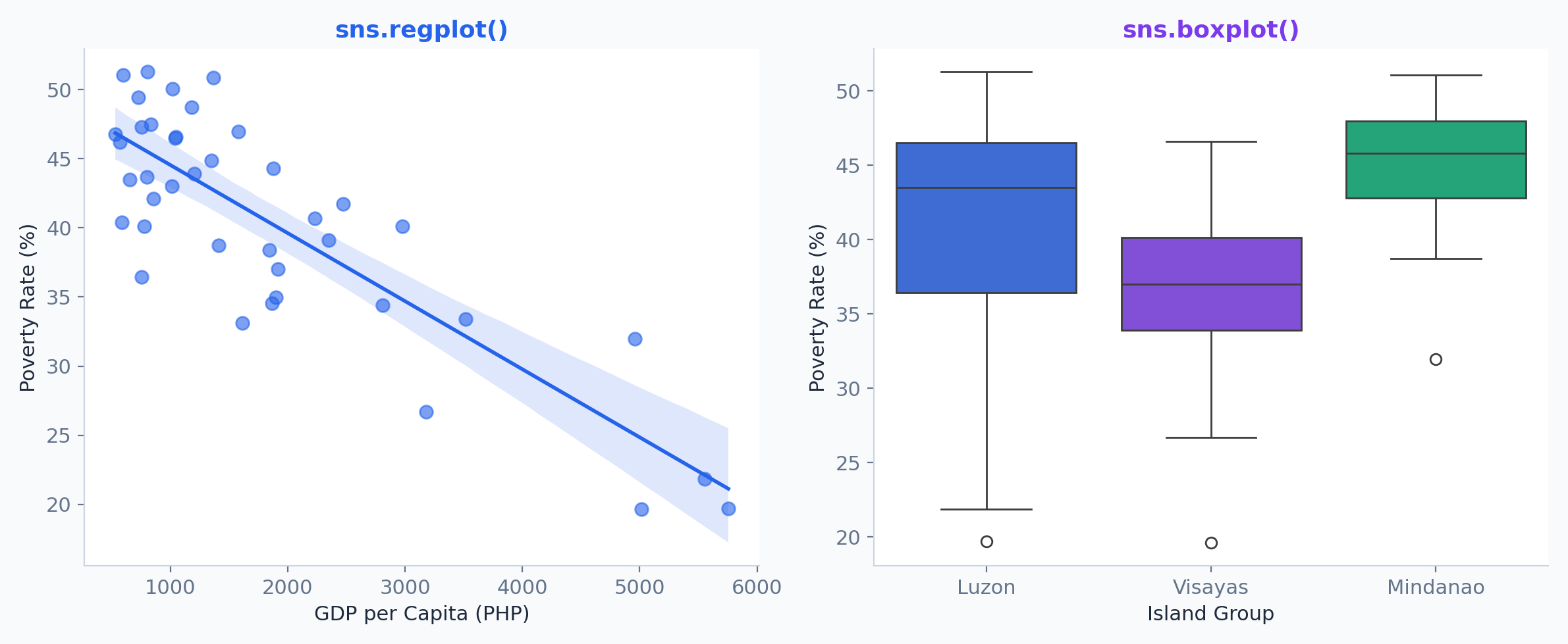
Tableau: The Artist's Choice
Tableau revolutionized the BI industry by turning drag-and-drop actions into database queries.
Strengths
Unmatched visual flexibility. The famous "Show Me" feature and its underlying proprietary VizQL (Visual Query Language) allow for rapid, intuitive exploratory data analysis.
Trivia
Founded in 2003 by researchers from Stanford University who commercialized their Department of Defense-funded research. Acquired by Salesforce in 2019 for $15.7 Billion.

Tableau
"Help people see and understand data."
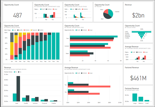
Power BI
The Enterprise Heavyweight
Power BI: The Corporate Standard
Microsoft's flagship analytics tool tightly integrated with the Azure and Office 365 ecosystem.
Strengths
Incredibly powerful data modeling via DAX (Data Analysis Expressions) and Power Query (M language). Highly cost-effective for enterprises already using Microsoft E5 licenses.
Trivia
Originally designed under the code name "Project Crescent". It evolved into a behemoth by combining several obscure Excel add-ins (Power Pivot, Power Query, Power View).
Looker: The Developer's BI
A 100% web-based platform that forced the industry to rethink how core metrics are governed.
Strengths
Introduced LookML, a Git-version-controlled semantic layer. This ensures a metric like "Revenue" is defined exactly once in code, meaning every dashboard across the company calculates it exactly the same way.
Trivia
Unlike Tableau or Power BI, Looker doesn't extract data into its own memory engine—it translates LookML into SQL and queries the data warehouse (like BigQuery or Snowflake) directly. Google Cloud acquired Looker in 2019 for $2.6 Billion.

Looker
Governance First, Viz Second