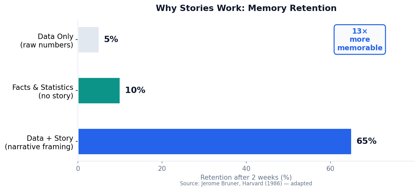
Stories Outperform Data Alone by 13×
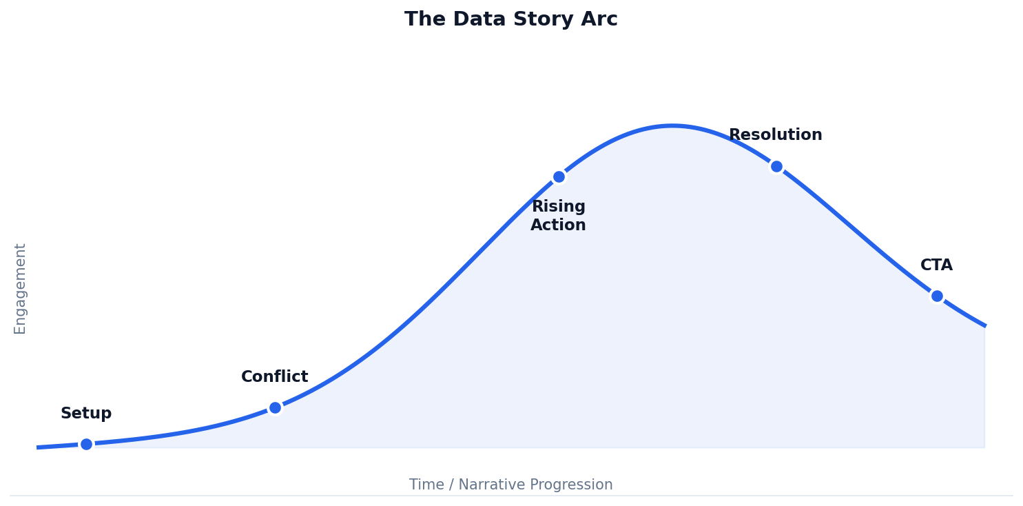
Every Data Story Has an Arc
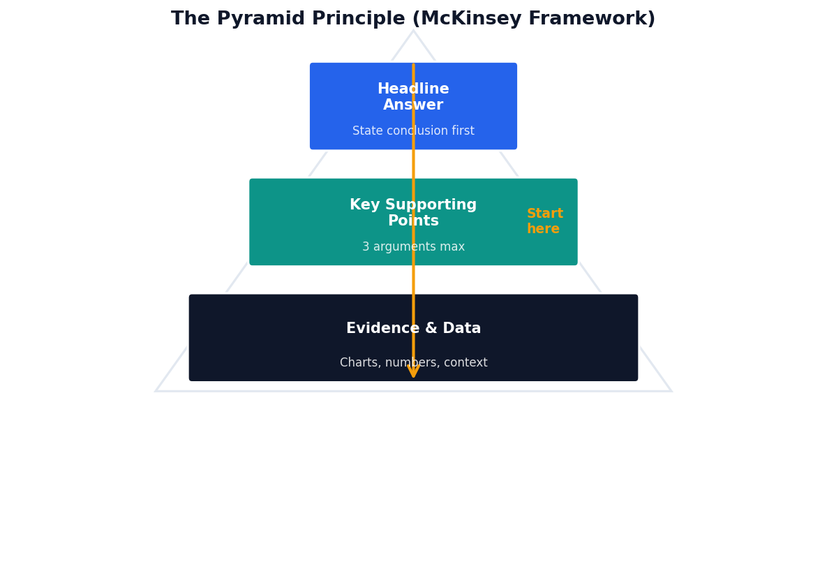
Lead with the Answer
The Pyramid Principle (Barbara Minto, McKinsey) inverts the traditional academic structure: state your conclusion first, then justify it.
Executive Communication Rule
Decision-makers are time-poor. If they have to read to slide 10 to understand your point, they will check their phones at slide 3.
BLUF: Bottom Line Up Front
The military version of the same principle. Used universally in high-stakes briefings where attention is limited.
Annotate to Guide the Eye
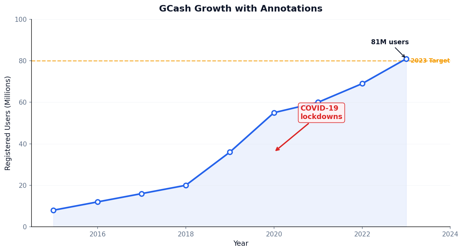
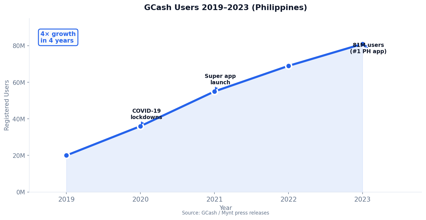
GCash: 4× Growth in 4 Years
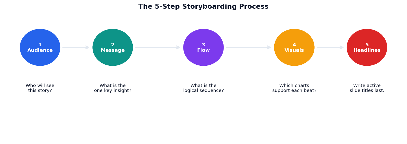
Storyboard Before You Visualize
The Rosling Method: Animate the Story
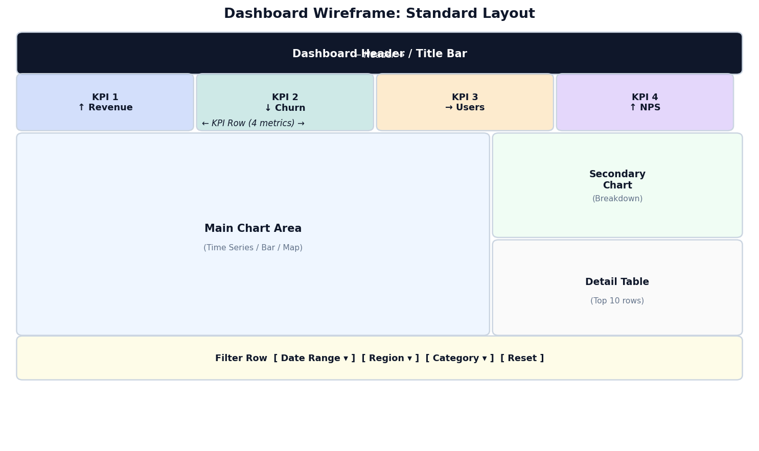
Wireframe: Where Information Lives
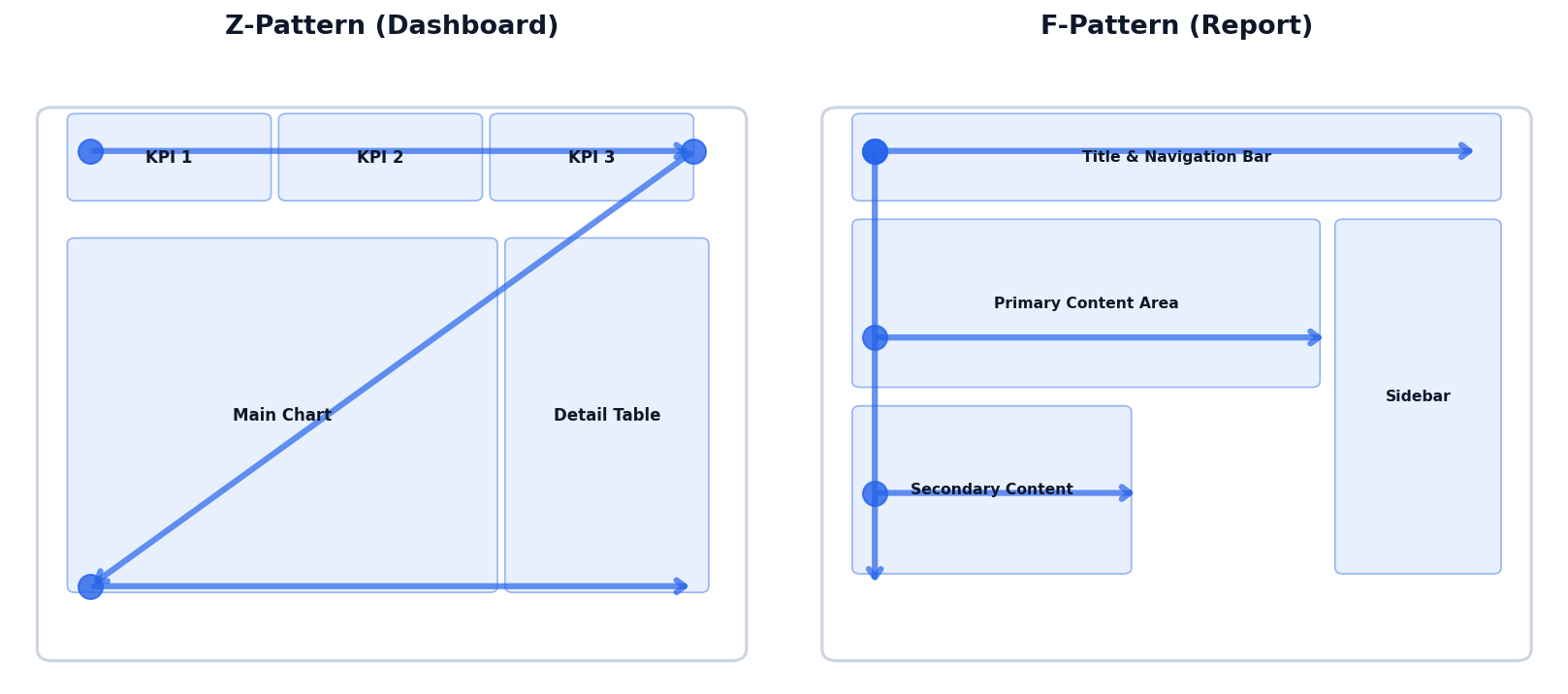
Eye-Tracking: Z and F Patterns
Users scan dashboards the same way they scan web pages. Place your most important content where the eye naturally lands first.
Z-Pattern (data-light pages)
Top-left → top-right → diagonal → bottom-left → bottom-right. Use for dashboards with large visual elements.
F-Pattern (data-dense pages)
Top band → left margin → second horizontal scan. Use for tables and text-heavy analytical dashboards.
Practical Rule
Put your single most important KPI in the top-left. Users will see it regardless of reading pattern.
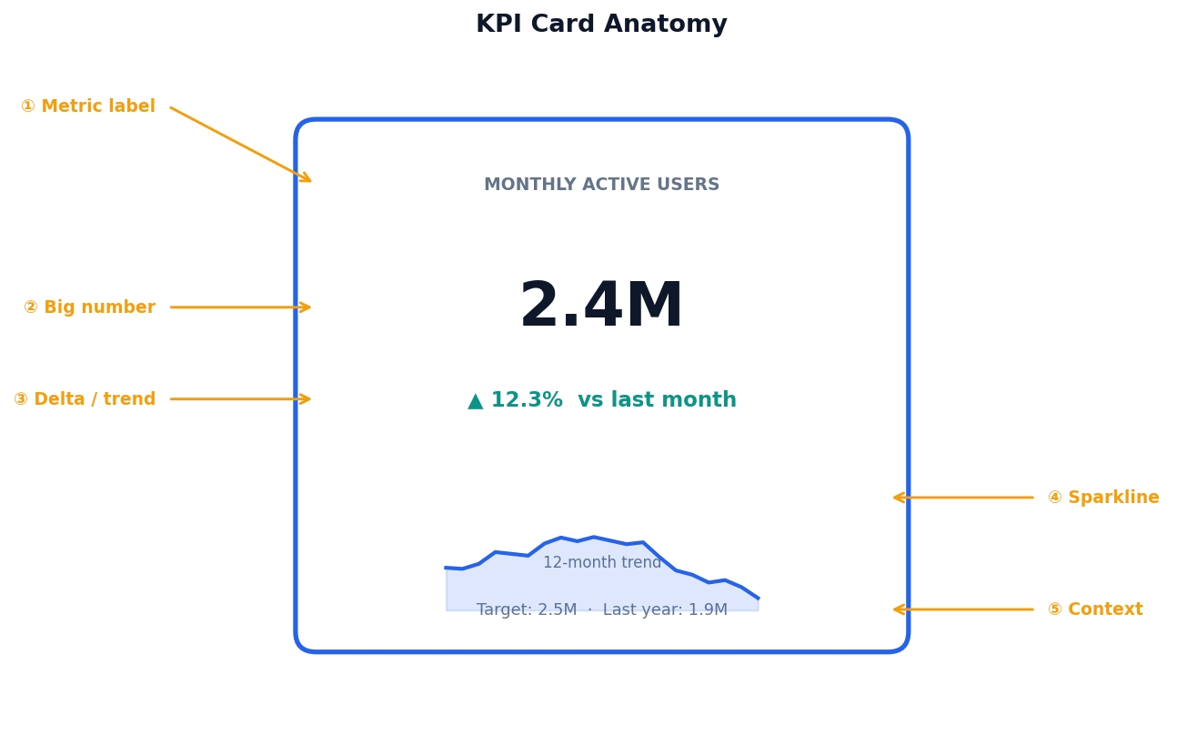
Anatomy of a KPI Card
A well-designed KPI card answers five micro-questions at a glance.
① Metric label
Short, specific. "Monthly Active Users" not "Users".
② Big number
Current value, largest text on the card. Format: 2.4M not 2,400,000.
③ Delta + direction
↑ 12.3% vs last period. Color-coded: define what "bad" means for your metric.
④ Sparkline + ⑤ Context
12-month mini-trend and a reference: target, last year, or industry benchmark.
Match the Chart to the Question
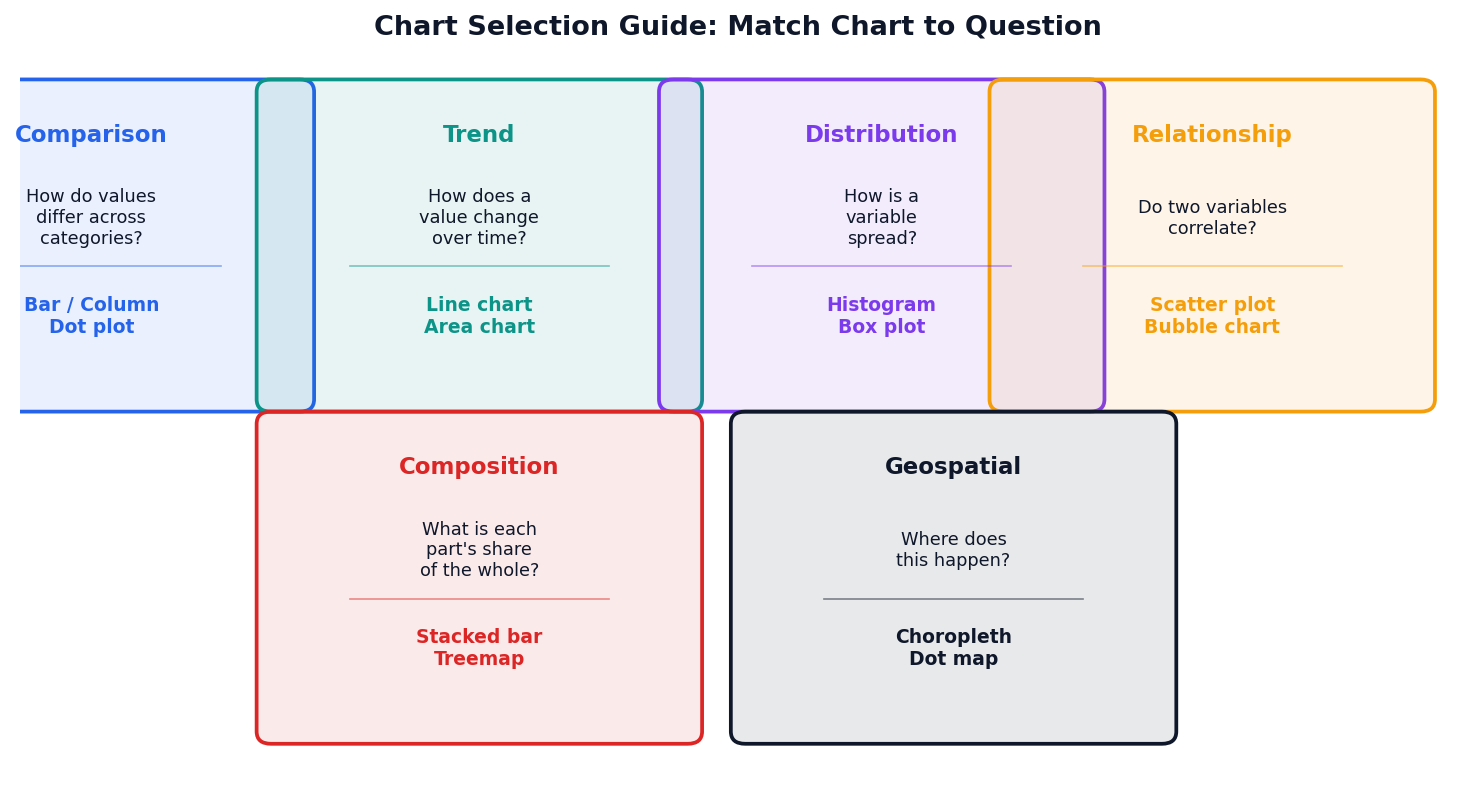
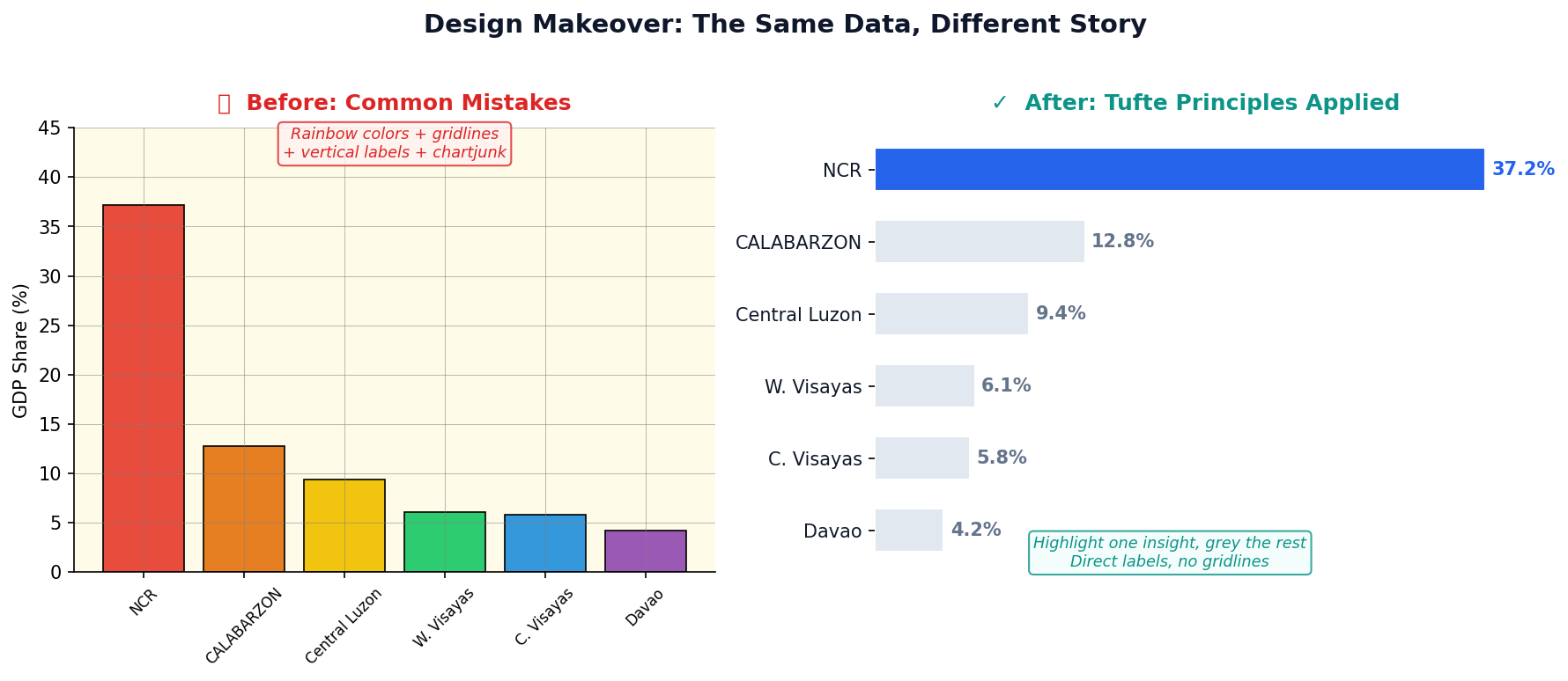
Chart Makeover: Design Principles in Action
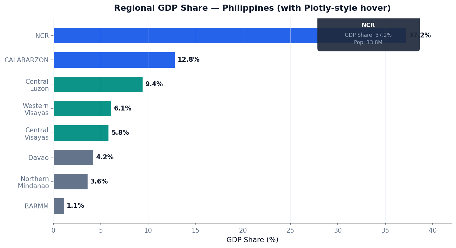
Interactive Charts: Plotly Express Bar
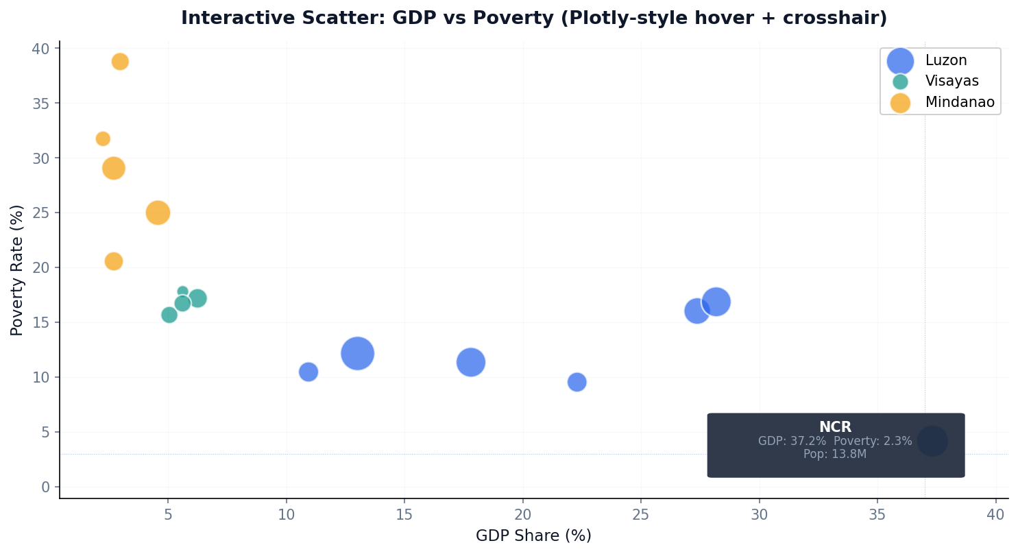
Interactive Scatter: Explore Relationships
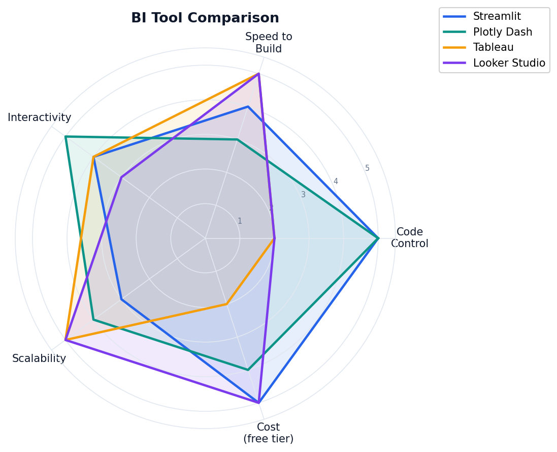
The BI Tool Landscape
Streamlit: Python Dashboards in Minutes
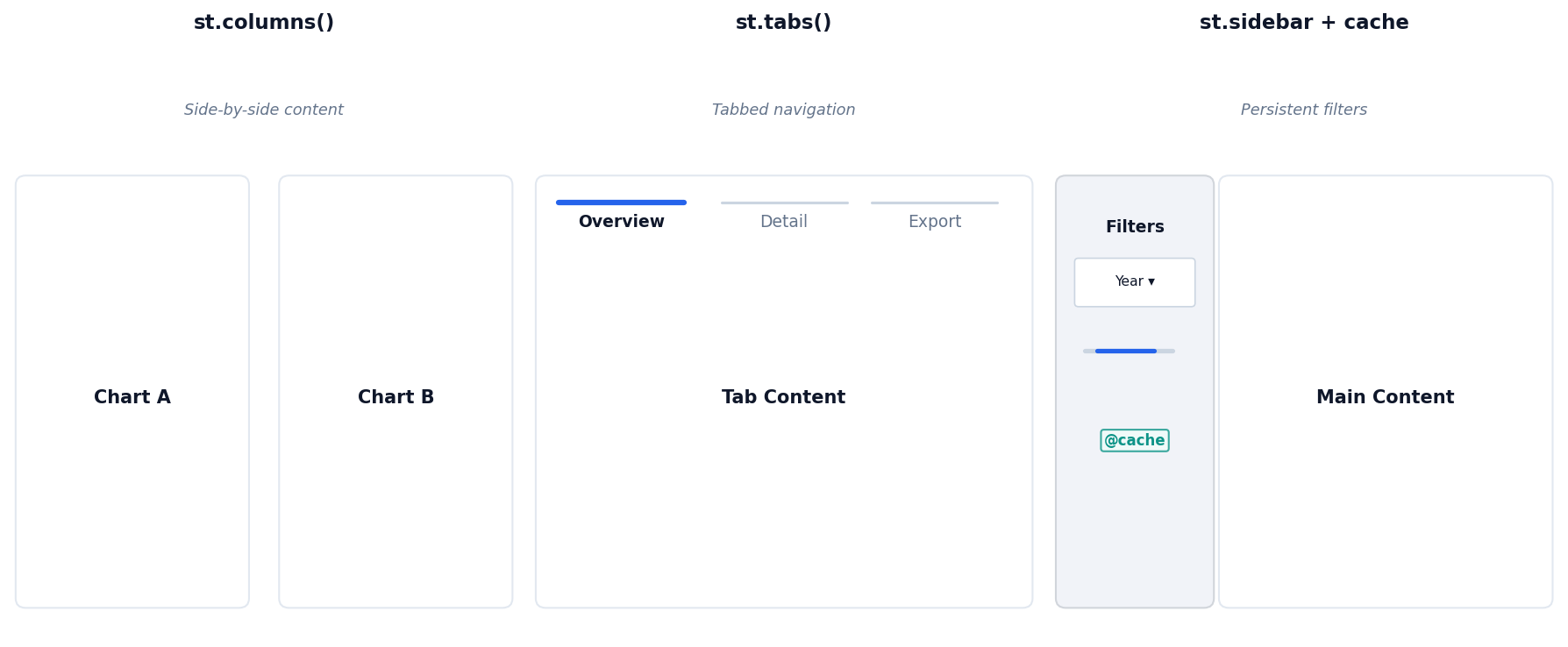
Streamlit Layout Patterns
Plotly Dash: Full Control
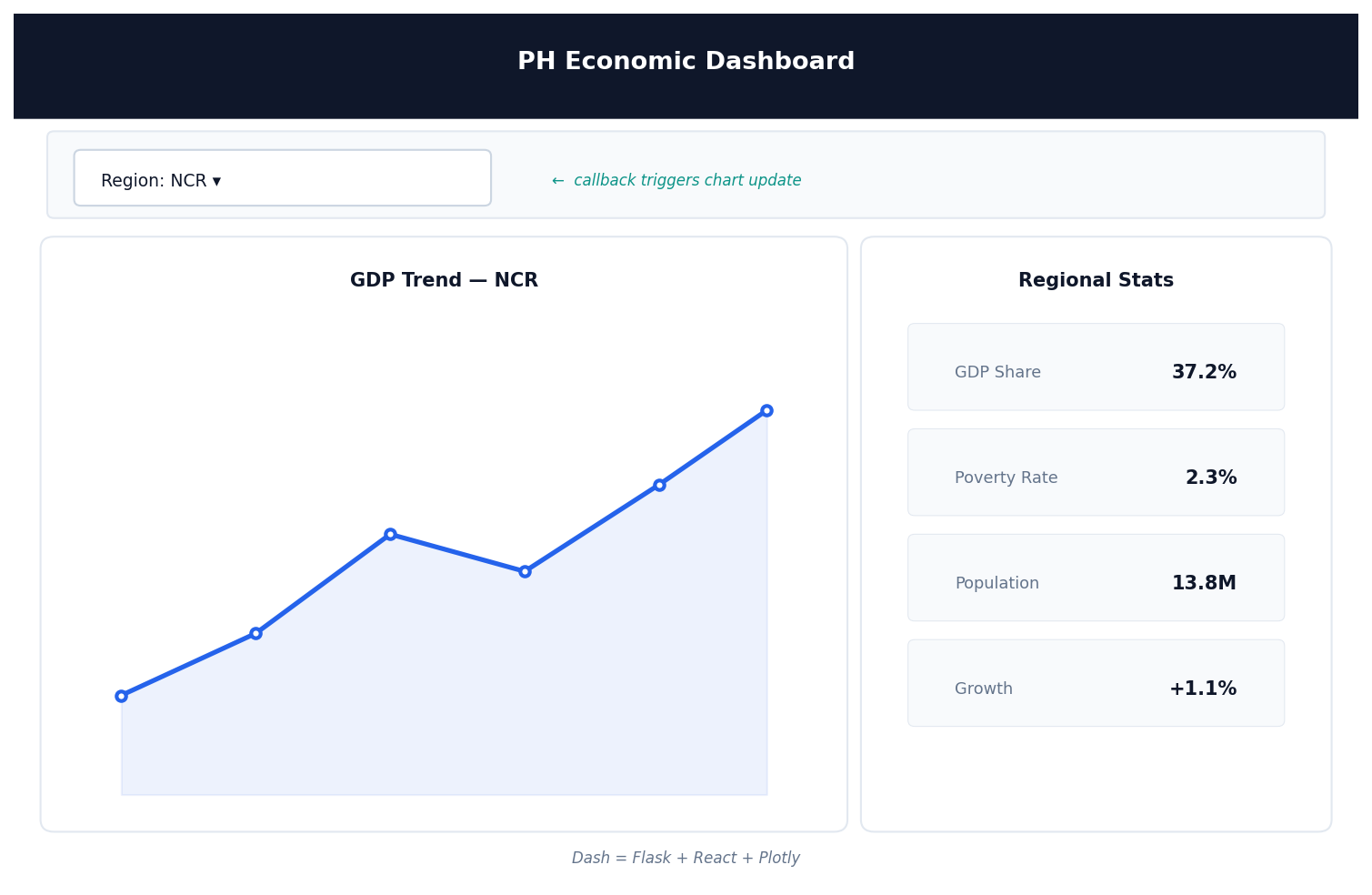
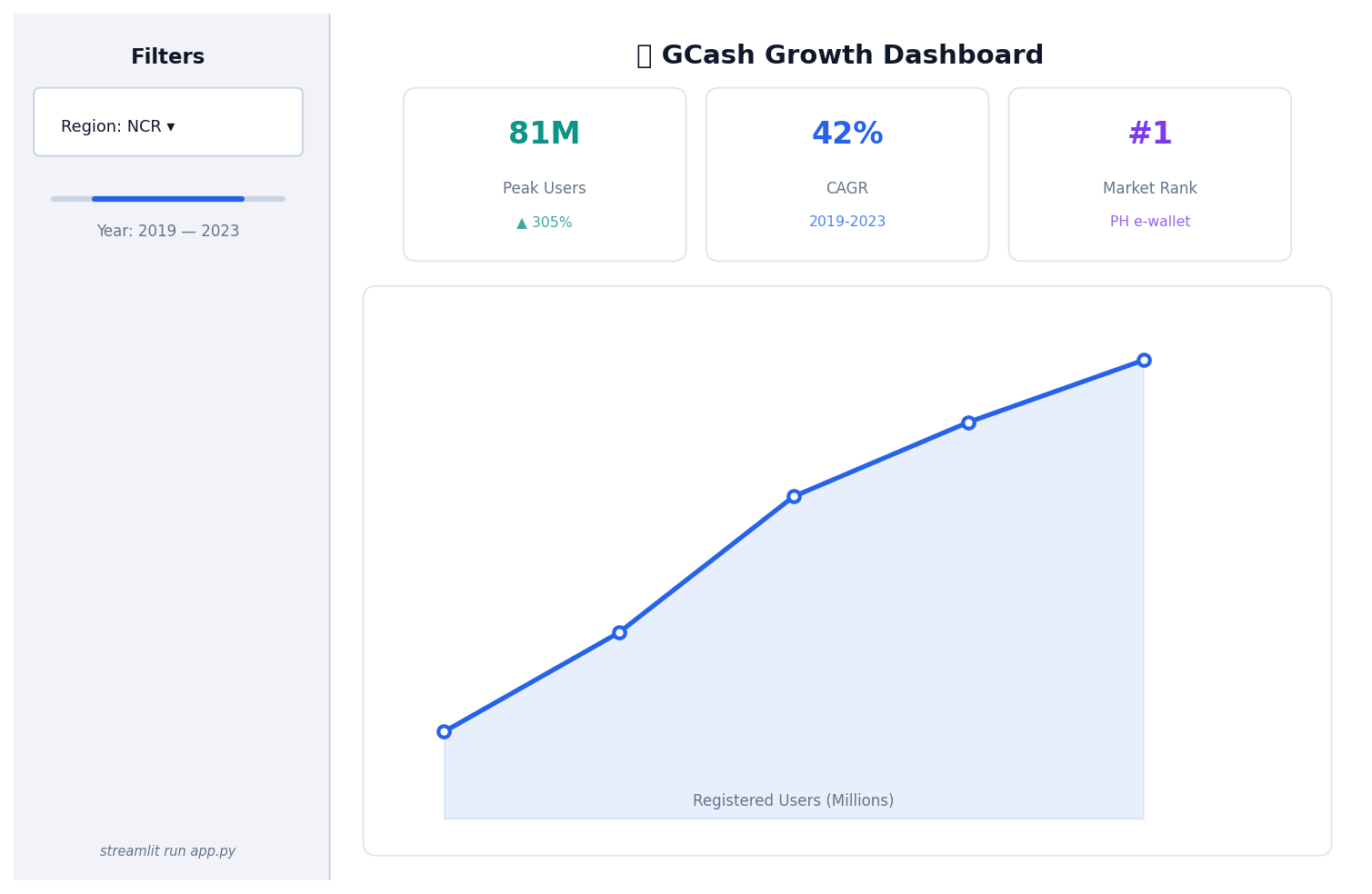
Philippine Example: GCash Analytics Dashboard