DS 208 · Week 8

Data Visualization

Turning a summarised table into a chart that makes the pattern obvious — with matplotlib for control and seaborn for speed.

Programming for Data Science · University of the Philippines Cebu

Session Map

From numbers to a picture

Words for Today

Ten words you will hear this week

figure

The whole picture: the canvas you size and save as an image file.

e.g. fig.savefig("chart.png")

axes

One plotting area inside a figure, with its own x and y axis. You draw on it.

e.g. fig, ax = plt.subplots() gives one figure and one axes

plot

To draw data onto an axes; ax.plot draws points joined by a line.

e.g. ax.plot([2021, 2022], [12, 15])

marker

The symbol drawn at each data point: a dot, a square, a triangle.

e.g. marker="o" puts a dot on every point

label

Text that names an axis or the chart, ideally with the unit.

e.g. ax.set_ylabel("Sales (₱)")

legend

The small key that says which colour or marker means which group.

e.g. ax.legend() after label="Cebu"

subplot

One of several small charts arranged in a grid inside one figure.

e.g. plt.subplots(1, 2) makes two side by side

histogram

Bars that count how many values fall in each range (bin) of one column.

e.g. ax.hist(scores, bins=5)

matplotlib

The basic Python charting library: you draw and label every part yourself.

e.g. import matplotlib.pyplot as plt

seaborn

A library built on matplotlib that draws statistical charts from a DataFrame in one call.

e.g. sns.histplot(data=df, x="pop") (Colab, not the browser lab)

Where We Left Off

A summary table still hides its shape

Your groupby gave numbers per region. But "which is biggest, and by how much" leaps out of a bar chart far faster than out of a column of digits.

The table

Exact, but you must read every row to compare.

The chart

Approximate, but the pattern is instant.

Part A

matplotlib

The foundation under every Python chart.

You can already turn a table into summary numbers. This part draws them: matplotlib is the Python library (a package of ready-made code you import) that draws charts, one instruction at a time.

The Two Objects

A figure holds axes; you draw on the axes

plt.subplots() hands back a figure (the canvas) and an axes (the plot itself). You call methods on ax to draw and label.

New words

figure
the whole picture: the canvas you size and save as a file
axes
one plotting area inside the figure, with its own x and y axis; a figure can hold several
axis
one of the two number lines (x across, y up) at the edge of an axes
plot
to draw data onto an axes; ax.plot draws points joined by a line

A method (week 4) is a function that belongs to an object, called with a dot: ax.plot(…).

import matplotlib.pyplot as plt fig, ax = plt.subplots() ax.plot(years, sales) ax.set_title("Sales over time")
  • import matplotlib.pyplot as pltload matplotlib's drawing tools under the short name plt
  • fig, ax = plt.subplots()make a new figure with one axes; the function gives back two things, so two names on the left catch them
  • ax.plot(years, sales)years and sales are two equal-length lists: x values and y values. Draw a line through the points
  • ax.set_title("Sales over time")write a title above the plot
What It Draws

Four lines of code, one line chart
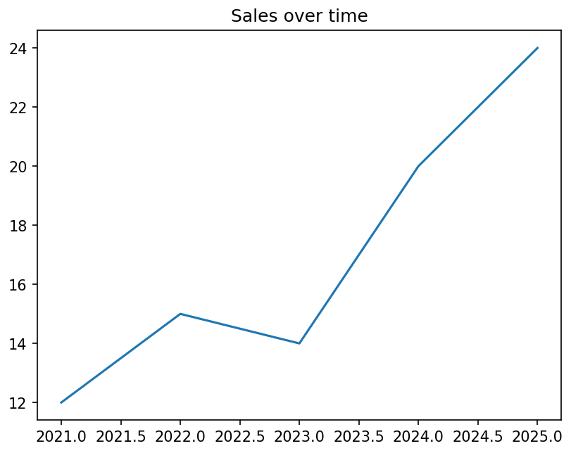
Line chart titled Sales over time: one blue line from 12 in 2021 up to 15 in 2022, down to 14 in 2023, then up to 20 in 2024 and 24 in 2025. The x axis ticks read 2021.0, 2021.5, 2022.0 and so on; neither axis has a label.

sales dip in 2023, then climb. The x axis shows 2021.5 and 2022.5 because matplotlib treats years as ordinary numbers, and neither axis says what it measures yet: labels come a few slides on.

Run with the week-8 lab’s lists: years = [2021, 2022, 2023, 2024, 2025], sales = [12, 15, 14, 20, 24]. Every chart in this deck is the real output of the code on the slide before it.

Always Start With subplots()

One call gives you both objects, named

plt.plot() draws onto whatever figure is "current", which is fine until there are two. Ask for the objects explicitly and that ambiguity never arises.

fig for the file, ax for the drawing

Everything you save or size happens on fig. Everything you draw or label happens on ax.

import matplotlib.pyplot as plt fig, ax = plt.subplots(figsize=(8, 5)) ax.scatter(df.budget, df.duration, alpha=0.05) ax.set_xlabel("Budget (PHP)") ax.set_ylabel("Duration (days)") # not: plt.scatter(...); plt.xlabel(...) # that works until you have 2 charts
  • figsize=(8, 5)the figure's width and height, in inches
  • ax.scatter(df.budget, df.duration, alpha=0.05)one dot per project: budget across, duration up. duration is a column made first: days from start to completion, (df.completion_date - df.start_date).dt.days after converting both to dates (week 6). alpha is transparency, from 0 (invisible) to 1 (solid)
  • ax.set_xlabel / ax.set_ylabelthe text under the x axis and beside the y axis
What It Draws

Budget against duration: the dots crowd the left edge
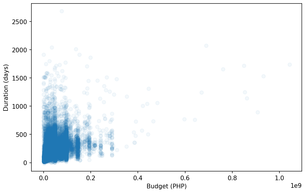
Scatter plot of duration in days (0 to about 2,700) against budget in pesos (0 to about 1.05 times 10 to the 9). Faint blue dots merge into a solid block below 0.2 billion pesos and 700 days; a few lone dots reach out to the right.

even at alpha=0.05 the left edge is solid blue. Most budgets are small and a few are huge, so nearly every dot is squeezed into the first fifth of the axis. The 1e9 at the bottom right means the ticks are in billions of pesos (0.2 = ₱200 million).

Data: DPWH flood-control projects (BetterGov.ph mirror, CC0), 34,079 rows; 27,664 have a duration.

A Grid Of Axes

subplots returns an array when you ask for more than one

Two numbers give you a grid. axes is then a NumPy array, and you index it like one. Each small chart in the grid is called a subplot.

sharey is not cosmetic

Panels with different y-limits look comparable and are not. Sharing the axis is what makes a multi-panel figure honest.

fig, axes = plt.subplots(2, 2, figsize=(12, 8), sharey=True) axes[0, 0].hist(df.budget, bins=30) axes[0, 1].hist(df.duration, bins=30) # flatten when you just want to loop for ax, col in zip(axes.flat, cols): ax.hist(df[col]); ax.set_title(col) fig.tight_layout() # stops overlap
  • plt.subplots(2, 2, …)2 rows by 2 columns of subplots; sharey=True gives them all the same y scale
  • axes[0, 0]the subplot in row 0, column 0 (top left); counting starts at 0, as with lists
  • hist(…, bins=30)a histogram with 30 bars (see Part B)
  • for ax, col in zip(axes.flat, cols)walk through the subplots and a list of column names in pairs (zip pairs them up), drawing one column per subplot
What It Draws

Two histograms drawn, two axes still empty
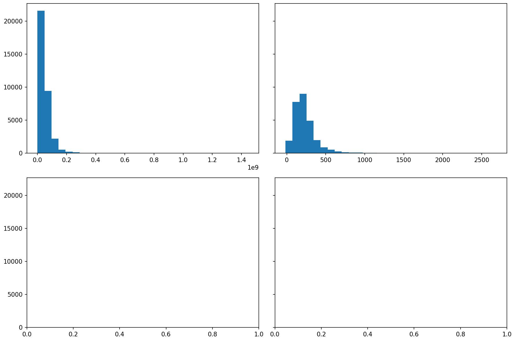
A 2 by 2 grid of plots sharing one y axis from 0 to about 22,000. Top left: a budget histogram with one tall bar near zero (about 21,500 projects) and a few short ones. Top right: a duration histogram peaking around 200 days. The bottom two panels are empty.

budget piles into the first one or two bars: most projects are small, a few are enormous. Because of sharey=True both histograms use the same 0–22,000 scale, so their bar heights can be compared directly.

Only the two hist lines and tight_layout(): the loop then fills the empty panels with whichever columns cols lists. Data: DPWH flood-control projects (BetterGov.ph mirror, CC0), 34,079 rows; 27,664 have a duration.

Overplotting

27,664 dots is a silhouette, not a scatter

Overplotting is when dots pile on top of each other until you can no longer see how many there are. Every real scatter in this course has too many points. Three fixes, and the first one is usually enough.

alpha first, then hexbin

Transparency shows density for free. When even that saturates, bin the plane instead of drawing points.

# 1. transparency ax.scatter(x, y, alpha=0.05, s=4) # 2. a reproducible sample d = df.sample(2000, random_state=42) # 3. bin the plane (log built in; budgets > 0) ax.hexbin(x, y, gridsize=40, cmap="Blues", xscale="log") # and for skewed money, always: ax.set_xscale("log") # not after hexbin
  • alpha=0.05, s=4each dot 95% see-through and small (s = size), so dark areas mean many dots
  • df.sample(2000, random_state=42)pick 2,000 random rows; the fixed random_state gives the same 2,000 every run
  • hexbin(…, cmap="Blues", xscale="log")split the plane into small hexagons and colour each by how many points fall in it (cmap = colour scale); xscale="log" bins on a log axis, which has no place for a 0 budget, so drop those rows first
  • set_xscale("log")a log scale: each step along the axis multiplies (1M, 10M, 100M), so tiny and huge budgets both fit. Calling it after hexbin leaves the chart empty
What It Draws

Fix 1 and fix 3, on a log budget axis

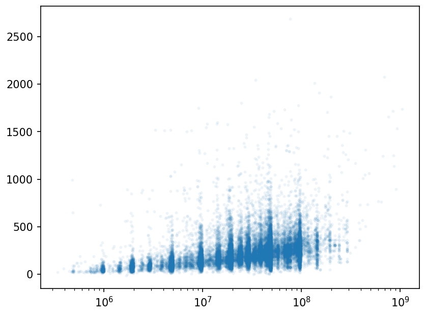
Scatter of duration against budget on a log x axis from 10 to the 6 to 10 to the 9 pesos: small faint dots form vertical stripes at round budgets and drift upward as budgets grow.
1 · alpha=0.05, s=4, then set_xscale("log")
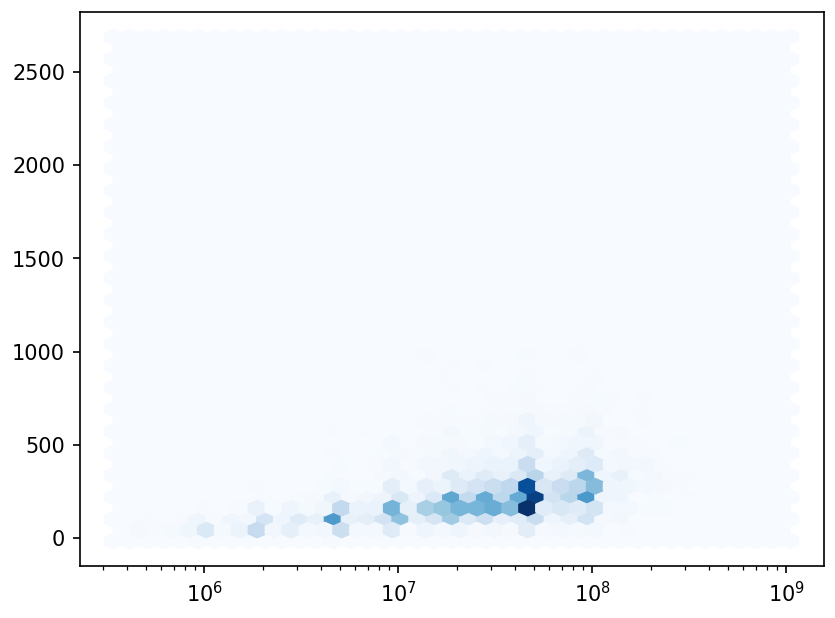
Hexbin chart of the same data on a log x axis: pale hexagons everywhere, the darkest ones around 50 million pesos and 150 to 300 days.
3 · hexbin(…, xscale="log"), budgets above 0

once the budget axis is logged, both show bigger budgets tending to take longer, and budgets bunching at round numbers (the vertical stripes). The darkest hexagon is the most common kind of project.

Here x is df.budget and y is df.duration. Run as first written, hexbin followed by set_xscale("log") drew an empty chart, so the code now passes xscale="log" to hexbin; it refuses the 939 projects with a ₱0 budget, so those are dropped first.

The Mental Model

Every chart has the same parts

figure (the canvas) Sales over time ← title Year ← x-axis label Sales (₱) ← y-axis label
The Habit That Saves You

An unlabelled chart is a puzzle

Three lines turn a mystery plot into a clear one. Do it every time — future you, reading this in a report, will not remember what the axes meant.

A chart without labels is a map without a legend or place names: the shapes are there, but nobody can say what they mean.

ax.set_xlabel("Year") ax.set_ylabel("Sales (₱)") ax.set_title("Cebu branch, 2019–2025")
  • ax.set_xlabel("Year")names the horizontal axis
  • ax.set_ylabel("Sales (₱)")names the vertical axis, with its unit in brackets
  • ax.set_title(…)the headline above the chart: what, where, when
Part B

Chart Types

Match the chart to the question.

You now know how to make a figure and label it. This part is about choosing which picture to draw, because each chart type answers a different kind of question.

Pick By The Question

Four charts cover most needs

ChartShowsReach for it when
Linea trend over timethe x-axis is ordered — dates, steps
Barcompare categoriesa value per named group
Scattera relationshiptwo numbers, one point per row
Histograma distributionthe spread of one number
Trend & Comparison

Line for time, bar for categories

A line connects ordered points — it says "these flow into each other." Bars sit apart — they say "compare these separate things."

A line chart is a temperature graph through the day: the hours follow each other. A bar chart is a height chart for a class photo: each bar is a separate person.

ax.plot(years, sales) # trend over time ax.bar(regions, pops) # compare categories
  • ax.plot(years, sales)x = years (ordered), y = sales; points joined by a line
  • ax.bar(regions, pops)one bar per region name, as tall as its population
Line, For Time

Spend per year, one call

A line chart says "these points are connected in order". Only use it when they are — time, or another genuine sequence.

A marker is the symbol drawn at each data point: "o" a dot, "s" a square, "^" a triangle.

Never a line across categories

Connecting 18 regions implies Region I flows into Region II. Bars, for anything unordered.

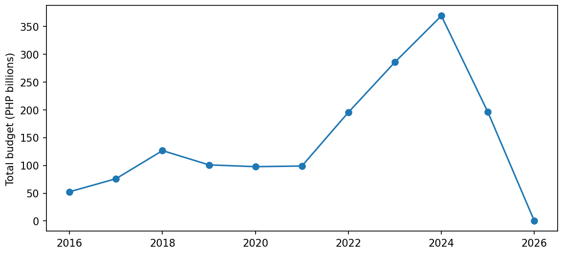
y = df.groupby("year").budget.sum() / 1e9 fig, ax = plt.subplots(figsize=(9, 4)) ax.plot(y.index, y.values, marker="o") ax.set_ylabel("Total budget (PHP billions)") 2016 52.6 ... 2024 369.3 2025 196.2 <- ? 2026 0.0 <- ? # y, rounded to 1 decimal
  • df.groupby("year").budget.sum() / 1e9week 7: total budget per year, divided by 1e9 (one billion) so the numbers read as billions of pesos
  • ax.plot(y.index, y.values, marker="o")years across (the Series' index), totals up (its values), a dot on each year
  • the outputthe yearly totals the line is drawn through (... hides 2017–2023): it climbs to ₱369.3B in 2024, then drops, to 0.0 in 2026
What It Draws

Spend per year, drawn

Line chart of total budget per year in billions of pesos, a dot on each year: about 53 in 2016, 127 in 2018, flat near 100 until 2021, then a steep climb to a peak of 369 in 2024, down to 196 in 2025 and to 0 in 2026.

the line climbs to a 2024 peak, then plunges to ₱196B in 2025 and to zero in 2026. The chart draws that plunge as confidently as every other year; the next two slides ask whether it is real.

Data: DPWH flood-control projects (BetterGov.ph mirror, CC0), 34,079 rows; 27,664 have a duration.

The Chart Draws It Without Comment

2024: ₱369B. 2025: ₱196B.

A 47% collapse in flood control spending — or an export taken partway through the year.

It Is The Data, Not The Country

An incomplete final year looks exactly like a crash

2026 has one project in it. 2025 has 3,475 against 2024’s 5,553. The dataset was exported mid-period, so the last bars are partial — and nothing in the chart says so.

Two honest fixes

Drop the incomplete periods, or draw them differently (dashed, greyed) and label them. Never plot a partial period as if it were whole.

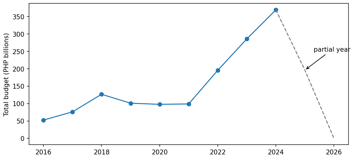
df.groupby("year").size().tail(3) 2024 5553 2025 3475 2026 1 <- partial # drop what is not comparable y = y[y.index <= 2024] # or mark it: whole years solid, partial dashed ax.plot(y[:-2], marker="o") ax.plot(y[-3:], linestyle="--", color="grey") ax.annotate("partial year", ...)
  • df.groupby("year").size().tail(3)how many projects each year has; tail(3) shows the last three years
  • y[y.index <= 2024]keep only the years up to 2024 (the years are whole numbers, so no quotes: "2024" in quotes would raise a TypeError)
  • y[:-2], y[-3:]y[:-2] is every year except the last two, drawn solid; y[-3:] is 2024 to the end, drawn as a grey dashed line, so the drop into the partial years looks different (dashing only y[-2:] would leave the 2024→2025 drop solid)
  • ax.annotate("partial year", ...)write a note on the chart (the ... stands for its position, shown later)
What It Draws

The two honest fixes, drawn

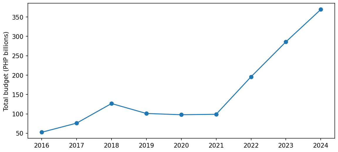
Line chart of total budget per year from 2016 to 2024 only, ending at its peak of 369 billion pesos.
drop: y[y.index <= 2024]
The same line from 2016 to 2024 in solid blue, then a grey dashed line down to 196 in 2025 and 0 in 2026, with an arrow labelled partial year pointing at 2025.
mark: solid to 2024, grey dashes after

on the left the partial years are gone, so the chart ends at the 2024 peak. On the right they stay but look different: the grey dashes say “not comparable” before anyone reads a label.

The note was placed with xy=(2025, y[2025]), xytext=(2025.3, 250). Data: DPWH flood-control projects (BetterGov.ph mirror, CC0), 34,079 rows; 27,664 have a duration.

Bar, For Categories

Sorted, horizontal, and starting at zero

Three decisions turn an unreadable bar chart into a readable one, and none of them is about colour: sort the bars by size, lay them sideways, and start the value axis at zero.

Horizontal for long labels

"National Capital Region" rotated 45 degrees is unreadable and eats a third of the figure. barh costs nothing.

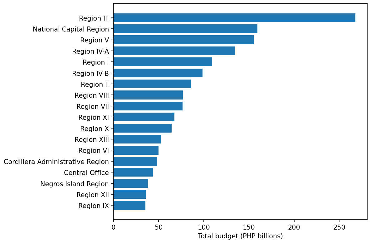
g = (df.groupby("region").budget.sum() .sort_values() / 1e9) fig, ax = plt.subplots(figsize=(7, 6)) ax.barh(g.index, g.values) ax.set_xlabel("Total budget (PHP billions)") Region IX 35.5 Region XII 35.9 ... Region V 155.6 National Capital Region 159.2 Region III 267.7 # g, rounded to 1 decimal
  • .sort_values()order the regions from smallest to largest total; barh draws the first one at the bottom, so the biggest bar ends up on top and the chart reads as a ranking
  • ax.barh(g.index, g.values)barh = horizontal bars: region names down the side, where long names fit
  • the outputthe totals in billions of pesos; Region III is the longest bar (₱267.7B)
What It Draws

The ranking, drawn

Horizontal bar chart of total budget by region in billions of pesos, longest bar on top: Region III about 268, National Capital Region 159, Region V 156, down to Region XII and Region IX at about 36.

every region name is readable, the longest bar sits on top, and Region III’s bar is about 1.7 times NCR’s, which the eye sees at once without reading a number.

Data: DPWH flood-control projects (BetterGov.ph mirror, CC0), 34,079 rows; 27,664 have a duration.

Two Charts, One Figure

When a second y-axis is and is not honest

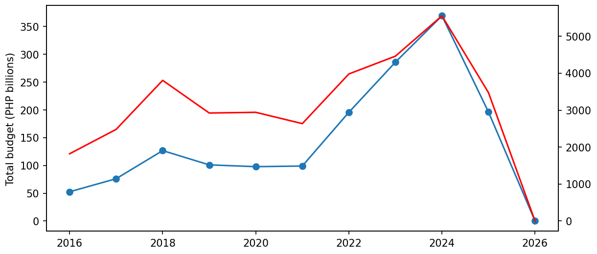
twinx() ("twin x") puts two scales on one plot: a second y axis on the right that shares the same x axis. It is the easiest way to imply a relationship that is not there, because you choose both scales.

The honest alternative

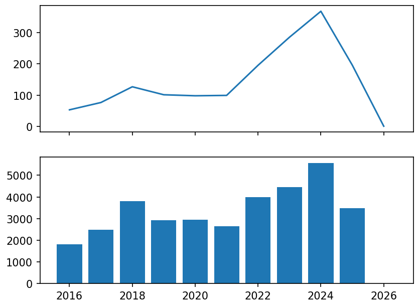
Two stacked panels with sharex=True. The comparison survives; the implied correlation (the suggestion that the two lines move together) does not.

# tempting — and easy to abuse ax2 = ax.twinx() ax2.plot(y.index, counts, color="red") # slide either scale and the lines # "diverge" or "track" on command # better fig, (a1, a2) = plt.subplots(2, 1, sharex=True) a1.plot(y.index, totals) a2.bar(y.index, counts)
  • ax2 = ax.twinx()a second axes drawn on top of the first, with its own y scale on the right
  • fig, (a1, a2) = plt.subplots(2, 1, sharex=True)two subplots stacked (2 rows, 1 column) that share the same x axis; the brackets catch the two axes by name
What It Draws

Twin axes against two stacked panels

Line chart with two y axes: blue total budget on the left (0 to 370 billion pesos) and red project counts on the right (0 to about 5,500). The two lines follow each other closely and meet at the 2024 peak and at zero in 2026.
twinx(): two scales on one plot
Two stacked panels sharing the year axis: top, a line of total budget per year; bottom, bars of projects per year, from about 1,800 in 2016 to 5,553 in 2024 and 3,475 in 2025.
better: two panels, sharex=True

on the left the lines seem to rise and fall as one, but only because matplotlib stretched each scale to fill the box; a different right-hand scale would pull them apart. On the right each measure keeps its own axis.

counts = projects per year, df.groupby("year").size(); totals = the yearly budget y; the twin axes sit on the spend-per-year chart. Data: DPWH flood-control projects (BetterGov.ph mirror, CC0), 34,079 rows; 27,664 have a duration.

Relationship & Spread

Scatter for pairs, histogram for one column

A scatter plots one point per row to reveal whether two numbers move together. A histogram bins one column to show where values cluster.

A histogram cuts the range of values into equal slices called bins (e.g. 0–10, 10–20, …) and draws one bar per bin, as tall as the number of values that fall in it.

A histogram is lining students up by height band: how many are 150–155 cm, how many 155–160 cm, and so on.

ax.scatter(area, pop) # do they move together? ax.hist(pop, bins=10) # where do values cluster?
  • ax.scatter(area, pop)one dot per city: area across, population up
  • ax.hist(pop, bins=10)only one column is needed; matplotlib counts how many cities fall in each of 10 population bands
Quick Check

Tap to reveal

You want to see the spread of exam scores across one class. Which chart?

A · line chart
B · scatter plot
C · histogram
D · pie chart

C — histogram.

A histogram bins one column to show its distribution — where scores cluster and how wide they spread. A line implies order; a scatter needs two numbers.

Break

  Five minutes

Back for the fast, good-looking way to plot.

Part C

seaborn

Statistical charts, straight from a DataFrame.

You can build any chart in matplotlib line by line. seaborn is a second library, built on top of matplotlib, that draws common statistical charts from a DataFrame in one call. (The in-browser lab has matplotlib only; try seaborn in Colab.)

Column Names, Not Arrays

Point seaborn at a DataFrame

Pass the whole frame and name the columns for each axis. seaborn reads the data directly, picks sensible defaults, and labels the axes for you.

With matplotlib you hand over two lists of numbers. With seaborn you hand over the whole table and say "region goes across, pop goes up" by column name.

import seaborn as sns sns.barplot(data=df, x="region", y="pop") sns.scatterplot(data=df, x="area_km2", y="pop")
  • import seaborn as snsload seaborn under its usual short name sns
  • sns.barplot(data=df, x="region", y="pop")a bar per region, height = population; column names go in quotes
  • sns.scatterplot(…)a dot per city: area across, population up
The seaborn Confusion

Why does ax= not work?

Because half of seaborn returns a figure, not an axes.

Two Families

Axes-level draws on your axes; figure-level makes its own

This one distinction explains nearly every seaborn error message a beginner meets.

New words

axes-level
draws one chart onto an axes you give it with ax=
figure-level
builds a whole new figure itself, possibly with many subplots
facet
repeat the same chart once per group, in a grid of small panels

Tell them apart by the name

The *plot functions that end in plot and take ax= are axes-level. relplot, displot, catplot are figure-level.

# AXES-level: give it an ax fig, ax = plt.subplots() sns.scatterplot(data=d, x=..., y=..., ax=ax) # scatterplot, lineplot, boxplot, # histplot, barplot, heatmap
# FIGURE-level: it owns the figure g = sns.relplot(data=d, x=..., y=..., col="region", col_wrap=4) # relplot, displot, catplot, pairplot # ax= is ignored, with a warning: # use g.fig / g.axes instead # faceting ONLY works here
  • ax=ax"draw on this axes": the one you made with plt.subplots()
  • col="region", col_wrap=4one panel per region, four panels per row
  • g.fig / g.axesg is the grid seaborn built; these give you its figure and its axes
  • relplot(…, ax=ax)if you pass ax= anyway, seaborn prints a warning that relplot does not accept it and ignores it: the chart lands in a new figure, not on your axes
Which To Reach For

Facet? Figure-level. Compose? Axes-level.

If you want one chart placed inside a layout you control, use axes-level. If you want the same chart repeated per group, use figure-level and let it build the grid.

You cannot facet an axes-level plot

There is no col= on scatterplot. Reaching for it and failing is the usual reason people end up writing manual subplot loops.

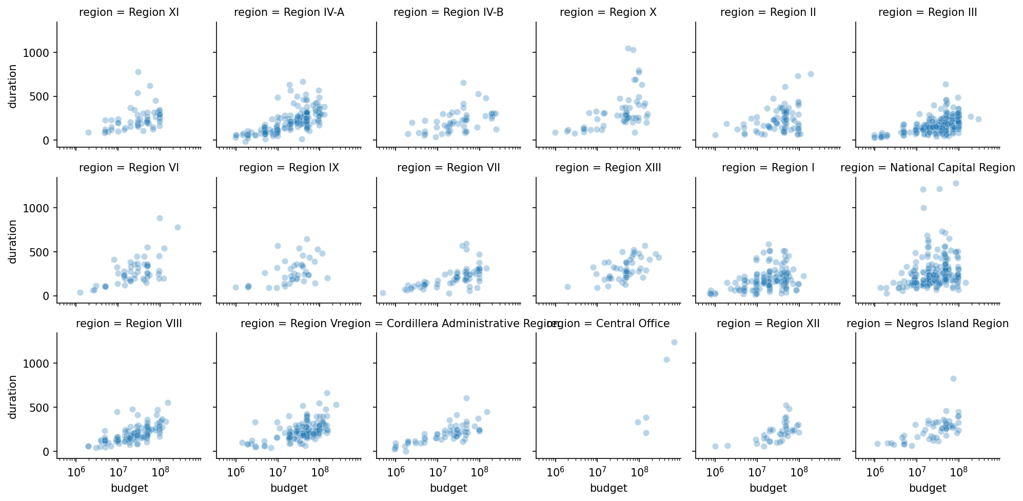
# 18 panels, one per region, shared axes g = sns.relplot(data=d, x="budget", y="duration", col="region", col_wrap=6, height=2.2, alpha=0.3) g.set(xscale="log") # and to save it: g.savefig("by_region.png", dpi=150) # note: g.savefig, not plt.savefig
  • sns.relplot(…, col="region", col_wrap=6)one budget-vs-duration scatter per region, six panels per row (18 panels)
  • height=2.2, alpha=0.3each panel 2.2 inches tall; dots partly see-through
  • g.set(xscale="log")apply a log x scale to every panel at once
  • g.savefig("by_region.png", dpi=150)save the whole grid as an image file
What It Draws

18 panels from one call

A grid of 18 small scatter plots, 6 per row, one per region, each showing duration against budget on the same log budget axis and the same duration axis up to about 1,300 days. In the bottom row two long panel titles run into each other.

every panel shares the same axes, so regions compare at a glance: Region III and NCR are dense, Central Office has only a handful of dots. Two long region names collide in the bottom row; that is seaborn’s default output.

d is the 2,000-row sample from the overplotting slide, df.sample(2000, random_state=42). Data: DPWH flood-control projects (BetterGov.ph mirror, CC0), 34,079 rows; 27,664 have a duration.

One Call Each

The seaborn charts you'll reuse

FunctionDrawsExtra it gives you
sns.histplota histogramoptional density curve (a smooth line tracing the bars’ shape)
sns.boxplotspread per groupmedian + outliers at a glance
sns.scatterplota relationshiphue= colours by a category
sns.barplota value per groupa confidence bar (a thin line showing how uncertain each average is) automatically
Legends

Only when there is more than one thing

A legend is the small key that says which colour or marker means what. A series is one set of data drawn as one line or one set of dots. A legend on a single-series chart is noise. On a multi-series one it is essential — and its placement matters more than people expect.

Label the lines directly when you can

Two or three series read better annotated at their right-hand end than via a legend the eye has to travel to.

ax.plot(x, a, label="Region III") ax.plot(x, b, label="NCR") ax.legend(loc="upper left", frameon=False) # push it outside when it covers data ax.legend(bbox_to_anchor=(1.02, 1), loc="upper left") # then bbox_inches="tight" on save, # or its labels get cropped off
  • label="Region III"give each line a name; nothing shows yet
  • ax.legend(loc="upper left", frameon=False)draw the key from those names, in the top-left corner, with no box around it
  • bbox_to_anchor=(1.02, 1)place the key just outside the right edge of the axes (1.0 = the edge)
What It Draws

Legend inside, and outside without a tight save
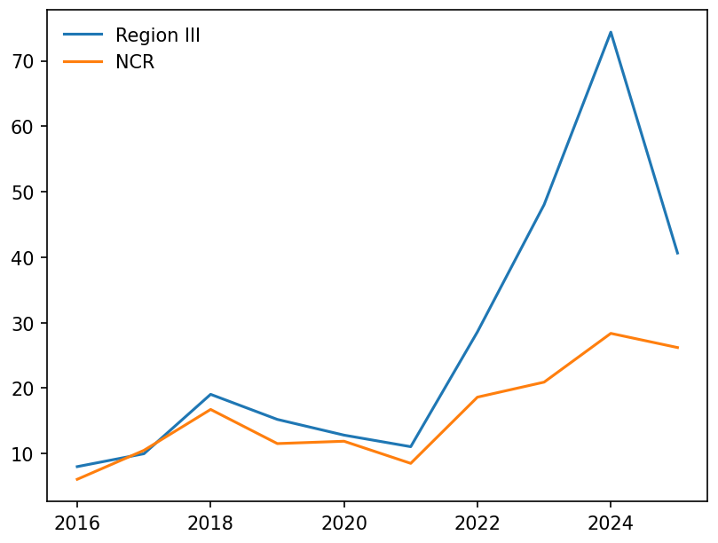
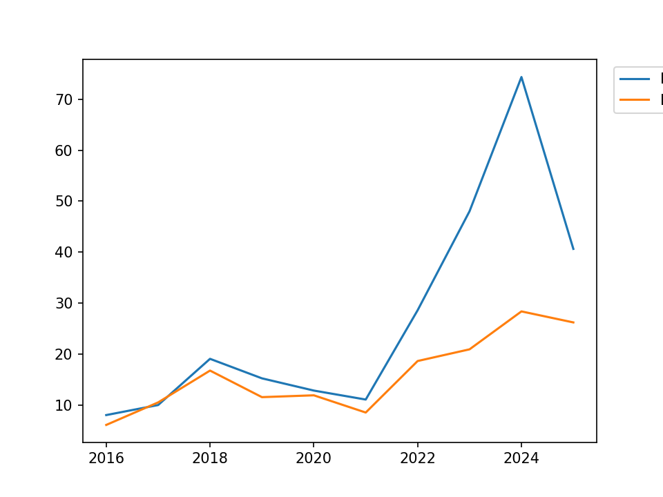
Two lines of yearly budget in billions of pesos, 2016 to 2025: Region III in blue rising to about 74 in 2024, NCR in orange to about 28. A legend with no frame sits in the top-left corner.
loc="upper left", frameon=False
The same chart with the legend placed outside the right edge and saved with default settings: the legend is cut off at the image border, so only the coloured line samples and the first letter of each name show.
outside, saved without bbox_inches="tight"

inside, the key fits the empty top-left corner. Outside, a default save cuts the names off at the image edge; saving with bbox_inches="tight" brings the whole key back.

x = the years; a, b = Region III’s and NCR’s yearly budget in PHP billions, from df.groupby(["year", "region"]).budget.sum(). Data: DPWH flood-control projects (BetterGov.ph mirror, CC0), 34,079 rows; 27,664 have a duration.

Set The Style Once

At the top of the notebook, not per chart

Consistent figures across a report come from one call, not from remembering to pass the same arguments twenty times.

Theme, then palette

whitegrid for anything with a y-scale to read against; ticks for scatter plots where a grid adds nothing.

import seaborn as sns sns.set_theme(style="whitegrid", palette="colorblind", context="talk") # context scales ALL text at once: # paper < notebook < talk < poster # use "talk" for slides — the default # is sized for a notebook, not a room
  • style="whitegrid"white background with light grid lines
  • palette="colorblind"the set of colours used for groups, chosen to stay distinguishable for colour-blind readers
  • context="talk"scale all text and lines for a projector
When It Will Not Render

Four errors and what each one means

SymptomCauseFix
Nothing appears in the notebookNo plt.show(), or a non-interactive backendAdd %matplotlib inline
Labels cropped in the saved fileDefault save clips outside the axes boxbbox_inches="tight"
relplot ignores ax= (with a warning)It is figure-level and owns its figureUse scatterplot(ax=ax)
Panels overlap each otherDefault spacing does not account for labelsfig.tight_layout()
Design With Integrity

A chart can mislead — don't let yours

Bars Start At Zero

A truncated bar axis multiplies differences

A bar’s meaning is its length. Cut the axis and you have changed every length while keeping the numbers technically correct.

Lines are different

A line chart encodes position, not length, so a non-zero baseline is fine — and often necessary to see the change at all.

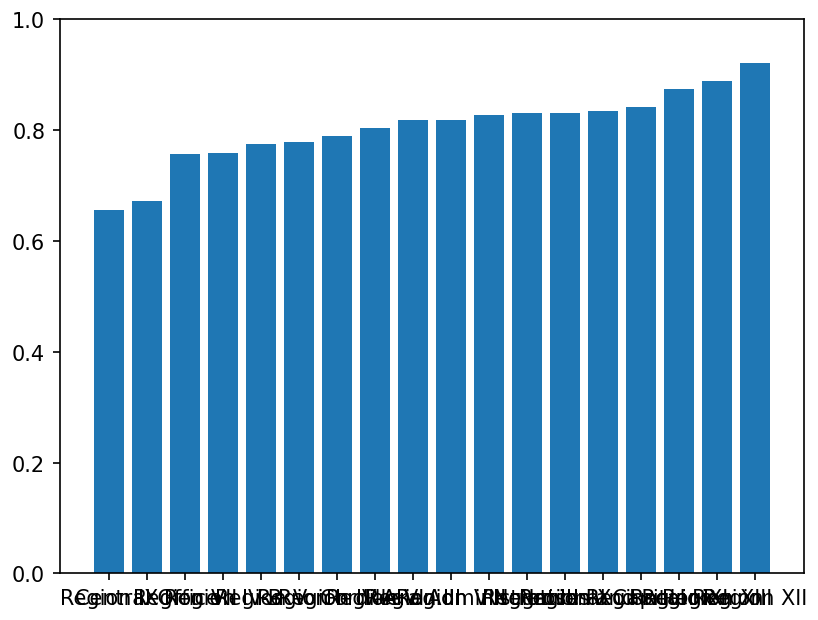
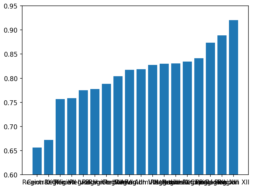
# completion rates 65.6% to 92.0% # HONEST: full scale ax.bar(regions, rates) ax.set_ylim(0, 1) a modest spread — which is true # MISLEADING: truncated ax.set_ylim(0.6, 0.95) Region XII looks ~5.7x Region IX the real ratio is 1.4x
  • ax.set_ylim(0, 1)the y axis runs from 0 to 1 (0% to 100%)
  • ax.set_ylim(0.6, 0.95)the y axis now starts at 60%, so every bar loses its bottom 60% and the gaps look far bigger
What It Draws

Same numbers, two y axes

Bar chart of completion rate by region on a 0 to 1 axis, sorted: the bars rise gently from about 0.66 (Region IX) to 0.92 (Region XII). The region names along the bottom overlap into an unreadable strip.
set_ylim(0, 1)
The same bars on an axis from 0.6 to 0.95: Region IX’s bar is now a stub and Region XII’s towers over it. The region names still overlap.
set_ylim(0.6, 0.95)

on the left the bars differ modestly, which is true. On the right the same numbers make Region XII look almost six times Region IX. The names crashing along the bottom are the long-label problem that barh solves.

rates = each region’s share of projects with status Completed, sorted. Data: DPWH flood-control projects (BetterGov.ph mirror, CC0), 34,079 rows; 27,664 have a duration.

Declare The Log Scale

A reader assumes linear unless told

On a log axis (short for logarithmic), equal distances are equal ratios, not equal amounts. That is a completely different chart, and it must be labelled as one.

Put it in the axis label

Not just the caption — the label travels with the image when someone screenshots it into a slide.

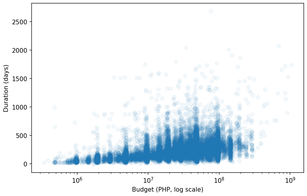
ax.set_xscale("log") ax.set_xlabel("Budget (PHP, log scale)") # the gap from 10M to 100M and the gap # from 100M to 1B are now the SAME # width. say so, or you are implying # they are the same difference.
What It Draws

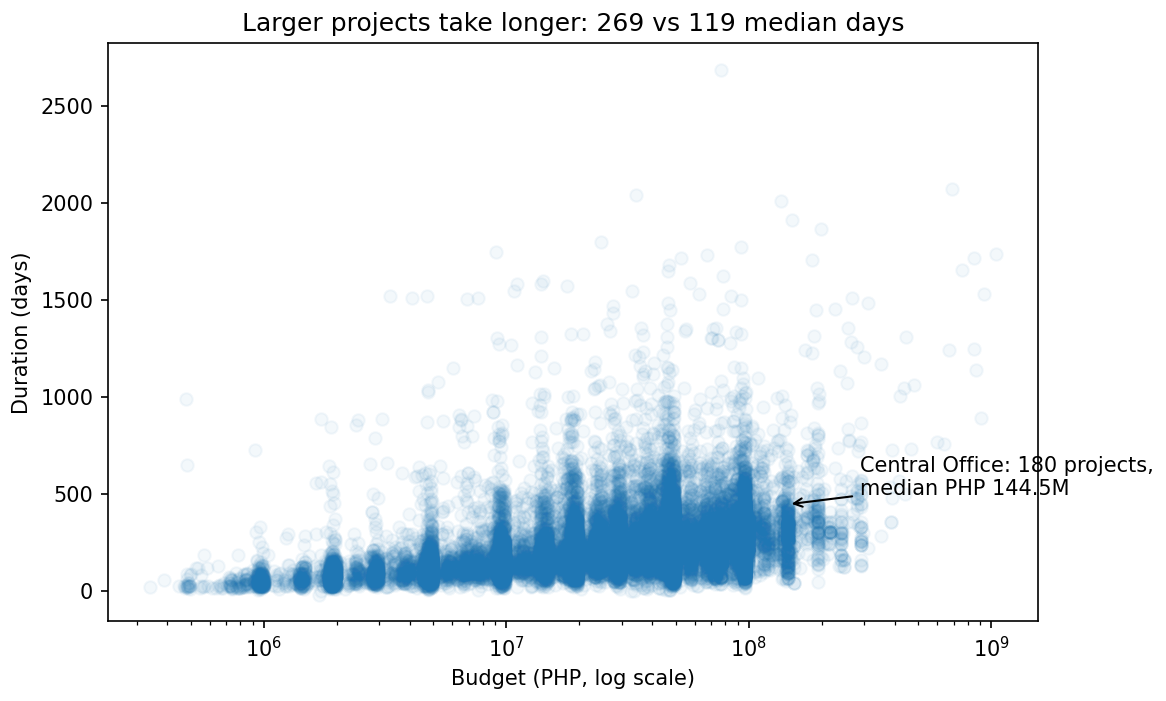
The same scatter, labelled as log

The budget against duration scatter again, now with a log budget axis from 10 to the 6 to 10 to the 9 pesos labelled Budget (PHP, log scale): the dots spread across the whole width in vertical stripes and drift upward as budgets grow.

the same dots as the first scatter now fill the width. The ticks go 106, 107, 108, each ten times the last, and the axis label says so.

The first scatter (figsize=(8, 5), alpha=0.05) with these two lines added. Data: DPWH flood-control projects (BetterGov.ph mirror, CC0), 34,079 rows; 27,664 have a duration.

Colour

Choose for meaning, and for readers who cannot see all of it

About 8% of men have some form of colour-vision deficiency. Red-green is the most common failure and the most common default.

A colormap (cmap) is a colour scale that turns numbers into colours, like a heat map from pale to dark.

Three kinds, three jobs

Sequential for magnitude, diverging for a meaningful midpoint, qualitative for unordered categories. Using the wrong family misstates the data.

# sequential: low -> high cmap="viridis" # colourblind-safe # diverging: centred on something cmap="RdBu_r", center=0 # qualitative: unordered categories sns.set_palette("colorblind") # never: rainbow/jet for magnitude — # it invents boundaries that are not # in the data
  • sequentialone colour from light to dark: low → high (e.g. budget)
  • divergingtwo colours meeting at a middle value, e.g. below vs above zero (center=0)
  • qualitativeclearly different colours with no order, for categories like regions
Annotate The Point You Are Making

If a chart has a message, write it on the chart

A reader should not have to find your conclusion in the dots. Mark it.

One annotation, not five

Two arrows mean the chart has two messages, which usually means it should be two charts.

ax.annotate( "Central Office: 180 projects,\nmedian PHP 144.5M", xy=(x0, y0), xytext=(x0*2, y0+50), arrowprops=dict(arrowstyle="->")) # and a title that states the finding ax.set_title("Larger projects take longer: " "269 vs 119 median days") # not "Budget vs Duration"
  • xy=(x0, y0)the data point the arrow points at
  • xytext=(x0*2, y0+50)where the note's text sits, away from the point
  • arrowprops=dict(arrowstyle="->")draw a simple arrow from the text to the point
  • "\n" in the texta line break: the note is written on two lines
What It Draws

The finding, written on the chart

Log-scale scatter of duration against budget titled Larger projects take longer: 269 vs 119 median days. An arrow points at about 144.5 million pesos and 448 days, with the note Central Office: 180 projects, median PHP 144.5M.

the title states the finding and one arrow points at the one group being discussed, so a reader gets the message without hunting through the dots. The note runs past the right edge because xytext doubles x0; a tight save keeps it in the file.

x0, y0 = Central Office’s median budget (₱144.5M) and median duration (448 days), on the log-scale scatter from the previous slides. Data: DPWH flood-control projects (BetterGov.ph mirror, CC0), 34,079 rows; 27,664 have a duration.

Get It Out

Tidy the layout, then save it sharp

tight_layout() stops labels clipping; savefig with a higher dpi exports a crisp image for a report or slide.

dpi means "dots per inch": more dots give a sharper, larger image file.

fig.tight_layout() fig.savefig("pops.png", dpi=150) plt.show() # display in the notebook
  • fig.tight_layout()nudge labels and subplots so nothing overlaps
  • fig.savefig("pops.png", dpi=150)write the figure to an image file called pops.png next to your notebook
  • plt.show()display the chart on screen
Saving It Properly

Two arguments stand between you and a cropped label

The default save clips anything outside the axes box — which is exactly where rotated tick labels and legends live.

dpi for where it is going

150 for a slide, 300 for print. The default 100 looks soft on any modern screen.

fig.savefig("budget_duration.png", dpi=150, bbox_inches="tight") # vector, for a report that gets zoomed fig.savefig("fig.pdf", bbox_inches="tight") # and in a script, close what you save plt.close(fig) # 18 open figures = a memory warning
  • bbox_inches="tight"crop the saved image to everything drawn, including labels outside the axes
  • "fig.pdf"a vector file: stored as shapes, not pixels, so it stays sharp when zoomed
  • plt.close(fig)throw the figure away once saved, to free memory
The Checklist

Before any chart leaves your notebook

CheckWhy it matters
Both axes labelled, with units"Budget" is not a unit. "Budget (PHP)" is.
Title states the finding"Larger projects take longer" beats "Budget vs Duration".
Bars start at zeroLength is the encoding; truncating it lies about ratios.
Log scales declared in the labelOtherwise the reader assumes linear distances.
n stated somewhere"27,664 projects with a completion date" — the denominator is part of the claim.
Saved with bbox_inches="tight"Or the labels you just wrote get cropped off.
Your Turn · 8 min

Build one chart you would defend

1 · Make the figure

Scatter budget against duration with subplots(). Fix the overplotting with alpha, and log the x-axis.

2 · Label it fully

Both axes with units, a title that states a finding rather than naming the variables.

3 · Facet it

Rebuild as relplot with col="region", col_wrap=6. Confirm the axis limits are shared.

4 · Save both

PNG at dpi=150 with bbox_inches="tight". Open the file and check nothing is cropped.

Quick Check

Tap to reveal

You call sns.relplot(data=d, x=..., y=..., ax=ax) and you get a warning, and your axes stay empty. Why?

A · relplot needs the data in long form first
B · relplot is figure-level — it creates its own figure and does not accept ax=
C · ax must be passed as the first positional argument
D · You must call plt.figure() beforehand
B. seaborn has two families. Axes-level functions (scatterplot, boxplot, histplot) draw onto an axes you supply. Figure-level ones (relplot, displot, catplot) build and own their whole figure — which is what lets them facet with col=. Use scatterplot(..., ax=ax), or drop ax= and use g.fig afterwards.
Quick Check

Tap to reveal

Completion rates across regions run from 65.6% to 92.0%. You set ax.set_ylim(0.6, 0.95) on a bar chart. What have you done?

A · Zoomed in appropriately so the differences are visible
B · Exaggerated the differences — a bar encodes length, so truncating the axis misstates every ratio
C · Nothing, as long as the axis is labelled
D · Improved it, since starting at zero wastes space
B. The real spread is 1.4× (92.0/65.6); on that truncated axis the tallest bar appears roughly 5.7× the shortest (0.32 of visible height vs 0.056). Bars must start at zero because their meaning is length. A line chart is different — it encodes position, so a non-zero baseline is legitimate there.
Putting It Together

Population by region, done right

Summarise, plot as bars, and label. Group, chart, label, save — the whole pipeline from a table to a report-ready figure.

by_reg = df.groupby("region")["pop"].sum() ax = by_reg.plot.bar() ax.set_ylabel("Population") ax.set_title("Population by region")
  • df.groupby("region")["pop"].sum()week 7: total population per region, as a Series
  • by_reg.plot.bar()pandas' shortcut to matplotlib: draw a bar chart of the Series and give back its axes
  • ax.set_ylabel / ax.set_titlethe same labelling as Part A, on that axes
Quick Check

Tap to reveal

A bar chart's y-axis starts at 90 instead of 0. What's the risk?

A · nothing — it saves space
B · it exaggerates small differences
C · the bars vanish
D · colours break

B — it exaggerates small differences.

Bar length encodes value, so a cropped baseline makes a tiny gap look huge. Bars must start at zero; a line chart may crop, since it encodes position, not length.

This Week's Lab

Four charts, all labelled

You'll build a line, bar, scatter, and histogram from a real dataset with matplotlib and seaborn, label each properly, and export one to a file. ~45 minutes.

You'll practise

plt.subplots, the four chart types, axis labels, and sns one-liners.

The in-browser lab runs matplotlib only (seaborn is not installed there), so the seaborn one-liners are for Colab.

Stretch, if you want

Use plt.subplots(1, 2) to place two charts side by side.

Recap

Build it, pick it, label it

Glossary

Every new word from today, in one line each

Building a chart

matplotlib
the basic charting library; you draw every part yourself
figure
the whole canvas you size and save
axes
one plotting area inside the figure; you draw on it
axis
the x (across) or y (up) number line of an axes
subplot
one of several axes arranged in a grid in one figure
plot
draw data onto an axes; ax.plot joins points with a line
marker
the symbol at each data point ("o", "s")
label
text naming an axis or the chart, with units
legend
the key saying which colour or marker is which series
overplotting
too many dots on top of each other to count
alpha
transparency, from 0 (invisible) to 1 (solid)
dpi
dots per inch: how sharp a saved image is

Choosing and styling

distribution
how one column's values are spread out
histogram
bars counting how many values fall in each bin (range)
relationship
whether two numbers rise or fall together; shown by a scatter
log scale
an axis where each step multiplies (1M, 10M, 100M)
twin axes
a second y scale on the right (twinx); easy to mislead with
seaborn
library on top of matplotlib: statistical charts from a DataFrame
axes-level / figure-level
draws on your axes (ax=) / builds its own figure
facet
the same chart repeated per group in a grid of panels
hue
seaborn's "colour by this column"
colormap (cmap)
a colour scale that turns numbers into colours
annotate
write a note, with an arrow, on the chart itself
Before Next Week

Practice & reading

Next Week

Working with Data Sources

Beyond the CSV: reading JSON and Excel, pulling rows from a SQL database, and fetching live data from a web API.

DS 208 · Programming for Data Science