Data Exploration I
Descriptive statistics and univariate EDA — before any model, you describe: one variable at a time, honestly.
Knowledge Discovery in Data · University of the Philippines Cebu
One variable, three questions
Part A · Centre & Spread
What's typical, and how far do values stray? Mean, median, std — in numbers.
Part B · Shape
Where do values cluster, and which way does the tail lean? Histograms and boxplots.
Part C · Categories & Habit
Counting the uncountable-by-mean — and the checklist that starts every EDA.
Your analysis-ready table from week 6 finally starts talking. This week it answers the humblest question there is: what does each column actually look like?
Before you judge a class, you look at its grades: what a typical student got, how far apart the best and worst are, and whether most sit near the top or the bottom. This week does that for any column.
Uni-variate
One variable at a time, deliberately. Relationships between variables are next week.
Nine words for describing one column
EDA
Exploratory data analysis: looking at data with summaries and charts before testing any idea.
e.g. run describe() and draw a histogram before any model
variable (in statistics)
One measured characteristic that changes from row to row: in a table, one column. Not a Python variable, which is a name holding a value.
e.g. budget is a variable of each project; x = 5 is a Python variable
distribution
How a variable's values are spread out: which are common, which are rare, where they bunch up.
e.g. most budgets are ₱10–70M; a few reach ₱1.45B
mean
The ordinary average: add all the values, divide by how many there are.
e.g. [2, 3, 4, 11] → 20 ÷ 4 = 5
median
The middle value once sorted (the average of the middle two if the count is even). Half below, half above.
e.g. [2, 3, 4, 11] → (3 + 4) ÷ 2 = 3.5
mode
The value that appears most often. The only "typical" that works for words.
e.g. ["M", "L", "M", "S"] → "M"
range
Largest value minus smallest value: the full width the data covers.
e.g. [2, 3, 4, 11] → 11 − 2 = 9
variance
How spread out values are: the average squared distance from the mean (pandas divides by n − 1).
e.g. [2, 4, 6]: mean 4, squared distances 4, 0, 4 → 8 ÷ 2 = 4
standard deviation (SD)
The square root of the variance: how far a typical value sits from the mean, in the column's own units.
e.g. [2, 4, 6] → √4 = 2; in pandas .std()
Seven words for shape and categories
percentile / quartile
The p-th percentile has p% of the values below it. Quartiles are the 25th, 50th and 75th percentiles: Q1, median, Q3.
e.g. if the 90th percentile of scores is 85, nine in ten scored below 85
IQR
Interquartile range: Q3 − Q1, the width of the middle half. Extreme values barely move it.
e.g. Q1 = 71, Q3 = 88.5 → IQR = 17.5
skew
Lopsidedness. Right-skewed: a long tail of big values (mean above median). Left-skewed: the mirror image. About 0: symmetric.
e.g. incomes are right-skewed: a few people earn far more
histogram
A bar chart of one numeric column: each bar counts how many values fall in one range.
e.g. ax.hist(income, bins=6)
bins
The equal-width ranges a histogram counts into. More bins: narrower bars, more detail, more noise.
e.g. scores 0–100 in 10 bins: 0–10, 10–20, …
box plot
A picture of the quartiles: a box from Q1 to Q3, a line at the median, whiskers, and dots for outliers.
e.g. df.boxplot(column="budget")
frequency table
Each category with how many times it appears (or its share). pandas builds it with value_counts().
e.g. Visayas 6, Mindanao 4, Luzon 2
Exploration comes before confirmation
"Exploratory data analysis — John Tukey's phrase — is detective work: looking at the data with as few preconceptions as possible, letting it suggest the questions worth asking, before any hypothesis gets tested."Describe first. Model later. Never the reverse.
EDA (exploratory data analysis) means looking at the data with summaries and charts before testing any idea. A hypothesis is an idea you want to test, e.g. "bigger projects take longer". Skipping EDA means computing precise answers to questions you never checked made sense.
A doctor takes your temperature and looks at you before ordering an expensive scan. EDA is that first look.
Where we are in CRISP-DM
CRISP-DM is week 2's six-step map of a data project. We are deep in its Data Understanding step: the one the diagram keeps looping back to, because looking changes what you ask.
Centre & Spread
Two numbers that, together, sketch a variable.
You can already load a table and pick one column (weeks 4–6). This part adds the numbers that describe that column: where its middle is (the centre) and how far its values stray from it (the spread).
describe() — the whole sketch in one call
Count, centre, spread and quartiles for a numeric column. Run it on every column before you believe anything about the data.
scores is a pandas
Series (one column of values) holding 12 exam scores.
.describe() is a method: a function that belongs to the Series and is
called with a dot.
count 1212 values that are not missingmean 78.42the ordinary average: 941 ÷ 12std 12.70standard deviation: a typical score sits about 12.7 points from the mean25% / 50% / 75%the quartiles: a quarter of scores are below 71, half below 81, three quarters below 88.5min / maxlowest and highest score: your first check for odd values, for free
You already know these quartiles
The 25% / 50% / 75% rows are the Q1,
median and Q3 from week 5's IQR fences — now doing descriptive duty instead of outlier
patrol.
Reminder from week 5
- quartile
- sort the values and cut them into four equal-count groups; Q1 has 25% below it, Q3 has 75% below it
- IQR
- Q3 − Q1, the width of the middle half: 88.5 − 71 = 17.5 here
50% = the median
Half the values below, half above. A statement about order, so extremes barely move it.
Q1 to Q3 = the middle half
The box in a boxplot. Where the "usual" values live, whatever the tails are doing.
Same numbers, two jobs
Week 5 used them to fence suspects; this week they describe the crowd.
Mean and median agree — until the data leans
On tight, symmetric data they're twins. Add one huge value and the mean chases it while the median stays home.
Seat a billionaire on a bus with 49 teachers. The mean wealth on the bus becomes tens of millions; the median passenger is still a teacher.
pd.Series([10, 12, 11, 13, 12])one column of five valuesprint(a, b)print both numbers on one line: the mean first, then the median11.6 12.0mean (10 + 12 + 11 + 13 + 12) ÷ 5 = 58 ÷ 5; median: sorted 10, 11, 12, 12, 13, the middle one33.2 12.0166 ÷ 5; the 120 alone lifts the mean. Sorted, the middle value is still 12
Which to report?
For skewed data — incomes, house prices, wait times — the median is the honest "typical." Better: report both; their gap is itself information.
Same mean, wildly different stories
Standard deviation (SD, std) measures how
far values typically sit from the mean. The range is simply largest
minus smallest. Two series can share a centre and share nothing else.
round(calm.std(), 1)the standard deviation, rounded to one decimalcalm.max() - calm.min()the range: largest minus smallest50.0 31.6 80mean, SD, range: the same centre ascalm, forty-five times the spread
Why a mean alone misleads
"Average river depth: 1 meter" has drowned people. The mean says nothing about the deep
parts — spread does. Next slide: the SD of wild, worked out by hand.
A standard deviation, by hand
Take wild = [10, 90, 30, 70, 50], whose mean is 50. Four steps
turn "how far from the mean?" into one number.
| Value | Distance from 50 | Squared |
|---|---|---|
| 10 | −40 | 1,600 |
| 90 | +40 | 1,600 |
| 30 | −20 | 400 |
| 70 | +20 | 400 |
| 50 | 0 | 0 |
Squaring stops the minus and plus distances cancelling out; the square root at the end turns the answer back into the original units.
wild - wild.mean()subtract 50 from every value at once: the distances(…)**2 … .sum()square each distance and add them up: 1,600 + 1,600 + 400 + 400 + 0wild.var()the variance: that total divided by n − 1 = 4 (pandas' choice for a sample)wild.std()√1000 ≈ 31.6: a typical value is about 32 away from 50
describe() on 34,079 budgets
One call, and every summary from Part A at once. Read it top to bottom before you plot anything. df is the flood-control table (34,079 projects); df.budget is a shortcut for df["budget"], its budget column in pesos.
The tell is mean vs 50%
They differ by ₱9.3 million here. On a symmetric distribution (the left half a mirror image of the right) they would be nearly equal. This one leans.
pd.set_option(…)a display setting, as in week 5: show numbers with commas and no decimalsmean 46,952,340the average project budget: about ₱47 million50% 37,676,233the median: half the projects cost less than ₱37.7 millionmin 0 / max 1,447,499,996some rows record a zero budget; the biggest is ₱1.45 billion
describe() quietly dropped 6,415 rows
Every statistic it printed is about the rows that survived.
It is the only place the omission appears
duration is the column you built in week 6: days from start date to completion date. Ask for a summary of it on a 34,079-row frame and pandas reports count 27,664. It did not error, it did not warn — it excluded the missing and carried on.
Which 6,415? The unfinished ones
Exactly the On-Going, For Procurement and Not Yet Started projects from week 5. So "median duration 202 days" is really "median duration of projects that finished".
len(df)counts the rows of the tabledescribe()["count"]picks one line of the summary by its label: how many values were actually used (27664.0has a decimal becausedescribe()stores every line as a decimal number)isna().sum()isna()marks each missing cell (NaN) True;.sum()counts the Trues, because True counts as 10.1886,415 ÷ 34,079: almost one row in five has no duration
The same statistic, two honest captions
✗ "Flood control projects take a median of 202 days"
Implies all 34,079. It is a statement about a population that was never measured — the unfinished ones have no duration by definition.
Why this one is tempting
It is what .describe() appears to say, and nothing in the output contradicts it except a number you have to notice.
✓ "Of the 27,664 completed projects, the median took 202 days"
States the population, the count and the statistic. A reader can check it and knows what it excludes.
The habit
Put the denominator in the sentence. If you cannot say what it is, you do not yet know what you measured.
This is survivorship bias again (week 5): drawing a conclusion only from the cases that got through a filter. Here the filter is "has finished", and a summary function applied it for you.
The denominator is the "out of how many" behind a number. "Median 202 days" is out of 27,664 finished projects, not all 34,079. Say which.
A 25% gap, and which one you quote is a choice
mean — ₱46.95M
Every project pulls on it, including the ₱1.45B one. It is the balance point, not the typical case.
median — ₱37.68M
Half of projects cost less than this. Move the largest project to ₱10B and this number does not budge.
the gap — 25%
Quote the mean and the typical project sounds a quarter more expensive than it is.
Neither is wrong. But "the average flood control project costs ₱47 million" describes an arithmetic property; "half cost under ₱38 million" describes a project. Say which you mean.
The mean is where a ruler would balance if every budget were a weight placed along it. One very heavy weight far to the right drags the balance point right; the median is just the middle weight in the line, and does not care how heavy the end one is.
A standard deviation bigger than the median
₱48.6M of standard deviation (SD) against a ₱37.7M median is a warning in itself. For bell-shaped data, about 95% of values sit within 2 SDs of the mean (the "mean ± 2 SD" rule). Here that range would reach below zero.
When SD stops helping
It assumes a roughly symmetric distribution. On skewed money, quote percentiles instead — they are always interpretable.
round(df.budget.std())the standard deviation of every budget, rounded to whole pesos46_952_340the underscores are digit separators, like commas; Python ignores them-50236298about −₱50.2M: mean minus two SDs is a negative budget: impossible, so the bell-shape rule does not apply
Skew 5.13 is not "slightly right"
Skewness (skew) puts a number on lopsidedness. Positive = a long tail of big values; negative = a long tail of small ones. Roughly: |skew| (the size, ignoring the sign) under 0.5 is symmetric, over 1 is strong.
Kurtosis 76 says: heavy tail
Kurtosis measures how often extreme values turn up. A normal distribution (the symmetric bell curve) scores 0 in pandas. 76 means extreme values are far more common than a bell curve would predict.
np.random.default_rng(0).normal(size=34079)NumPy draws 34,079 random numbers from a bell curve (the0is a seed, so the draw repeats exactly)round(pd.Series(bell).skew(), 4)wrap them in a Series so pandas can measure the skew, rounded to 4 decimals: about 0, as a symmetric shape should be
Every one of these is a sentence you can say
For skewed data, quote the percentile ladder. The p-th percentile is the value with p% of the data below it. Each rung is directly interpretable without assuming any shape at all.
p99 is the useful "big project" line
₱212M. Above that you are in the top 1% of 34,079 contracts — a much clearer threshold than "two standard deviations".
quantile([.05, .25, …])a list of fractions:.05asks for the 5th percentile,.5for the median(p / 1e6).round(1)divide by one million (1e6) and keep one decimal, so ₱96,499,614 reads 96.50.90 96.590% of projects cost less than ₱96.5 million
Where the ₱1.6 trillion actually sits
| Slice of projects | Count | Share of total spend |
|---|---|---|
| Top 1% by budget | 340 | 6.5% |
| Bottom 50% by budget | 17,039 | 16.5% |
| The middle | 16,700 | 77% |
Read a row across: the 340 biggest projects (the top 1%) add up to 6.5% of all the money. A univariate (one-column) summary answered a question about public spending: the money is spread more evenly than the ₱1.45B headline project suggests. The largest project is not where the budget lives.
This is why you look at the whole distribution
A single extreme value makes a good headline and a bad summary.
Tap to reveal
Two sections took the same exam. Both average 75. Section A's std is 3; Section B's is 18. Who should the teacher worry about?
C — the spread hides the struggling students.
With std 18, Section B plausibly has students in the 40s that Section A simply doesn't. Identical means, completely different classrooms — which is why a mean without spread is half a sentence.
Centre answers "what's typical." Spread answers "how much does typical actually cover?"
Habit
Never report one without the other.
Five minutes
Then: what the numbers can't show — shape.
Shape
Distributions have geography. Draw the map.
You can now sum up a column in a few numbers. Numbers hide the shape; this part draws it, with histograms, box plots and a log scale.
A histogram shows where values live
Chop the range into bins (equal-width ranges, like 15–20k, 20–25k), count what falls in each, draw bars. Clusters, gaps and tails appear instantly — things no single number can say.
Line people up by height band: how many are 150–155 cm, how many 155–160 cm… The height of each queue is a bar.
fig, ax = plt.subplots()start a blank chart:figis the whole picture,axthe plotting area you draw on (matplotlib, imported asplt)ax.hist(income, bins=6)incomeis a Series of 12 incomes (in thousands); count them into 6 equal-width bins, one bar per binset_xlabel / set_ylabellabel the axes: what is across, what is upplt.show()display the finished chart
Read it in this order
Where's the tallest bar (the crowd)? Is there one hump or two? Which way does the tail stretch?
One crowded bar, one lonely income far to the right
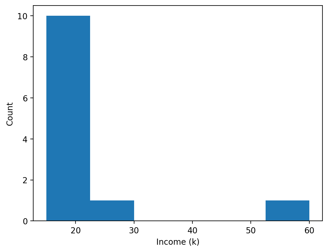
the tallest bar is the crowd: 10 of the 12 incomes sit between 15k and 22.5k. Then comes an empty gap, and one income (60k) stands alone at the far right. That long stretch to the right is the tail.
Bin count changes the story
The same twelve incomes with bins=6 and bins=3: the outlier (60k)
stands alone in both, but with bins=3 all eleven other incomes melt into one
bar and the 23k income disappears into the crowd. Neither is "the" picture —
both are choices.
Bins are like the size of a fishing net's holes: too big and everything slips into one catch, too small and every fish gets its own pocket.
Too few bins
Everything smooths into one lump; structure (and outliers) vanish.
Too many bins
Every value gets its own lonely bar; noise masquerades as pattern.
The honest practice
Try several bin counts before you conclude anything. If a "finding" only exists at one bin setting, it's probably the bins talking.
bins=6 against bins=3, same twelve incomes
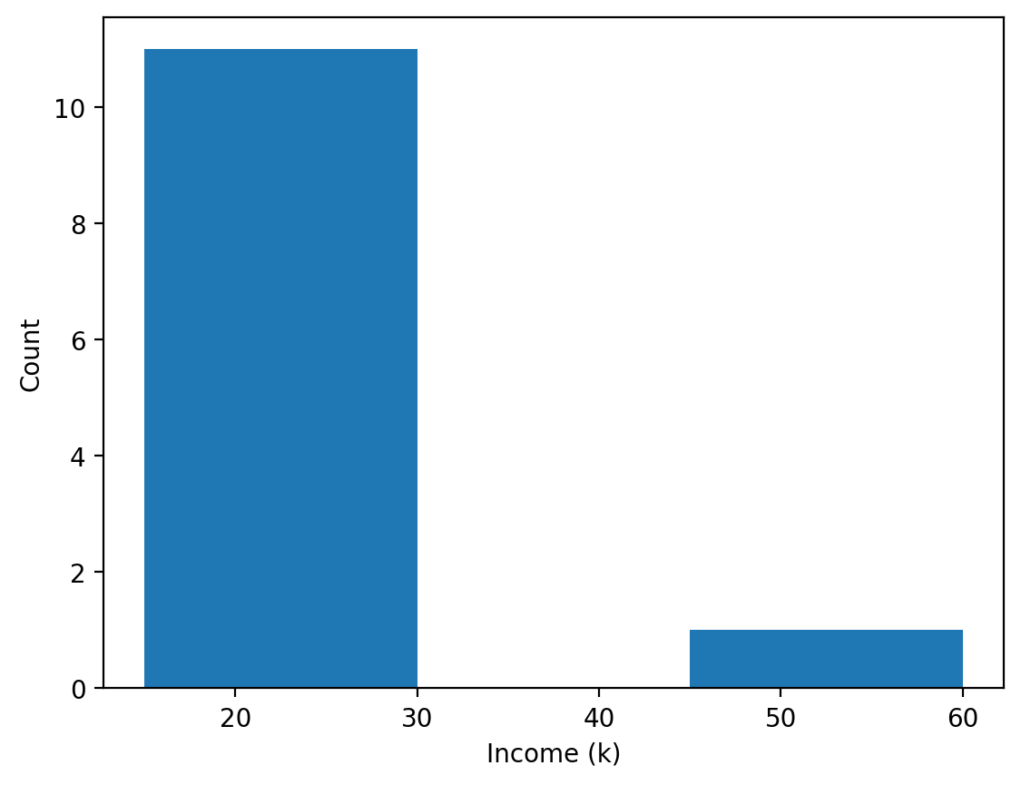
left, the previous slide's code with bins=6; right, the same code with bins=3. The 60k income stays alone either way, because it is far from everyone else. What changes is the crowd: at 3 bins it is one block of 11 and you can no longer see that 23k sat a little apart.
The histogram of the column you just described
Everything above — the lean, the heavy tail, the gap between mean and median — is one picture. Plot it before you believe any of the numbers.
Clip the axis to see the body
With a ₱1.45B maximum, 95% of the data crushes into the first four of 50 bars. Limit the range, and say that you did.
df.budget.hist(bins=50)pandas' shortcut: draw a histogram of the column with 50 bins (it draws a picture and prints nothing; the# →comments describe what you see)2e8e-notation: 2 followed by 8 zeros, i.e. 200,000,000 (₱200 million)df.budget[df.budget < 2e8]keep only budgets under ₱200M (a boolean filter: keep the rows where the test is True), then draw those
All 50 bars, then the clipped version
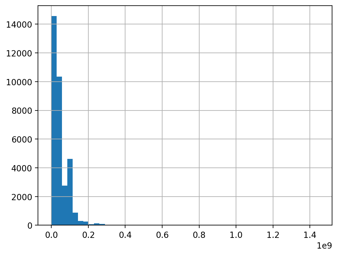
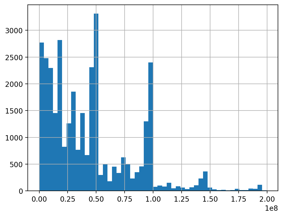
left, df.budget.hist(bins=50): the first bar alone holds 14,564 projects (43%) and everything past ₱0.3B is nearly empty (1e9 = billions of pesos). Right, the clipped version (1e8 = hundreds of millions): now you can see spikes just under ₱50M and ₱100M. Run each line in its own cell; in one cell pandas draws both on the same axes.
Same 33,000 projects, three different pictures
| Bins | Bin width | Tallest bar holds | What it looks like |
|---|---|---|---|
| 10 | ₱20.0M | 11,817 projects | One dominant block — detail gone |
| 30 | ₱6.7M | 4,891 projects | A clear peak and tail — usable |
| 100 | ₱2.0M | 3,192 projects | Spiky — noise starts to show |
Bin width is the range divided by the number of bins: the ₱0–200M range ÷ 10 bins = ₱20M per bar. No bin count is correct. 10 hides the shape, 100 invents texture. The honest move is to look at several and report one you can defend — and never to pick the one that makes your point best.
Symmetric, right-skewed, left-skewed
Symmetric
Mirror-image around the middle; mean ≈ median. Heights and test scores often look like this.
Right-skewed
Long tail toward high values drags the mean above the median. Incomes, house prices, city populations.
Left-skewed
Long tail toward low values; mean below median. Scores on an easy exam — most ace it, a few don't.
This closes the loop on Part A: the mean–median gap you computed is the skew you can now see. Two views of one fact.
The tail points to where the few unusual values are. A right tail means a few very large values, and the mean runs after them.
The lab's income series
Mean 22.4, median 19.5 — before you even plot it, you know the tail points right.
Change the scale, not the data
A log transform does not delete the outliers — it re-spaces the axis.
log₁₀ asks "10 to the power of what?": log₁₀(1,000) = 3, log₁₀(1,000,000) = 6. Each step of 1 means "ten times bigger".
Skew 5.13 becomes −0.82
Money is often roughly log-normal: its logs look like a bell curve, because differences that matter are multiplicative (×2, ×10) rather than additive (+₱1M). Plotting log₁₀(budget) turns that shape into a near-symmetric one.
Report in pesos, plot in logs
The transform is for seeing. Convert back before you quote a number, or your reader has to exponentiate in their head.
df.budget[df.budget > 0]keep the positive budgets: the log of 0 does not existnp.log10(…)NumPy takes log₁₀ of every value: ₱10M becomes 7, ₱100M becomes 8round(10**lb.mean())**is "to the power of": undo the log. The result is the geometric mean, a typical value on the multiplying scale
The boxplot is the IQR rule as a picture
Box = middle half. Line = median. Whiskers = the lines that reach out to the last value inside the fences you computed by hand in week 5 (1.5 × IQR beyond the box). Dots beyond = outliers, values far from the rest, drawn for you.
In the lab
You'll box-plot the 12 exam scores and match the box to the quartiles from
describe(): 71, 81 and 88.5.
Week 5’s IQR rule, drawn
The box is p25 to p75 (Q1 to Q3). The whiskers reach 1.5×IQR beyond the box: the top fence is 67.5M + 1.5 × 52.9M = 146.9M. Everything beyond is drawn as a point — the same 798 projects week 5 flagged.
Best for comparing groups
One box per region puts 18 distributions side by side, which a histogram cannot do legibly.
df.boxplot(column="budget", by="region")draw one box of budgets for each region, side by side# box / line / whisker / dotsthe comments list what the national box shows; the numbers come from thedescribe()and IQR fence above
Eighteen boxes, and eighteen labels on top of each other
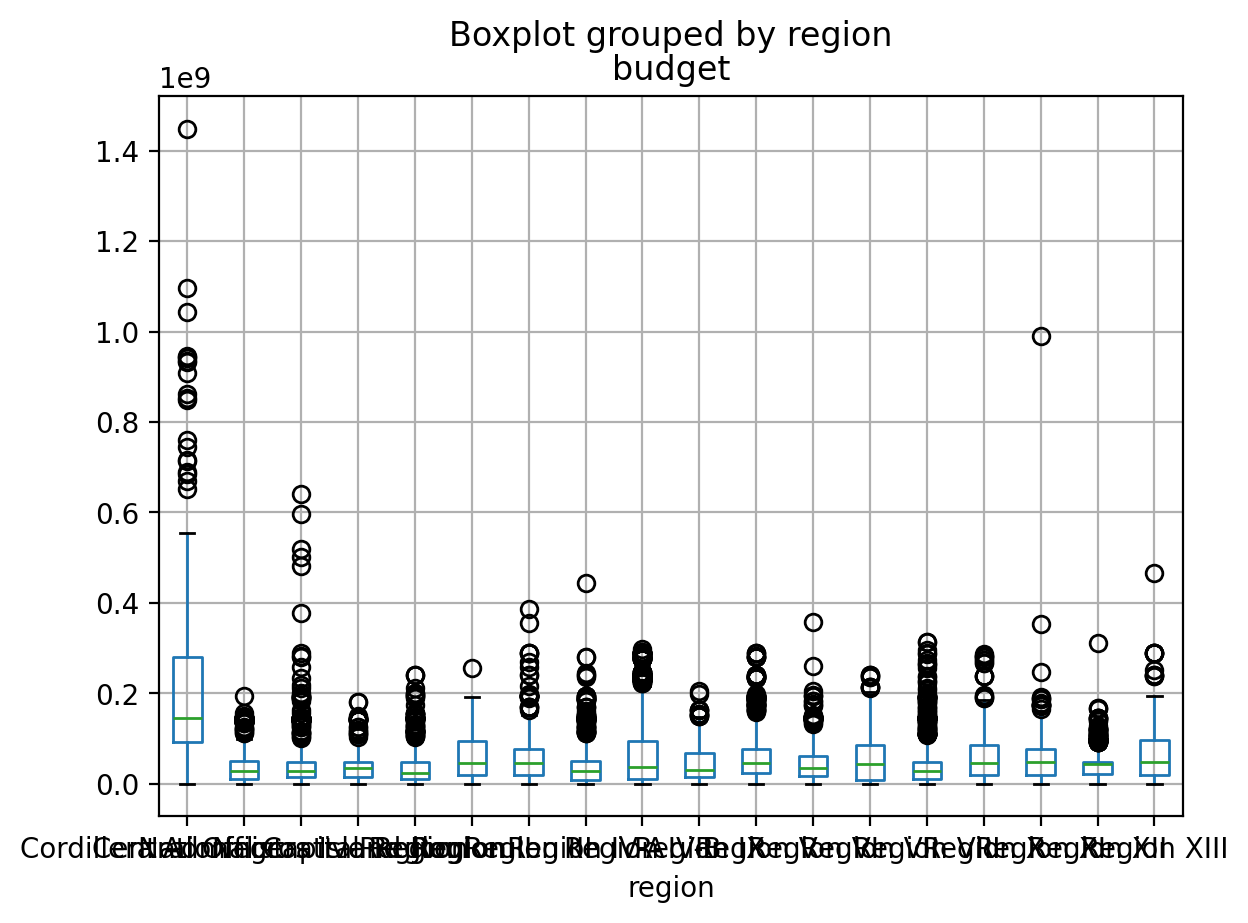
this is the default output: regions in alphabetical order, names written flat, so the 18 labels pile up unreadably. The first box (Central Office) sits far above the others; every other box is squashed near zero with a column of outlier dots above it, the skewed tail. 1e9 means billions of pesos. Next week's sorted, horizontal boxplot fixes the labels.
Histogram for detail, boxplot for comparison
They summarize the same distribution at different zoom levels — so they answer different questions.
Reach for the histogram when…
You're meeting a variable for the first time and want its full shape: humps, gaps, tails.
Reach for the boxplot when…
You need a compact summary — especially several side by side: income by region, scores by section.
Next week's bridge
"Boxplots side by side" is already a two-variable question — exactly where Data Exploration II begins.
Tap to reveal
Household income in a city is strongly right-skewed. Without computing anything: how do its mean and median compare?
A — the tail drags the mean.
A few very high incomes lift the mean well above what a typical household earns; the median stays with the crowd. It's why "average income" headlines flatter and "median income" informs.
Shape, centre and the mean–median gap are one connected story — know any two, and the third follows.
Week 9 preview
Which statistic a headline chooses is an editorial decision. You'll be the one making it.
Categories & The Habit
Variables with no mean at all — and the checklist that covers everything.
You can describe a column of numbers. Text columns such as region or contractor have no mean; this part counts them, then gathers every check into one routine.
You can't average a region — you count it
A categorical column holds labels, not amounts
(region, status). Its summary is a frequency table: each value and
how often it appears. value_counts() builds it, and with
normalize=True gives each value's share.
r = pd.Series([…] * 6 + …)a toy column of 12 region labels:* 6repeats a label six times,+joins the listsr.value_counts()count the rows for each region, biggest first: 12 rows in totalnormalize=Truedivide each count by the total: 6 ÷ 12 = 0.50. The shares add up to 1 (proportion = share)
Counts vs shares
Counts answer "how many"; shares answer "how dominant" — and shares survive comparison across datasets of different sizes.
On real data: 18 regions, 4,841 contractors
The whole Part A toolkit is for numbers. For text columns, the summary is a frequency table, and the "typical" value is the mode: the value that appears most often.
Check unique first
18 regions is groupable. 4,841 contractors is a long tail. 33,325 different descriptions is free text — a different tool entirely.
.head(4)show only the first four lines: Region III holds 15.9% of projectsnunique()how many different values the column hasmode()[0]mode()returns a list-like Series, since two values can tie;[0]takes the first
Describe one column properly
1 · Pick a number column
Use duration (you built it in week 6) or progress (percent complete, 0–100). Run .describe().
2 · Measure the lean
Compute .skew(). Predict the histogram shape from that number alone, then plot it and check.
3 · Try three bin counts
10, 30, 100. Which one would you put in a report, and what is your reason?
4 · Write three sentences
One about the centre, one about the spread, one about the shape — each with a number in it.
Step 4 is the deliverable. A description without numbers is an impression; a description with three is a finding.
Tap to reveal
Flood budgets have mean ₱46.95M, median ₱37.68M and skew 5.13. Which sentence is the most honest summary?
Tap to reveal
You take log₁₀ of the budget column and the skew goes from 5.13 to −0.82. What have you achieved?
The univariate EDA checklist
Every numeric column
describe() → mean-vs-median check → histogram (try bins) → boxplot.
Note the shape and any flagged points.
Every categorical column
value_counts() both ways → look for rare levels (a
level is one possible category), typo-twins (the same value spelled two
ways: "Cebu"/"cebu " — week 6 flashback) and suspicious dominance.
And for both kinds: isna().sum() — because week 5 never
stops applying. Ten minutes of routine per dataset, and no surprise survives it.
Write down what you see
"income right-skewed, one extreme value; region 50% Visayas" — three lines of notes now steer every chart and claim later.
"What fraction is below X" — no binning required
A histogram needs you to choose bins. The ECDF (empirical cumulative distribution function) does not: for any threshold you pick, it gives the share of the data below it.
Read it as a sentence
Each row below is a claim you could put in a report, with no modelling assumption behind it.
df.budget < 1e7compare every budget with 1e7 = 10,000,000: one True or False per row( … ).mean()True counts as 1 and False as 0, so the mean is the share of Trues: 0.214 = 21.4% of projects
CV puts pesos and days on the same ruler
A standard deviation of 48 million pesos and one of 159 days cannot be compared. The coefficient of variation (CV) divides each SD by its own mean, so the units cancel and both become plain numbers.
Rule of thumb
CV above 1 means the spread exceeds the average — a sign the distribution is skewed or has heavy tails. Budget sits at 1.03.
cv = lambda x: x.std() / x.mean()lambdamakes a one-line function (you met it in week 5): give it a columnx, it hands back SD ÷ meancv(df.budget)call it on the budget column: 48.6M ÷ 47.0M = 1.03
Where is spending consistent, and where is it lumpy?
| Region | Projects | Median budget | CV |
|---|---|---|---|
| Region IV-B | 1,467 | ₱37.6M | 1.18 — lumpiest |
| Region VIII | 1,935 | ₱27.5M | 1.07 |
| Central Office | 180 | ₱144.5M | 1.05 |
| Region III | 5,412 | ₱46.3M | 0.72 — most consistent |
Region III has the most projects and the steadiest sizes. Region IV-B has a similar median but far more variation — a few large works among many small ones. Same median, different story, and only the spread shows it.
Six lines that describe any numeric column
Run these in order on every new column. It takes a minute and it is the difference between describing data and guessing at it. Here col stands for any one column (for example df.budget) and threshold for a cut-off number you choose.
Then, and only then, plot
The numbers tell you what shape to expect. If the picture disagrees, one of you is wrong and it is worth finding out which.
Identical statistics, different data
"Anscombe's quartet: four datasets with the same means, the same variances, even the same correlation — and four completely different shapes when plotted. The summary numbers cannot tell them apart. A single glance can."F. J. Anscombe, 1973 — the most famous argument for drawing your data
Summaries compress; compression loses. That's fine — as long as you looked at the uncompressed picture at least once. (Correlation, next week's topic, is one number for how closely two columns move together.)
Four students can all average 75 — one steady, one improving, one collapsing, one with a single zero. Only their report cards show which.
The rule
No conclusion from statistics you haven't plotted. Ever.
Every new word from today, in one line each
Centre and spread
- EDA
- exploratory data analysis: summaries and charts before testing ideas
- variable (in statistics)
- one measured characteristic, i.e. one column (not a Python name)
- distribution
- how a variable's values are spread out
- mean
- add the values, divide by how many
- median
- the middle value once sorted
- mode
- the most frequent value; works for categories
- range
- largest minus smallest
- variance
- average squared distance from the mean
- standard deviation (SD)
- square root of the variance; typical distance from the mean
- percentile / quartile
- value with p% below it; quartiles are p25, p50, p75
- IQR
- Q3 − Q1: width of the middle half
- coefficient of variation (CV)
- SD ÷ mean; compares spread across units
- denominator
- the "out of how many" behind a number
Shape and categories
- skew
- lopsidedness; right-skewed has a long tail of big values
- kurtosis
- how often extreme values appear (normal curve = 0)
- normal distribution
- the symmetric bell curve
- histogram
- bars counting values per range
- bins
- the equal-width ranges a histogram counts into
- box plot
- box Q1–Q3, median line, whiskers, outlier dots
- outlier
- a value far from the rest (beyond the 1.5 × IQR fence)
- log transform
- replace x by log₁₀(x) to re-space a skewed axis
- ECDF
- share of values below any threshold you pick
- categorical
- a column of labels, not amounts
- frequency table
- each category with its count or share
- survivorship bias
- judging only the cases that got through a filter
Describe, compare, draw
Exam scores through describe(), a tight and a skewed series
to compare centres, calm-vs-wild spreads, and an income histogram whose story changes with
the bins. ~45 minutes.
You'll practise
describe(), mean()/median(), std()
and range, and ax.hist() with labeled axes.
Stretch, if you're quick
value_counts(normalize=True) for a categorical, and a boxplot you connect
back to week 5's IQR fences.
Four things to carry out
1 · describe() everything first
Centre, spread, quartiles, extremes — one call, before any belief.
2 · Centre needs spread
A mean without a std is half a sentence; skew decides mean vs median.
3 · Shape is visual
Histograms for the full geography, boxplots for the compact summary — and bins are a choice you must vary.
4 · Always draw it
Anscombe's lesson: identical summaries can hide different worlds.
One sentence: before asking what the data proves, learn what it looks like.
Next step
One variable at a time was training wheels. Relationships are where discoveries live.
Before next week
Primary
pandas User Guide — "Descriptive statistics" (in Essential basic
functionality): what describe, std and friends
actually compute. pandas.pydata.org
Skim
Look up "Anscombe's quartet" and stare at the four plots for two minutes. That's the whole assignment.
Both are linked on the course page beside this deck and the lab.
Do the lab first
The docs are a reference; the feel for skew comes from plotting it yourself.
Data Exploration II
Multivariate EDA and visualization — correlations, group comparisons, and the plots that reveal how variables move together.
DS 227 · Knowledge Discovery in Data