Data Exploration II
Multivariate EDA and visualization — how variables move together, how to see it, and the one conclusion you're not allowed to draw.
Knowledge Discovery in Data · University of the Philippines Cebu
Between the variables
Part A · Correlation
Co-movement in one number, −1 to +1 — and the whole matrix in one call.
Part B · Seeing It
Scatter plots and heatmaps — the shapes and clusters the number can't show.
Part C · The Causation Trap
Groups, confounders, and why "related" never means "caused" on its own.
Last week: each variable alone. This week: pairs and groups — because discoveries almost never live inside one column. They live between columns. Multivariate means "several variables at once".
Last week you described each student's height. This week you ask whether taller students also tend to be heavier, and whether that holds in every class.
Running example
Eight students: hours studied, hours slept, exam score. Small enough to see through, rich enough to mislead.
Six words for relationships
correlation (r)
A number from −1 to +1 for how closely two columns follow a straight line together. The sign says which way.
e.g. study hours vs score, r = 0.99: they rise together
causation
X causes Y if changing X would change Y. Correlation alone never shows this: correlation is not causation.
e.g. ice cream sales and drownings rise together; summer causes both
confounder
A third variable that drives both X and Y, making them move together without one causing the other.
e.g. fire size drives both firefighters sent and damage done
scatter plot
One dot per row: one column across (x), another up (y).
e.g. ax.scatter(df["study_hours"], df["score"])
trend line
The straight line that best fits the dots in a scatter; its slope says how much y changes per step of x.
e.g. score ≈ 5.1 × study hours + 55.6
heatmap
A grid whose cells are coloured by their value; for a correlation matrix, colour shows sign and strength.
e.g. sns.heatmap(df.corr(), annot=True, center=0)
Six words for building charts
figure / axes
The figure is the whole picture you save; an axes is one plotting area inside it, with its own x and y.
e.g. fig, ax = plt.subplots() gives one of each
subplot
One of several axes arranged in a grid inside one figure.
e.g. plt.subplots(1, 2) makes two side by side
shared axis
Panels that use exactly the same scale on an axis, so their heights can be compared fairly.
e.g. plt.subplots(1, 2, sharey=True)
hue / facet
Two ways to add a grouping column: hue colours the dots by group; facet draws one panel per group.
e.g. hue="passed"; sns.FacetGrid(df, col="region")
pair plot
A grid of scatter plots for every pair of columns, with each column's histogram on the diagonal.
e.g. sns.pairplot(df) on 3 columns gives a 3 × 3 grid
grouped / stacked bar
Bar charts for two categories at once: grouped puts bars side by side, stacked piles them into one bar.
e.g. completed vs on-going projects, per year
A table can whisper a trend — barely
Stare at eight rows and you might sense that more study means higher scores. Might. Multivariate EDA replaces squinting with two tools: a number and a picture.
The printout is a DataFrame (a table): one row per student, numbered 0, 1, 2… on the left, and one column per measurement.
The two questions of the week
How strongly do two columns move together? And what does that relationship actually look like?
Correlation
Co-movement, compressed to a single number.
Last week you summarised one column with a mean and a standard deviation. This part adds one number for two columns: how closely they rise and fall together.
One scale, from −1 to +1
Correlation (written r) measures how tightly two variables follow a straight line together. The sign (+ or −) gives direction; the size, ignoring the sign, gives strength.
Two dancers: at +1 they move in perfect step, at −1 one mirrors the other, at 0 they ignore each other.
| r | Reads as | Example |
|---|---|---|
+1.0 | perfect together | height in cm vs inches |
+0.7 | strong positive | study hours vs score |
0.0 | no linear link | shoe size vs exam score |
−0.7 | strong negative | absences vs grades |
−1.0 | perfect opposite | time used vs time left |
.corr() builds the whole matrix
Every numeric column against every other. The result is a correlation matrix: a grid with one row and one column per variable. The diagonal is always 1 — a variable moves perfectly with itself — and the matrix mirrors across it.
df.corr()correlate every numeric column with every other one.round(2)show two decimal places-0.98study and sleep: strongly opposite (more study, less sleep)
Read one cell
study ↔ score = 0.99: in this tiny dataset, study hours and scores rise together almost perfectly.
Six columns, every pair at once
One call gives you every pairwise correlation. cols is a list of six numeric column names; df[cols] keeps just those columns. Read it for the big absolute values (big size, either sign) — then go and look at each one.
Scan, do not conclude
A correlation matrix is a list of things worth plotting. It is not a list of findings.
.rename(columns={…})shorter column names (old → new), only so the grid fits on screen-0.785lat vs lon: the largest value off the diagonal (more on that soon)
Bigger projects take longer — moderately
r = 0.365 across 27,664 finished projects. Positive and believable: more money usually means more work.
r² is the sobering part
r² (r squared) is the share of the ups and downs in one column that a straight line on the other can account for.
0.365² = 0.133. Budget accounts for about 13% of the variation in how long a project takes. The other 87% is something else entirely.
df[["budget", "duration"]].dropna()keep the two columns, then drop every row missing either onesub.budget.corr(sub.duration)the correlation of exactly these two columns (rounded to 3 decimals)0.365**2**means "to the power of": square r to get r²
Same pair, two answers — and the gap is the finding
Pearson r is the usual correlation, on the raw values. Spearman correlation first replaces each value by its rank (smallest = 1, next = 2…) and correlates the ranks. Spearman is much higher here. That means the relationship is monotonic (always moving the same way) but not linear (not a straight line) — exactly what you would expect from a budget column with skew 5.13. Pearson is being dragged down by the shape, not by the absence of a relationship.
Which to report
Spearman when either variable is skewed or has outliers. Pearson when you have checked the scatter and it really does look like a line.
Log the skewed variable and Pearson recovers
The same transform from last week (log₁₀: 10 to the power of what?). On log₁₀(budget), the linear correlation rises from 0.365 to 0.396 — closer to what the ranks were already telling you. lg keeps the positive budgets, because the log of 0 does not exist.
Two routes, same insight
Use Spearman, or transform and use Pearson. What you must not do is report 0.365 as "weak" without checking whether a straight line was ever the right model.
r = 0.365 sounds weak. Look at it in quartiles.
Group the projects into four budget bands and take the median duration of each. The pattern that a scatter plot buried under 27,664 dots becomes unmistakable. d is a copy of sub, the 27,664 finished projects.
6,916 projects in every band
Equal-sized groups by construction, so the comparison is fair and no band is a small-sample fluke.
pd.qcut(d.budget, 4, labels=[…])cut the budgets into 4 equal-count bands (quartile bands) and name themd["band"] = …store the band as a new columngroupby("band").duration.median()for each band, the median duration in days
The rank correlation was describing this
| Budget band | Projects | Median duration | vs the smallest band |
|---|---|---|---|
| Q1 — smallest | 6,916 | 119 days | — |
| Q2 | 6,916 | 189 days | 1.6× |
| Q3 | 6,916 | 226 days | 1.9× |
| Q4 — largest | 6,916 | 269 days | 2.3× |
The largest quarter of projects take more than twice as long as the smallest quarter. Nobody reading "r = 0.365" would have guessed that. Binning is not a lesser technique than correlation — often it is the honest one.
Three things a correlation can't tell you
Curves
r measures straight-line co-movement. A perfect U-shaped relationship can score r ≈ 0.
Clusters
Two separate blobs can fake a trend that exists in neither blob alone.
One loud point
A single outlier can manufacture — or destroy — a strong r. Week 5's leverage lesson, again.
Anscombe's quartet from last week was exactly this warning: four datasets, same r, four different realities.
The rule, extended
No conclusion from a correlation you haven't scattered. That's Part B.
latitude vs longitude
Strong. Real. Reproducible. And completely empty.
It is the shape of the country
Across 30,884 geocoded projects, latitude and longitude correlate at −0.785 — stronger than any other pair in the matrix. No mechanism exists, and none is needed.
The Philippines runs northwest to southeast
Go further south and you are also further east. The correlation is a fact about the archipelago’s outline, not about flood control.
.agg(["min", "max"])two summaries at once: lowest and highest latitude (degrees north);.tolist()prints them as a plain list[5.01, 20.79]from Mindanao's south to Luzon's north; longitude (degrees east) runs 117 to 127
Nobody is tempted to invent a story
The coefficient is strong
(A coefficient is just a number that measures something; here, r.)
−0.785 would headline any correlation table. Strength is not evidence of anything.
The sample is large
30,884 rows. A big n makes a coefficient precise, not meaningful.
The mechanism is absurd
No one would claim latitude causes longitude. With two variables you cared about, you might have.
That last point is the warning. The danger is not the correlation you cannot explain — it is the one you can, because a plausible story makes you stop looking. (n is the number of rows the statistic uses.)
Correlation is not causation: two things moving together tells you they are linked somehow, never which one pushes the other, or whether a third thing pushes both.
Tap to reveal
In the matrix, study_hours ↔ sleep_hours =
−0.98. What does that number claim?
B — a strong pattern, and only a pattern.
The magnitude (0.98) says the opposite movement is very consistent; the sign says which way. What it does not say is why — maybe a fixed number of evening hours forces the trade-off. Causes are Part C's business.
Practice reading r as exactly what it is: "these move together this consistently, in this direction." Full stop.
Habit
Say "is associated with," never "causes," when all you hold is r.
Five minutes
Then: pictures that do what the number can't.
Seeing Relationships
One point per row, and the truth comes out.
You now have r, one number per pair. This part draws the pairs, so you can see curves, clusters and odd points that r hides.
The scatter plot: one dot per row
A scatter plot draws one dot per row: x (across) from one column, y (up) from another. Trend, tightness, curves, strays — all visible at once, no summary in the way.
fig, ax = plt.subplots()a blank chart:figthe whole picture,axthe plotting area (last week)ax.scatter(df["study_hours"], df["score"])first column across, second column up: one dot per studentset_xlabel / set_ylabelname each axis, so a reader knows what the dots mean
What you'll see in the lab
Eight dots climbing steadily up-right — the shape that 0.99 was compressing into one number.
Eight dots climbing up and to the right
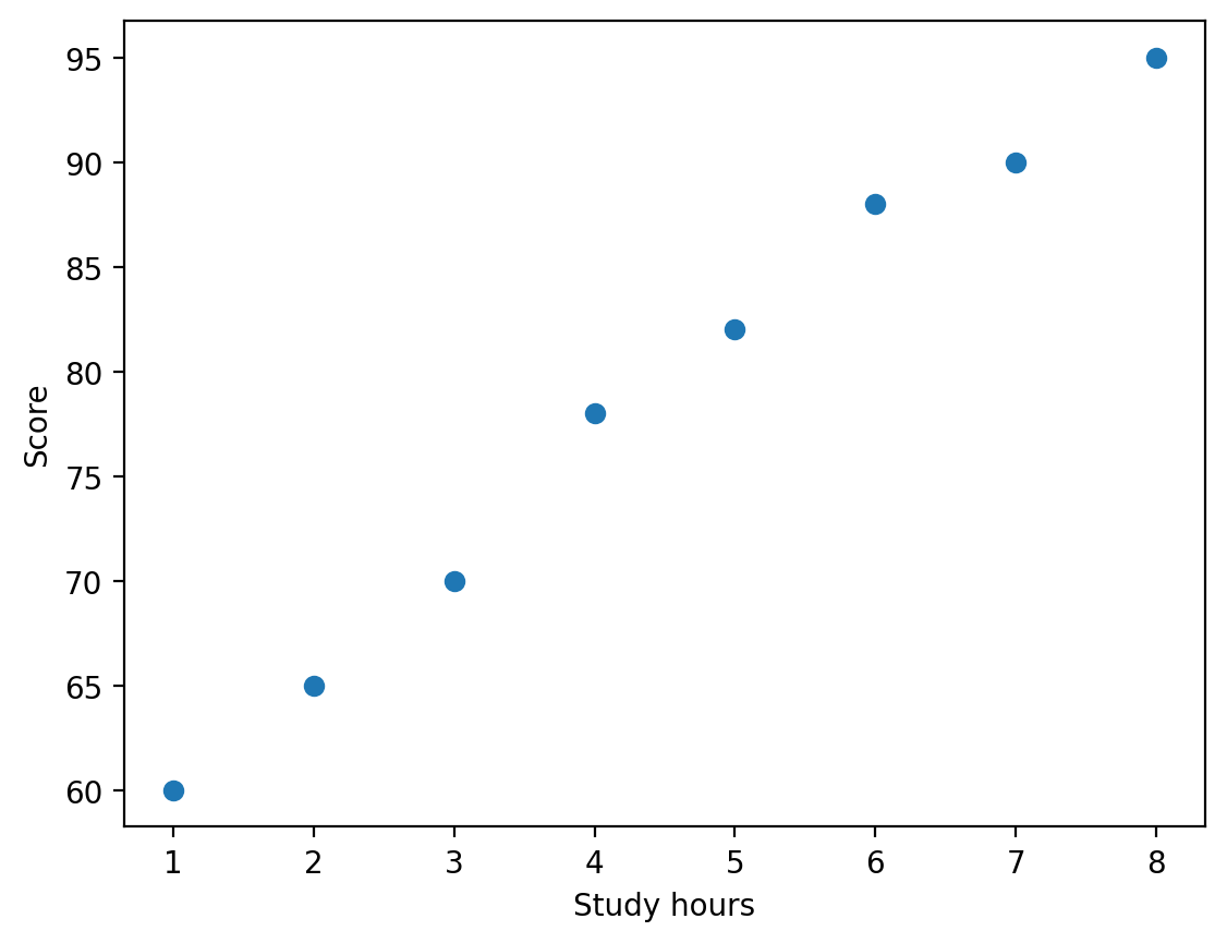
every dot is one student. They climb from the bottom left to the top right almost in a straight line: that tight, rising line is the picture behind r = 0.99.
One straight line through the dots
A trend line is the straight line that fits the dots best (closest overall). Its slope is how much y changes when x goes up by 1; its intercept is where it crosses x = 0.
Stretch a string through a cloud of pins so it passes as close to all of them as it can. The string's tilt is the slope.
Describes, does not explain
"Each extra study hour goes with about 5.1 more points" in these 8 students. Not "causes": that is Part C.
np.polyfit(x, y, 1)find the best straight line (the1means a line, not a curve); it gives back two numbersslope, intercept = …two names on the left catch the two numbers5.1 55.6score ≈ 5.1 × hours + 55.6: each extra hour goes with about 5 more pointsax.plot(xs, slope * xs + intercept)draw the line from 1 hour to 8 hours on top of the dots
The line passes close to every dot
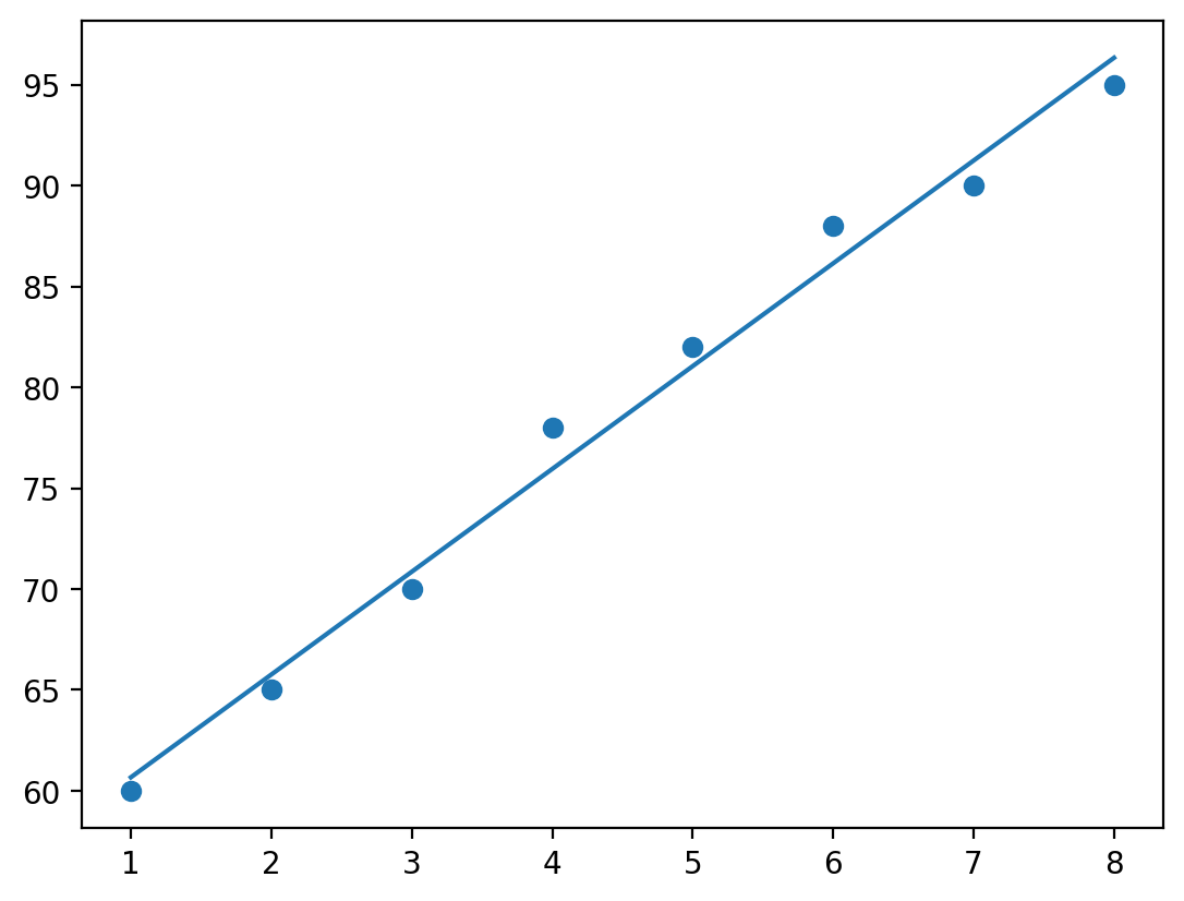
the line climbs about 5 points for every extra hour, and no dot sits far from it. This chart has no axis names because this code never called set_xlabel / set_ylabel: add them in your own version.
The scatter plot, and its first problem
Plot budget against duration for every finished project and the middle becomes a solid block. You cannot see density (how crowded each area is), only outline.
Overplotting hides the mass
Overplotting: so many dots on top of each other that you cannot count them.
Where most of your data lives is exactly where the plot stops being readable.
alpha=0.05transparency from 0 (invisible) to 1 (solid): crowded areas darken where dots pile updf.sample(2000, random_state=42)draw a random 2,000 rows;random_statefixes the draw so it repeatsdf.plot.hexbin(…, gridsize=40)cover the chart in honeycomb cells and colour each by how many dots fall in it
27,664 dots, one solid block
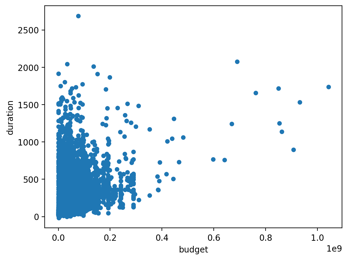
almost every project sits inside the solid block in the bottom-left corner, so you cannot tell where it is most crowded. The 1e9 under the x axis means the tick labels count billions of pesos (0.2 = 200 million).
Two of the fixes: fewer dots, or count them in cells
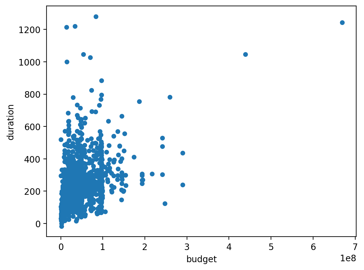
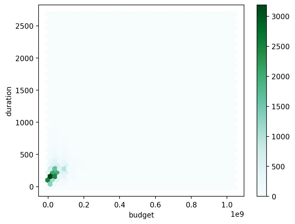
left, df.sample(2000, random_state=42): with fewer dots you can see single projects, and the biggest ones were not drawn, so the axis stops near 700 million (1e8 = hundreds of millions). Right, hexbin: the darkest cells, hard against the origin, are where thousands of projects pile up; the colour bar on the right says how many.
The same plot, readable
You do not have to transform the column to fix the picture — just the axis. On a log scale each equal step multiplies (1M, 10M, 100M). The tick labels stay in pesos, so the reader needs no translation.
Say it in the caption
"x-axis is logarithmic" is one clause and prevents a reader from misjudging every distance on the chart.
Log axis plus transparency: the crowd becomes visible
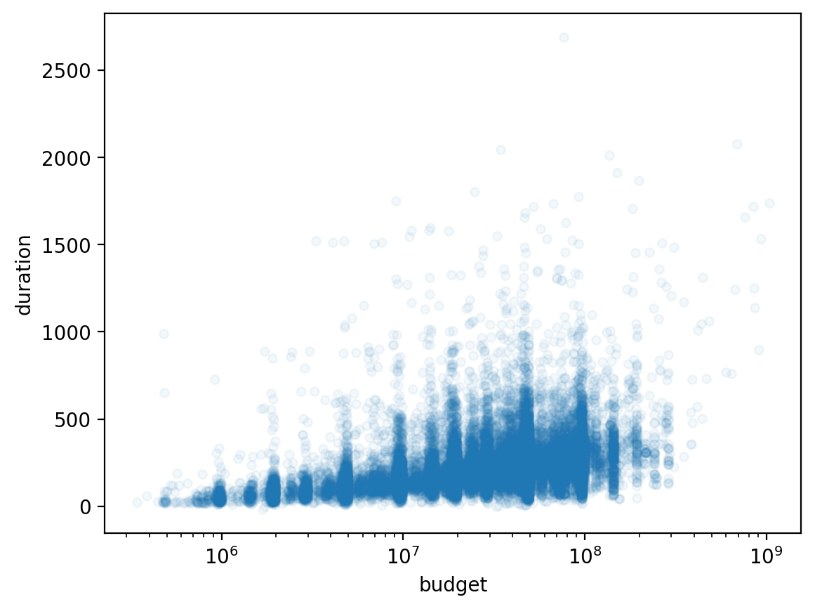
the dark band between 107 (10 million) and 108 (100 million pesos) is where most projects are, and the cloud now tilts upward: bigger budgets tend to take longer. Read 107 as "1 followed by 7 zeros".
Heatmap: the matrix, painted
Color encodes each correlation — warm for positive, cool for negative, pale near zero. Ten variables means 45 pairs; your eye finds the hot spots instantly.
A weather map of the matrix: you spot the hot and cold regions before you read a single number.
The settings that matter
annot=True prints the numbers on the cells; center=0 anchors
white at zero so sign is instantly readable.
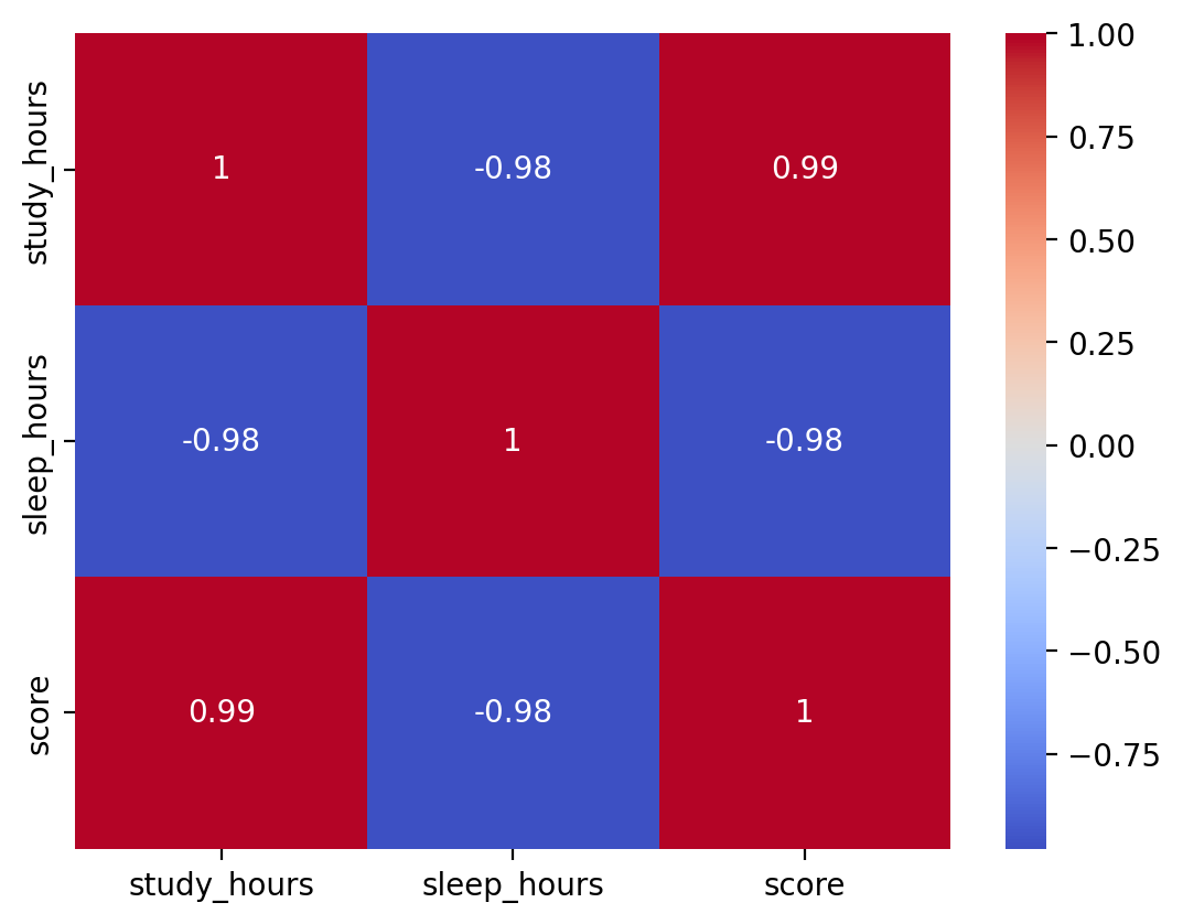
Three columns, nine coloured cells
red cells are pairs that rise together, blue cells the pair that moves in opposite directions. Nothing is pale, because every pair here is strongly related. The diagonal is 1: each column against itself.
The pair plot: the matrix as scatter plots
A heatmap gives one colour per pair. A pair plot
draws the actual scatter for every pair of columns, in a grid, with each column's
histogram on the diagonal. It is the picture behind every number in .corr().
A heatmap is the table of contents; the pair plot is the book. Use the first to choose, the second to check.
Keep it small
3 columns make 9 panels; 10 columns make 100. Pick the handful the heatmap pointed at.
sns.pairplot(df)seaborn draws one panel for every pair of numeric columns (in Colab; not the browser lab)g.axes.shapethe grid of axes it made: (3, 3) means 3 rows by 3 columns of panelsdiagonal panelsa column against itself would be a straight line, so each shows that column's histogram instead
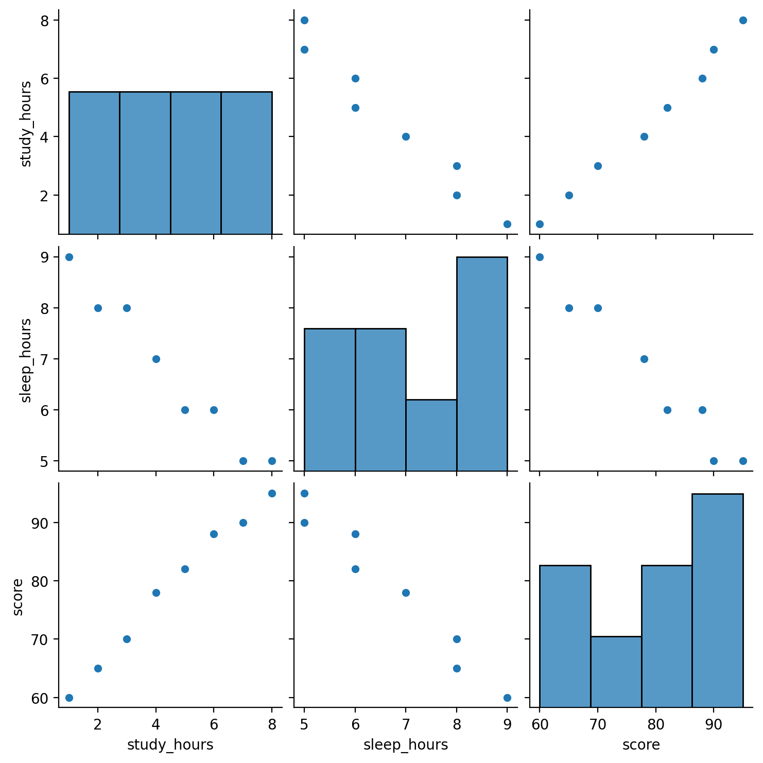
Nine panels: three histograms, six scatters
each off-diagonal panel is one pair. Study hours and score climb together; every panel with sleep hours falls. The panels above the diagonal repeat the ones below it with x and y swapped, and the diagonal shows each column's own histogram.
The matrix, painted
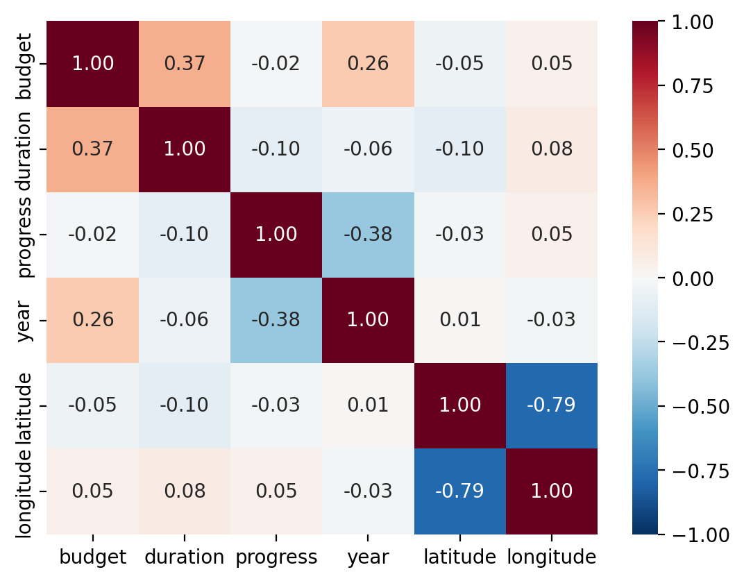
Six columns is fifteen pairs. A heatmap colours each cell of the matrix by its value, so you find the strong ones without reading a grid of numbers.
Diverging colormap, centred on zero
A colormap turns numbers into colours. A diverging one runs blue → white → red, so negative and positive look different. A sequential one (pale → dark) renders −0.785 and +0.785 nearly the same.
import seaborn as snsload seaborn, a chart library built on matplotlib (in Colab; not in the browser lab)annot=True, fmt=".2f"write each r on its cell, with two decimalscmap="RdBu_r", center=0red-blue colours, white exactly at r = 0vmin=-1, vmax=1fix the colour scale to the full −1 to +1 range
Mostly pale: one dark pair stands out
almost every cell off the diagonal is pale: most pairs barely move together. Latitude vs longitude is the one dark blue pair (−0.79, which is −0.785 rounded by fmt=".2f"); progress vs year and budget vs duration are the only other visible tints.
The number ranks; the picture explains
Correlation is compact — perfect for scanning many pairs. The scatter is rich — mandatory before you believe any single pair. Use them in that order.
Step 1 · Scan with r
The matrix (or heatmap) points at the interesting pairs in seconds.
Step 2 · Verify with a scatter
Is it truly linear? One cluster or two? Is one point doing all the work?
Step 3 · Only then, claim
"Strong, roughly linear, no obvious outliers" — now the r you quote means something.
Color the dots by a category
A scatter takes two variables; hue, seaborn's word for "colour the dots by this column", sneaks in a third. If the study–score trend differs between students who passed and those who did not, colored dots show it immediately.
Why it matters
A trend that holds overall can vanish — or reverse — inside subgroups. Seeing groups separately is the first defense against being fooled by the aggregate.
In the lab
You'll colour the dots by a third column (sleep hours) with matplotlib's
c=: the same idea, without seaborn.
Colour, size, or a separate panel
Two axes are used up. There are three honest ways to add one more variable, and one dishonest one. To facet is to repeat the same chart once per group, in a grid of small panels: those panels are called small multiples.
Never use colour for a number on a scatter
Readers cannot rank colours accurately. Use it for categories; use position or size for quantities.
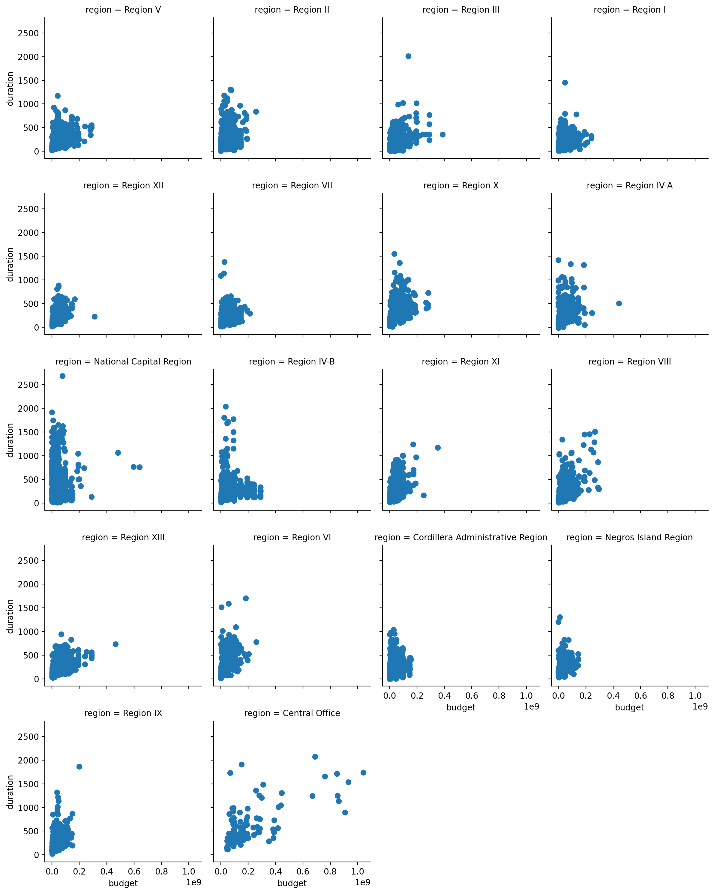
hue="status"one colour per status values=budget/1e6sis dot size: bigger budget, bigger dotsns.FacetGrid(d, col="region", col_wrap=4)one panel per region, four panels per rowg.map(plt.scatter, "budget", "duration")draw the same scatter in every panel
Eighteen regions, one shared scale
because every panel uses the same axes, you can compare them directly. Central Office is the only region whose projects reach far to the right (up to about 1 billion pesos), and it tilts upward most clearly; most other panels are a tall blob near zero budget.
Why a fresh d: FacetGrid needs the region column. The earlier d (a copy of sub, budget and duration only) has none and would raise KeyError: 'region'.
Figure, axes, subplots and a shared axis
The figure is the whole picture you save. Each
axes is one plotting area inside it. Ask
plt.subplots for a grid and each cell is a subplot.
With sharey=True the panels get a shared axis: one y
scale for all.
The figure is a sheet of paper; each axes is a box you draw a chart in. Sharing the y axis means every box uses the same ruler.
plt.subplots(1, 2, figsize=(8, 3))1 row, 2 columns of axes, in a figure 8 inches wide and 3 tallaxes[0], axes[1]the left and right panel, counted from 0(2,)the shape ofaxes: a row of two panelsshared y: Trueboth panels show the same y range, so heights compare fairly
Two panels, one ruler for score
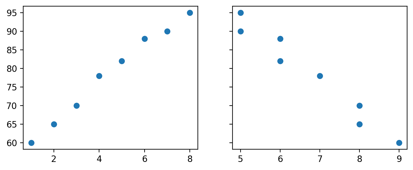
only the left panel prints score numbers: with sharey=True both panels use that one scale, so the same height means the same score in both. Score rises with study hours (left) and falls with sleep hours (right).
Eighteen small panels, one shared scale
One chart, 18 colours
Unreadable. Nobody can hold eighteen colours in mind, and the dots overlap.
18 panels, shared axes
Each is simple; the comparison happens between panels. Differences in shape jump out.
The rule that makes it work
Identical axis limits on every panel. Free scales make panels look alike when they are not.
A shared axis means every panel uses the same scale on that axis. Faceting is how you compare many groups without asking the reader to decode a legend. It only works if the scales are shared — otherwise you have drawn eighteen unrelated charts and implied they are comparable.
What you are comparing decides the picture
| Question | Chart | Watch out for |
|---|---|---|
| One numeric column’s shape | Histogram | Bin count changes the story |
| Two numeric columns | Scatter | Overplotting; log the skewed axis |
| One numeric across groups | Boxplot, ordered by median | Alphabetical order hides the pattern |
| Two categoricals | Crosstab, normalised | Raw counts just show group size |
| Many pairs at once | Heatmap, diverging, centred on 0 | Sequential colormaps hide the sign |
| Many groups, same relationship | Small multiples | Unshared axis limits |
Pick from the left column, never from the chart gallery. The question comes first; the chart is downstream of it.
The Causation Trap
The most expensive four words in data: "so it must cause."
You can now measure and draw a relationship. This part compares groups, and asks the hard question: what could have produced it?
Split, then summarize
Another face of multivariate EDA: a category splits the rows, and you compare summaries across the split — passers vs non-passers, region vs region.
df["passed"] = df["score"] >= 75a new column: True if the score is 75 or more, else Falsegroupby("passed")[[…]].mean()split into the False and True piles, then average two columns in each;.round(1)keeps one decimalTrue 6.0 5.8passers averaged 6 study hours and 5.8 sleep hours
Read it carefully
Passers studied more and slept less — in this data. A difference between groups is a fact; its cause is still an open question.
One box per region, eighteen distributions at once
A histogram shows one distribution well. To compare eighteen, the boxplot is the only chart that stays readable.
Order by the median
Alphabetical order hides the pattern. Sorted, the chart answers "where is this fast and where is it slow?" at a glance.
groupby("region").duration.median()median duration per region.sort_values().indexsort those medians and keep just the region names, fastest firstsns.boxplot(…, order=order)one box per region, drawn in that sorted order
Sorted by median, the boxes drift right
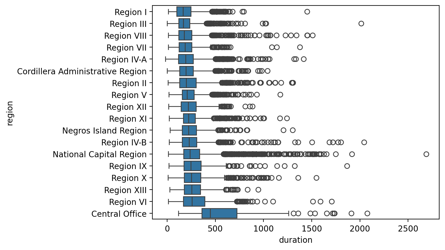
reading down, each box sits a little further right than the one above: slower regions are lower. Central Office, at the bottom, is clearly the slowest. The circles are single projects far longer than their region's usual range (outliers).
A 93-day gap between the fastest and slowest region on the map
| Region | Projects | Q1 | Median | Q3 |
|---|---|---|---|---|
| Region I | 2,730 | 100 d | 167 d | 246 d |
| Region III | 4,428 | 121 d | 170 d | 235 d |
| Region VIII | 1,586 | 120 d | 178 d | 257 d |
| Region X | 961 | 179 d | 252 d | 348 d |
| Region VI | 881 | 169 d | 260 d | 390 d |
Region VI’s median project takes 93 days longer than Region I’s, and its spread is far wider (IQR 169–390 against 100–246). That is a question worth asking someone — not an answer. (Central Office, the national headquarters, is not on the map; its 122 finished projects are slower still, median 448 days.)
Rates, not counts, when the groups differ in size
Region III has 5,412 projects and Central Office 180. Comparing raw completed counts would say nothing except which region is bigger. A crosstab counts the rows for every combination of two categories (region × status).
A 26-point spread
Completion rates run from 65.6% in Region IX to 92.0% in Region XII. Normalising is what makes that visible.
normalize="index"divide each row by its row total, so each region's statuses add up to 1["Completed"]keep one column: the share of each region's projects that are completed( … )the outer brackets let the command continue onto the next linerate.iloc[[0, -1]]rows by position: the first (0) and the last (−1) of the sorted list
Grouped bars compare; stacked bars add up
A crosstab of year × status is two categories at once. A grouped bar chart puts one bar per status side by side for each year: easy to compare statuses. A stacked bar chart piles them into one bar per year: easy to see the total, harder to compare the upper pieces.
What the numbers show
2025 projects are mostly on-going, 2023 projects mostly completed: the same "elapsed time" story as progress vs year.
pd.crosstab(df.year, df.status)count projects for every (year, status) combinationct.loc[2023:2025, […]]keep the rows 2023 to 2025 and two status columnsfew.plot.bar()one group of bars per year, one bar per status: 6 barsstacked=Truethe same 6 pieces piled into 3 bars, one per year
Same six numbers, two different questions
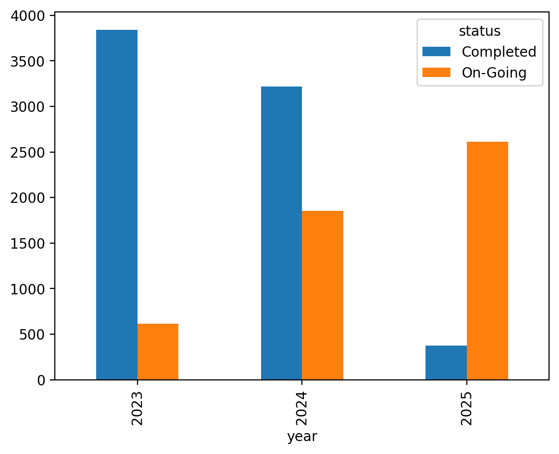
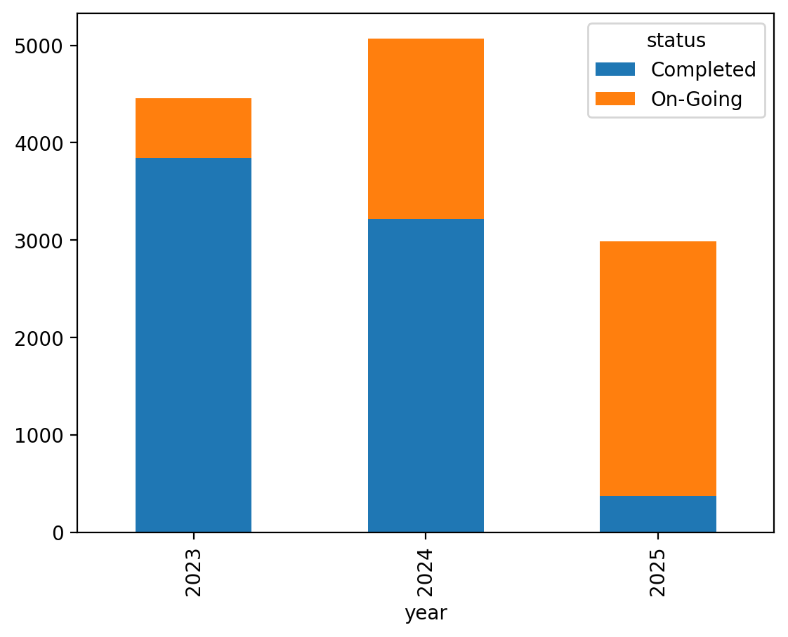
left, grouped: easy to see Completed shrink and On-Going grow from 2023 to 2025. Right, stacked: easy to see that 2024 had the most projects in total (5,071), but hard to compare the orange On-Going pieces, because each starts at a different height.
"X and Y move together" has three explanations
X drives Y
Studying really does raise scores. Plausible here — but the data alone didn't prove it.
Y drives X
Reverse the arrow: strong students choose to study more. Same dots, same r, opposite story.
Z drives both
A confounder: motivation raises study hours and scores. The correlation is real; the causal arrow between X and Y may not exist.
All three produce identical correlation matrices. Nothing inside
.corr() can pick between them — that's why the trap works.
Causation means changing X would change Y; a
confounder is a third variable Z that drives both.
Correlation is not causation. The rooster crows every morning before sunrise; it does not make the sun come up.
Classic example
Ice cream sales correlate with drowning deaths. Neither causes the other; summer causes both.
EDA generates hypotheses — it doesn't settle them
Finding a strong association is a beginning: now you know which question is worth the harder tools — controlled comparisons, experiments, domain knowledge.
EDA can say
"Study hours and scores are strongly associated (r = 0.99, linear, n = 8)."
EDA cannot say
"One more study hour causes 5.1 more points." (5.1 is the slope of the trend line.) That claim needs a design, such as an experiment, not a scatter.
And always report n
Eight students is a whisper, not a verdict. Small samples make large correlations cheap.
progress vs year, r = −0.379
Newer projects show less progress. Stated as a coefficient it sounds like a finding. Stated as a sentence it is a tautology: true by definition, so it tells you nothing new.
Time is the mechanism
A project started in 2025 has had less time to finish than one started in 2021. The correlation is real, and it tells you nothing you did not already know.
The national number hides the variation
| Region | Projects | r (budget vs duration) |
|---|---|---|
| National Capital Region | 3,373 | +0.090 — almost none |
| Region IV-B | 1,116 | +0.112 |
| …national average… | 27,664 | +0.365 |
| Region IV-A | 2,735 | +0.554 |
| Region VIII | 1,586 | +0.623 — strong |
In Region VIII, budget predicts duration reasonably well. In NCR it barely predicts at all — plausibly because urban projects are constrained by permits and traffic rather than by size. One coefficient for the whole country describes no region in particular.
Always ask: does this hold within groups?
Before reporting any correlation, compute it again inside the obvious subgroups. If the answer moves a lot, the aggregate figure is a summary of different things.
When it reverses, it has a name
A relationship that flips sign inside every group is Simpson’s paradox. Here it does not reverse — but it ranges from 0.09 (NCR) to 0.66 (Central Office, only 122 projects), which is enough to make the average misleading.
dropna(subset=[…])drop rows missing a budget or a duration.apply(lambda g: …)run a small function on each region's pile of rowsg(just the two columns picked in[[…]]): here, its own rCentral Office 0.655the top value rests on only 122 projects: exactly the warning in the comment
Interrogate a correlation
1 · Pick a pair
Any two numeric columns. Compute Pearson and Spearman on them.
2 · Explain the gap
If they differ by more than ~0.1, say why. Plot the scatter to check your explanation.
3 · Split it
Recompute within regions (or within years). How much does r move? Report the range, not just the average.
4 · Write the honest sentence
One sentence stating the relationship, the strength, and one thing it does not establish.
Step 4 is the whole course in miniature: a claim, a number, and an explicit limit.
Tap to reveal
budget vs duration gives Pearson 0.365 but Spearman 0.508. What does that gap tell you?
Tap to reveal
latitude and longitude correlate at −0.785 across 30,884 projects. What is the correct interpretation?
Tap to reveal
Across cities: the more firefighters sent to a fire, the larger the fire damage (strong positive r). Should cities send fewer firefighters?
B — the confounder is the fire itself.
Fire size drives both variables, creating a real correlation with an absurd causal reading. Compare damage within fires of similar size and the "firefighters cause damage" story evaporates.
When a correlation implies something ridiculous, hunt for the third variable. It's usually hiding in plain sight.
Week 9 preview
Data journalism lives and dies on exactly this discipline — next week.
Every new word from today, in one line each
Relationships
- multivariate
- several variables at once
- correlation (r)
- −1 to +1: how closely two columns follow a line
- correlation matrix
- r for every pair of columns, in a grid
- r²
- share of the variation a straight line accounts for
- Pearson / Spearman
- r on the values / r on their ranks
- monotonic / linear
- always the same direction / a straight line
- causation
- changing X would change Y; correlation is not causation
- confounder
- a third variable that drives both X and Y
- trend line
- best-fitting straight line; its slope is y per unit of x
- crosstab
- counts for every combination of two categories
- tautology
- true by definition, so it tells you nothing
- n
- the number of rows a statistic rests on
Charts
- scatter plot
- one dot per row, x across and y up
- overplotting
- too many dots on top of each other to count
- log scale
- an axis where each step multiplies (1M, 10M, 100M)
- heatmap
- grid of cells coloured by value
- colormap
- numbers to colours; diverging for ± values
- pair plot
- scatter for every pair, histograms on the diagonal
- figure / axes
- the whole picture / one plotting area in it
- subplot
- one axes in a grid of axes
- shared axis
- every panel uses the same scale
- hue / facet
- colour by group / one panel per group
- small multiples
- the same chart repeated per group
- grouped / stacked bar
- bars side by side / piled into one
Eight students, three variables
Build the frame, read its correlation matrix, scatter the strongest pair, and paint the heatmap. Then explain a negative correlation without the word "causes." ~45 minutes.
You'll practise
df.corr(), ax.scatter() with labels, and a heatmap drawn with
matplotlib's ax.imshow (seaborn does not run in the browser lab).
Stretch, if you're quick
A scatter coloured by a third column, and two side-by-side panels that share one y axis.
Four things to carry out
1 · r compresses co-movement
Sign = direction, magnitude = consistency, and linear only.
2 · Scan, then scatter
Heatmap to find the pairs; scatter to trust them. Curves, clusters and loud points hide from r.
3 · Three arrows fit every correlation
X→Y, Y→X, or Z→both. The matrix can't choose for you.
4 · Association is the honest word
EDA raises the question; causal answers need stronger designs.
One sentence: find the relationships, draw them, and describe them exactly as strongly as the evidence allows — no stronger.
Milestone
Exploration done. What's left is telling people — weeks 9 and 10.
Before next week
Primary
seaborn tutorial — "Visualizing statistical relationships": scatterplots,
hue, and friends, with runnable examples.
seaborn.pydata.org
Skim (for fun)
Tyler Vigen's "Spurious Correlations" — absurd variable pairs with beautiful r values. The causation trap, played for laughs.
Both are linked on the course page beside this deck and the lab.
Do the lab first
Spurious correlations are funnier once you've computed a real one.
Data Journalism
Finding stories in data — turning associations, gaps and outliers into questions the public deserves answered.
DS 227 · Knowledge Discovery in Data