Data Journalism
Finding stories in data — turning a question into a comparison, a comparison into a chart, and a chart into one sentence you can defend.
Knowledge Discovery in Data · University of the Philippines Cebu
From dataset to defensible claim
Part A · Stories Live In Data
What data journalism is, and where story ideas actually come from.
Part B · The Craft
Question → comparison → chart → one sentence with a number and a caveat.
Part C · The Standards
Confounders, robustness, honest charts — interrogate your own story first.
Everything from weeks 3–8 was preparation for this: exploration with a public on the other end. The stakes change; the discipline shouldn't. Data journalism is reporting news whose evidence is a dataset.
A reporter checks a quote before printing it. A data reporter checks a number the same way: where it came from, what it counts, and what it leaves out.
The theme
A data story is EDA that someone else has to be able to trust.
Ten words a data journalist uses
story
A finding that a reader should know, told so that they can check it.
e.g. "48 of 4,841 firms hold 27.6% of the money"
angle
The particular question or point of view a story takes on the data. One dataset has many angles.
e.g. flood data: spending per region, or which firms get the most
comparison
Setting a number next to another group, time or expectation. Most findings are one.
e.g. passers studied 7.0 h; the others 2.4 h
context
The surrounding facts a reader needs to judge whether a number is big, small or normal.
e.g. Region IV-B builds different works than Region I
denominator
The number you divide by: the "out of how many" or "per what" behind a figure.
e.g. ₱1.6T ÷ 11 years = ₱145.5B per year
per-capita
Per person: divide a count by the population, so places of different sizes compare fairly.
e.g. 500 cases ÷ 1,000,000 people = 50 per 100,000
base rate
How common something is overall: the yardstick you compare a group against.
e.g. 0.4% of all projects are terminated
source
Where the data came from: who produced it and where you got it.
e.g. DPWH flood control projects, via the BetterGov.ph mirror
verification
Checking a claim against the evidence before publishing it.
e.g. look at .unique() on the column a claim rests on
unpopulated column
A column that exists but was never filled in. Its zeros mean "not recorded", not "none". The amount_paid trap.
e.g. df.amount_paid.unique() gives array([0])
Stories Live In Data
They always have — since before "data science" was a phrase.
For six weeks you have collected, cleaned and explored data. This part asks what turns a pattern you found into a story someone else should read.
1854: a map finds a pump
"During London's cholera outbreak, John Snow plotted each death as a mark on a street map. The marks piled up around one water pump on Broad Street. The dominant theory said disease traveled by air; his picture said it traveled by water — and the pump handle came off."One question, one dataset, one chart — and a changed world
Notice the shape of it: a sharp question, data nobody had bothered to arrange, and a visual that made the answer undeniable. That shape hasn't changed in 170 years.
Modern descendants
Disaster response times, budget flows, price spikes, school outcomes — the same question-data-picture recipe, run on today's records.
Three shapes a data story takes
The uncounted
Nobody had put numbers on it before. Counting something for the first time is itself news.
The contrast
Two groups, places or times that should look alike — and don't. Most data stories are this one.
The change
Something shifted: a trend broke, a gap widened, a number that was flat started moving.
A story here is a finding a reader should know, told so they can check it. All three shapes reduce to the same underlying move — a comparison: this number set next to another group, another year, or an expectation.
And one more source
Your own EDA leftovers: the outlier you didn't delete (week 5), the gap in the data (who isn't being counted?), the correlation that surprised you (week 8).
Pick an angle before you pick a chart
Place
"Region VI’s median project takes 93 days longer than Region I’s." Compares regions.
Who gets the money
"48 of 4,841 contractors hold 27.6% of awarded value." Compares firms.
What is unfinished
"80.8% of projects are complete; 16.0% are on-going." Compares statuses.
An angle is the particular question a story takes on its data. The same 34,079 flood-control rows support all three angles above, each with its own comparison, chart and caveat.
Three photographers at the same festival come back with three different stories. The festival did not change; where they stood did.
Choose one per story
A piece that tries all three angles at once usually lands none of them.
A story starts with a question, not a dataset
"Here's a CSV, find something" produces noise. "Does study time relate to passing?" names an outcome and a suspected driver — now every step has a direction.
The outcome is what you want to explain (passing); the driver is what you suspect explains it (study hours). A boolean column holds only True or False.
A good question names
The outcome you care about (passing) and the candidate explanation (study hours).
Then shape the data to it
The lab turns score into a boolean passed — the question got
easier to ask, at the cost of nuance (a 74 and a 40 become the same "failed").
Name your trade-offs
Every simplification you make is one a critic can point at. Better you point at it first.
All on the same dataset
Weeks 4 through 8. Each one was a single keystroke away.
Every week, a plausible claim that was wrong
| Week | The tempting claim | Why it was false |
|---|---|---|
| 4 | ₱1.17T of work completed but never paid | amount_paid is 0 on every row — unpopulated, not unpaid |
| 5 | 99.6% of flood projects are complete | dropna() deleted every unfinished project; the real figure is 80.8% |
| 6 | One project finished 17 days before it started | True — and it is a data error, not a scandal |
| 7 | Projects take a median of 202 days | describe() silently excluded 6,415 unfinished ones |
| 8 | Latitude strongly predicts longitude | r = −0.785, and it is the shape of the archipelago |
Not one of these required a mistake in arithmetic. Every one came from a correct operation applied to data whose meaning had not been checked.
Each row is a true calculation with a false sentence attached. The next slide takes the first one apart.
A column of zeros is not a column of "unpaid"
The flood data has an amount_paid column. Sum the budgets of
completed projects, see that amount_paid is 0, and you have a
₱1.17 trillion "completed but never paid" scandal. Except the column is
unpopulated: it exists, but nobody ever filled it in.
A blank "tip" line on a receipt does not prove nobody tipped; the restaurant may just not record tips on receipts.
The ten-second check
Before any claim rests on a column, look at its .unique() values. One
value on every row means "not recorded" until proven otherwise.
.unique()every different value in the column: here only 0array([0])a NumPy array holding one value: every one of 34,079 rows says 0df[df.status == "Completed"]keep the completed projects, then add up their budgets in trillions
The dangerous claim is the one that sounds like a story
Notice which of those five you would have been most excited to publish. The ₱1.17 trillion one. It was also the most wrong.
Excitement is a warning sign
A finding that immediately feels like a headline deserves more checking than one that feels mundane — not less. The story pulls you past the verification.
df.amount_paid.unique()list every different value in the column: one value only means nothing was recordedlen(df), len(clean)row count before and after cleaning: what did you drop?why_would_these_relate()not real code: a question to ask yourself
Five minutes
Then: the craft — building the finding, step by step.
The Craft
Question → comparison → chart → sentence.
You know how to group and summarise (weeks 5–8). This part turns a group comparison into a chart and one sentence a reader can check.
Turn the question into a comparison
Split the rows by the outcome, then summarize the candidate driver in each
group. One groupby, and the question has numbers.
The data: 10 students with their weekly study
hours and a passed column (True if the score was 75 or more).
groupby("passed")["study_hours"]split students into passed / not passed, and look at their study hours.agg(["mean", "min", "max", "count"])four summaries at once for each groupTrue 7.0 5 9 5the 5 passers averaged 7 hours; the least any of them studied was 5
Read the whole row
Not just the means — the ranges don't even overlap here, and count tells
you how much weight the claim can bear (not much, at 5 per group).
Is that a lot?
You cannot answer that, and neither can your reader, without a denominator.
Give it something to stand next to
₱1.6 trillion is the headline figure for this dataset. On its own it is unreadable — big enough to sound like everything, small enough to sound like nothing. A denominator is what you divide by to make it comparable: per year, per project, per person.
Divide by time first
It covers eleven years. ₱145.5B per year is a number someone can hold in their head and compare to other budget lines.
df.budget.sum() / 1e12add every budget; 1e12 is a trillion, so the answer is in trillions (roundkeeps 2 decimals: 1.60 prints as 1.6)df.year.nunique()how many different years appear: 11 (2016 to 2026)… / 1e9 / 11in billions (1e9), then divided by 11 years
Same ₱1.6T, different meanings
Per year
₱145.5B/year across 11 years. Comparable to other annual budget lines.
Per project
34,079 projects, so ₱47.0M each on average — or ₱37.7M for the typical one.
Per region, per project
Central Office ₱242.0M vs Region I ₱31.2M. A 7.8× spread that the national figure erases.
Pick the denominator that matches the question you are answering, and say which one you used. Most misleading statistics in public reporting are a correct numerator over an unstated denominator.
Bigger places have more of everything
Per-capita means "per person". Divide a count by the population and places of very different sizes become comparable. The numbers on the right are made up to show the arithmetic.
The count and the rate disagree
City A has 12 times as many reports, yet Town B has the higher rate: 80 against 50 per 100,000 people. A headline built on the count would point at the wrong place.
A family of eight eating eight kilos of rice a week is not hungrier than a couple eating three. Divide by the people at the table.
pd.Series({"City A": 500, …})a Series built from a dictionary: the names become the row labelsreports / peoplepandas lines the two Series up by label and divides City A by City A, Town B by Town B* 100_000reports per 100,000 people, an easier number to read than 0.0008dtype: float64the results are decimal numbers
The question a reader asks before believing you
Region IV-B spends ₱67.1M per project; Region I spends ₱31.2M. Twice as much — which sounds like a finding until you ask what kind of projects each builds. That is context: the surrounding facts a reader needs to judge whether a number is big, small or normal.
A difference is not yet a story
Bigger rivers, denser cities, and different works all produce different unit costs legitimately. The comparison generates the question; it does not answer it.
n=("contract_id", "count")a new columnn: how many projects each region hastotal=("budget", "sum")a new columntotal: the region's summed budgetg.total / g.ndivide one column by the other, row by row: average budget per projecttop.iloc[[0, 1, 2, -1]]in millions, biggest first; show the top three and the last one (−1)
Show the contrast — honestly
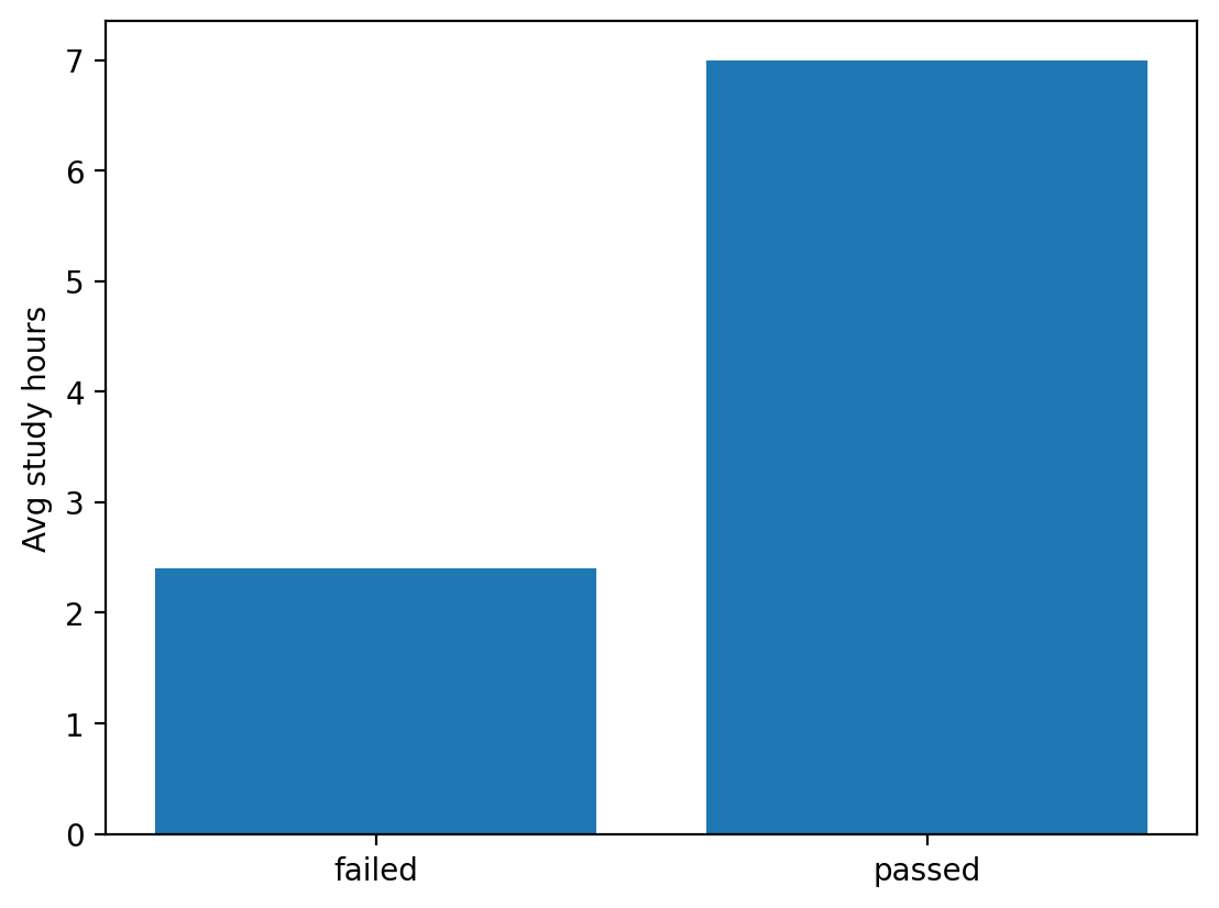
A bar chart of the two means makes the gap land in half a second. Note the y-axis: bars encode length, so they must start at zero — a truncated bar chart is a lie about proportion.
ax.bar(["failed", "passed"], means)two bars: the labels along the bottom, the two means as heightsax.set_ylabel(…)say what the height measures; matplotlib starts bars at 0 unless you change it
Chart follows claim
The chart exists to carry this comparison — not to decorate. If it needs a paragraph to explain, the comparison isn't sharp yet.
Two bars from zero: 2.4 hours against 7.0
the y axis starts at 0, so the passed bar is really almost three times as tall as the failed bar (7.0 against 2.4), and your eye reads the true proportion. This is the lab's ten students, with fig, ax = plt.subplots() run first to make ax.
The finding is one sentence
Claim + number + caveat. A caveat is the honest limit you attach ("only 10 students"). If you can't say it in a sentence, you don't have a finding yet — you have an area of interest.
The sentence
"Students who passed studied about 4.6 hours more per week on average — though with only 10 students, this is suggestive, not conclusive."
Anatomy
Claim (studied more) · number (4.6h, n=10) · caveat (suggestive). All three, every time.
The caveat is not weakness — it's accuracy
"An overclaimed finding gets one news cycle and then gets corrected in public. A precisely-claimed finding gets cited. 'Suggestive, not conclusive' isn't timidity — it's the exact size of the evidence."Say what the data supports. Then stop talking.
Ten students is a whisper. Small n (few rows) makes big gaps easy to produce
by luck — which is precisely why count belongs inside your sentence, not in a
footnote. The data is also observational: recorded as it happened,
with nobody assigning study hours, so it can show association but not cause.
Words to calibrate by
is associated with < suggests < shows < proves. Most EDA findings live at the first two.
Tap to reveal
Which is the defensible version of the lab's finding?
C — claim, number, caveat.
A is causal (the data is observational); B has no number; D overclaims from a sample of ten. C says exactly what was measured, how big it was, and how much to trust it.
The difference between A and C is the difference between a headline that gets retracted and one that holds.
Habit
Draft the sentence before polishing the chart. The sentence is the story.
The Standards
Attack your own story before anyone else can.
You can now build a finding. This part tries to break it: other explanations, other framings, misleading charts, and a real finding that could hurt real companies.
Hunt the confounder
Week 8's lesson goes to work: could a third variable (a confounder) drive both study time and passing? Suppose the ten students came from two class sections, A and B.
list("AAABABABBB")one section letter per student, in order A to J["passed"].mean()True counts as 1, so the mean is the share who passed
Uh-oh
Section B both studies more and passes more. Different instructor? Different exam? Until you can separate section from study time, "study more, pass more" is on shaky ground.
Reframe it — does the story survive?
A solid finding holds under a different cut of the same data (it is robust). Instead of comparing mean hours, compare pass rates of high- vs low-study students.
Two framings, same direction
Mean-gap and pass-rate agree here — good sign. A "finding" that flips when you change the cut was never a finding; it was an artifact of one framing.
Charts can lie without a single false number
Truncated bars
Start bars at 60 instead of 0 and a 5% gap looks like a landslide. Bars encode length — length must start at zero.
Cherry-picked windows
Any wiggly line "soars" or "crashes" if you choose the right two endpoints. Show the fuller series.
Counts vs rates
"Most incidents in Cebu City" may just mean most people in Cebu City. Week 6's per-capita (per person) lesson is a journalism standard too.
Each of these passes a fact-check — every number is real — and still leaves the reader believing something false. That's why chart honesty is an ethics topic, not a style topic.
Next week
Storytelling and dashboards — where these rules do their heaviest lifting.
Now do it with a story that could hurt someone
131 contractors. PHP 75.2 billion. And a word in their names.
131 firms, 1,263 projects, ₱75.2 billion
Some contractor names in the source export (the file the agency produced) contain the token (marker text) [REVOKED]. Counting them takes one line, and the total is not small.
4.7% of all awarded value
Against a base of 4,841 contractors and ₱1.6 trillion. Large enough to be worth understanding; large enough to do damage if framed wrongly.
df.contractor.str.contains("REVOKED", na=False)True for each row whose contractor name contains the text;na=Falsetreats missing names as Falsedf[ … ]keep only those rows:revis the flagged projectsrev.contractor.nunique()how many different firms: 131
4.7% of the money: more or less than you would expect?
A base rate is how common something is overall: the yardstick you compare a group against. The flagged firms are 2.7% of all contractors and hold 3.7% of the projects, but 4.7% of the value.
What it does and does not say
Their projects are larger than average: 3.7% of the projects carry 4.7% of the value. That is a question to report, not evidence of wrongdoing.
If 3 of your 10 friends are left-handed, is that odd? Only if you know that about 1 person in 10 is left-handed. That "1 in 10" is the base rate.
revthe 1,263 projects of the 131 flagged firms (previous slide)nunique() / nunique()131 flagged firms out of 4,841 firms;round(…, 3)keeps 3 decimalslen(rev) / len(df)1,263 projects out of 34,079
Then find out whether you are allowed to
✗ "₱75 billion awarded to contractors with revoked licences"
Every number in it is correct. It is still not a claim this data supports, and it names real companies.
What it implies
That the licence was revoked when the project was awarded. Nothing in the dataset says that.
✓ "131 firms holding ₱75.2B in contracts are flagged as licence-revoked in the DPWH export"
States what the data records, and when. A reader can check it and knows its limits.
What changed
The verb. "Awarded to firms with revoked licences" asserts a sequence. "Flagged as revoked in the export" asserts a record.
Both sentences rest on identical numbers. One is publishable; the other is an accusation the evidence does not reach.
Licence status at export time — and that is all
[REVOKED] is part of the contractor name string in the source. It is a snapshot of that firm’s licence when the file was produced.
Three things it does not tell you
When the licence was revoked. Whether it was revoked before or after these awards. Whether any of these particular projects was irregular.
Applied to this exact finding
1 · What does the field literally record?
A licence status at export time, embedded in a name string. Not a judgment about a project.
2 · What ordering am I assuming?
"Awarded to revoked firms" assumes revocation came first. There is no date column to check that.
3 · Who is harmed if I am wrong?
Named, real companies. This is the difference between an error and a defamation.
Defamation is publishing a false statement that damages someone’s reputation. Question 3 sets how much evidence you need. A wrong claim about an average costs you credibility; a wrong claim about a named firm can cost them their business and you a lawsuit.
The pre-publication checklist
Verification means checking a claim against evidence before you publish it. Journalists verify sources; data journalists verify pipelines (every step from raw file to final number). Your weeks 3–6 discipline is the verification.
Source the data
Where it came from, who collected it, what it doesn't cover — stated plainly.
Show the work
Reproducible code from raw file to final chart (week 5's rules). "Trust me" is not a methodology.
Seek the counter-story
Ask "what else would explain this?" — and check it — before someone on the internet does it for you.
Concentration — and you can check every number
Set the licence question aside. Here is a finding with no ordering assumption and no accusation in it. Concentration means a few players hold most of something.
48 firms, 27.6% of the money
Out of 4,841 contractors. That is a structural fact about the market, measurable directly, and it implicates nobody of anything.
groupby("contractor").budget.sum()total budget per firm.sort_values(ascending=False)biggest firm firstc.head(48).sum() / c.sum()the top 48 firms' total as a share of everything: 0.276 = 27.6%
Terminated projects: 131, or 0.4%
"131 flood control projects terminated" is true and sounds bad. 0.4% of all projects is the same fact and sounds like a functioning system.
Report both
The count makes it concrete; the rate makes it fair. Giving only one is where the reader gets steered.
value_counts(normalize=True)the share of projects in each status (shares add to 1)* 100turn shares into percentages: 0.808 becomes 80.8
Four facts, or the claim is unverifiable
A source is where your data came from: who produced it, and where you got it. A reader who cannot reproduce your number has to take your word. Four short facts remove that. (CC0 means the data is free to reuse; a mirror is a copy hosted elsewhere.)
Put it under the chart
Not in an appendix. The person who needs it is looking at the figure, not reading your methodology section.
Everything weeks 4–9 taught, in one pass
| Check | From | The question |
|---|---|---|
| Column means what I think | week 4 | Have I looked at .unique() on the field my claim rests on? |
| I know what I dropped | week 5 | Row count before and after — and which rows went? |
| Derived values are possible | week 6 | Min, max, and how many are impossible? |
| I know my denominator | week 7 | Does count match len(df)? If not, say so. |
| The relationship survives splitting | week 8 | Does it hold within regions, or only on average? |
| The verb matches the evidence | week 9 | Am I asserting a sequence the data cannot order? |
| A stranger can rebuild it | week 9 | Source, scope, n, method, date — under the chart. |
Seven checks. If a finding survives all of them, publish it and defend it. If it does not, you have just saved yourself a correction.
Finding, number, method, limit
| Part | The sentence |
|---|---|
| Finding | Flood control contracting is concentrated: 1% of contractors hold over a quarter of the awarded value. |
| Number | 48 of 4,841 firms account for 27.6% of ₱1.6 trillion; the largest single firm holds ₱28.85B across 242 projects. |
| Method | Summed budget by contractor over 34,079 DPWH projects, 2016–2026, from the BetterGov mirror (CC0). |
| Limit | Concentration is not evidence of wrongdoing. Large firms win large contracts; this measures structure, not conduct. |
Four sentences. A reader can reproduce it, and knows exactly what you are and are not claiming. That is the deliverable of this course.
Know the ceiling before you start climbing
| Question | Why the data cannot reach it |
|---|---|
| Was this project good value? | No quality, inspection or outcome field exists. Budget is not worth. |
| Was money misused? | amount_paid is unpopulated. There are no disbursement records here at all. |
| Did flooding actually decrease? | No flood-incidence data is joined. The dataset describes spending, not effect. |
| Was a licence revoked before the award? | No revocation date. The token is a snapshot at export time. |
| Who decided each award? | No procurement or approval fields. The decision process is not recorded. |
Write this list before you analyse. It stops you spending a week reaching for a claim the columns were never going to support — and it is the honest answer when an editor asks "can we say X?"
The data produces the question; a human answers it
"Region VI’s median project takes 93 days longer than Region I’s" is not a story yet. It is a good question to put to the agency, an engineer, or a contractor.
This is the step that makes it journalism
Analysis stops at the pattern. Reporting takes the pattern to someone who knows why, and publishes their answer alongside it — including when they decline to comment.
Being right is a process, not a moment
You will get something wrong. The difference between a credible outlet and a discredited one is entirely what happens next.
Say where the data and code live
A link to the notebook is the strongest possible signal that you expect to be checked — and it is how errors get found while they are still small.
Not a disclaimer bolted on at the end
A caveat written last reads as a retreat. A caveat written into the claim reads as precision — and it is what stops a careful reader from dismissing the whole piece.
Hedging vs accuracy
"May possibly suggest" is hedging. "Measures structure, not conduct" is accuracy. The first weakens a claim; the second defines it.
Take a finding all the way
1 · Find something
Any pattern in the flood data: by region, by year, by contractor, by duration.
2 · Write the four parts
Finding, number, method, limit. One sentence each — the table above is the template.
3 · Attack it
Swap with a neighbour. Their job: find the assumption your sentence smuggles in. Every claim has one.
4 · Rewrite
Fix the verb, not the number. Most bad claims are a correct figure attached to an overreaching verb.
Step 4 is the point. You will almost never need to change the arithmetic — you will need to change what you said it meant.
Tap to reveal
You find 131 contractors with "[REVOKED]" in their name holding ₱75.2B in projects. Which headline does this dataset support?
Tap to reveal
Which of the five near-misses from weeks 4–8 would have been the most damaging to publish, and why?
Tap to reveal
Draft headline: "Studying CAUSES passing, data shows." Based on the lab's 10-student comparison. What's wrong with it?
B — three strikes in seven words.
Nobody randomized study hours (no causal license), ten students can't carry "shows," and Part C found section B passing at 4× section A's rate. The honest headline: "Passing students studied more — small sample, cause unclear."
Boring headlines that hold beat exciting headlines that don't. In class and in print.
Remember
Your reader can't see your pipeline. Your words have to carry its limits for them.
Every new word from today, in one line each
Finding the story
- data journalism
- reporting news whose evidence is a dataset
- story
- a finding a reader should know, told so they can check it
- angle
- the particular question a story takes on its data
- comparison
- a number set next to another group, time or expectation
- context
- surrounding facts that show if a number is big or normal
- denominator
- what you divide by: per year, per project, per person
- per-capita
- per person: count ÷ population
- base rate
- how common something is overall; the yardstick
- caveat
- the honest limit attached to a claim
- outcome / driver
- what you explain / what you suspect explains it
Checking the story
- source
- who produced the data and where you got it
- verification
- checking a claim against evidence before publishing
- unpopulated column
- exists but never filled in; amount_paid is 0 on every row
- confounder
- a third variable that drives both things you compare
- robust
- still holds when you slice the data another way
- truncated axis
- bars not starting at zero: exaggerates gaps
- cherry-picking
- choosing the window or cases that suit the claim
- concentration
- a few players holding most of something
- export / token
- the file an agency produced / marker text inside a field
- correction policy
- a public promise to log and fix errors
- observational data
- recorded as it happened; shows association, not cause
- defamation
- a false published claim that damages a reputation
Build a finding you can defend
Ten students, a pass/fail outcome, and a suspected driver. You'll make the comparison, chart it, and write the one-sentence finding — number and caveat included. ~45 minutes.
You'll practise
Turning a score into a pass flag, groupby() comparisons with a size and an
n, a zero-based bar chart, and the claim–number–caveat sentence.
Stretch, if you're quick
Rates versus counts, and a check for a third variable (tutoring) that could explain the gap.
Four things to carry out
1 · Question first
Name the outcome and the candidate driver before touching the data.
2 · Findings live in comparisons
Groups, times, places — one groupby away.
3 · One sentence: claim + number + caveat
If n is small, the caveat is part of the finding.
4 · Attack it yourself first
Confounders, reframings, honest axes — the interrogation is the job.
One sentence: a data story is a comparison that survived your best attempt to kill it.
Next step
You have a finding. Next week: making an audience feel it — narrative and dashboards.
Before next week
Primary
The Data Journalism Handbook (free online) — skim a chapter of "getting stories
from data." Real newsroom workflows, recognizably yours.
datajournalism.com
Skim
One visual essay from The Pudding or a FiveThirtyEight methodology note — watch how they surface caveats without burying the story.
Both are linked on the course page beside this deck and the lab.
Do the lab first
Having written one finding sentence, you'll spot everyone else's — and their caveats.
Data Storytelling
Narrative, dashboards and communication — carrying your finding to an audience that has thirty seconds and no context.
DS 227 · Knowledge Discovery in Data