Data Storytelling
Narrative, dashboards and communication — carrying your finding to an audience with thirty seconds and no context.
Knowledge Discovery in Data · University of the Philippines Cebu
From finding to felt
Part A · Narrative
Your audience isn't you. Structure the story for someone with no pipeline in their head.
Part B · Dashboards
Small multiples, layout and order — a sequence of charts that argues one point.
Part C · The Craft
Finding-titles, decluttering, consistent color — the details that carry the load.
Week 9 ended with one defensible sentence. This week's question: how does that sentence survive contact with a busy reader?
The theme
A dashboard is not a pile of charts. It's an argument with a layout.
Eight words for telling the story
audience
The particular person or group who will read your chart. Decide who, before you write anything.
e.g. a fellow analyst, a newspaper editor, the general public
narrative arc
The order a story moves in. Here: three beats, context → contrast → consequence.
e.g. "spend grew" → "48 firms hold a quarter" → "worth asking why"
headline (finding-title)
A chart title written as a full sentence that states what the chart shows, with its number.
e.g. "Luzon sales grew 35% over the half-year", not "Sales"
annotation
A short note written on the chart itself, next to the mark it explains, often with an arrow.
e.g. an arrow to the dip labelled "enrolment period"
chart choice
Picking the kind of chart from the question: line for change over time, sorted bars to compare groups…
e.g. "how did it change?" → a line chart
pre-attentive attribute
A visual property the eye notices in a split second, before reading: colour, size, position, length.
e.g. one orange bar among grey ones jumps out at once
decluttering
Deleting everything on a chart that does not help the message: heavy grid lines, borders, 3-D, extra decimals.
e.g. ₱267.7B instead of ₱267,688,008,746.34
colour meaning
Using colour on purpose: one colour per thing, the same in every chart, and grey for "background".
e.g. Visayas is orange in every panel of the dashboard
Eight words for building the dashboard
dashboard
One screen of a few charts and headline numbers that people check again and again to answer one question.
e.g. a page showing spend per year, by region, and the top contractors
KPI (key performance indicator)
One headline number a dashboard tracks, shown big so it is read first.
e.g. "₱1.60T total, 11 years" in the top-left tile
small multiples
A grid of small charts side by side, each making one point, so the eye can compare them.
e.g. a trend panel next to a totals panel
filter
A control that narrows the data a dashboard shows, such as a drop-down list or a date slider.
e.g. pick "Region VII" and every chart redraws for Region VII only
interactivity
A chart that responds to the reader: hover for exact values, click to filter, zoom in.
e.g. hovering a bar shows "Luzon: 134"
pivot table
A reshaped table: one row per value of one column, one column per value of another.
e.g. rows = months, columns = regions, cells = sales
figure & axes
In matplotlib, the figure is the whole picture; each axes is one chart panel inside it.
e.g. plt.subplots(1, 2) gives one figure holding two axes
legend
The small key on a chart that says which colour or line style stands for which thing.
e.g. an orange line = Visayas, a blue line = Luzon
Narrative
The reader starts from zero. Design for that.
You already know how to find and check one finding (weeks 7–9). This part adds the next step: choosing who you tell it to and in what order.
You know too much to see your own chart
You've lived in this data for weeks — every column name, every caveat. Your reader gets one screen and thirty seconds. The curse of knowledge is forgetting that gap exists: once you know something, it is hard to imagine not knowing it.
It is like giving directions to your house as "turn left where the old bakery used to be". Obvious to you; useless to a visitor who never saw the bakery.
What you see
"Obviously the June dip is the enrollment period — everyone knows that."
What they see
An unexplained dip, a legend with cryptic labels, and no reason to care.
The fix
Put the context on the chart: a finding-title, a label at the dip, units on the axis. Assume nothing survives outside the image.
The number does not change; everything else does
"48 of 4,841 contractors hold 27.6% of awarded value" is one fact. Your audience, the particular reader you are telling, decides its length, its framing, and what you lead with.
Words in the analyst version
- n=4,841
- n is how many things were counted: here, 4,841 contractors
- top 1%
- the 48 contractors with the largest summed budgets (1% of 4,841)
- Gini-adjacent
- close to the Gini index, a 0–1 score of how unequal shares are (0 = all equal)
- conduct claim
- an accusation that someone did something wrong
Write the audience down first
Most unclear communication is a piece written for nobody in particular, which means it is tuned for the writer.
Three different deliverables from one analysis
The analyst wants the method
n, the aggregation, the caveats. They will check you, which is a compliment — make it possible.
The editor wants the risk
What can we say? What gets us sued? The limit matters more to them than the number.
The public wants the meaning
One number, one comparison, no method. If they want more, the link to your notebook is there.
The failure mode is writing the analyst version for the public (nobody reads it) or the public version for the editor (they cannot assess the risk). Both come from not deciding who you are writing for.
If you cannot finish the sentence, it is not a story yet
Take any finding and say it out loud, then answer "so what?" twice. (The median on the right is week 7's middle value: half the projects took longer, half shorter.) If you run out before the second answer, you have a statistic, not a story.
A worked example
It usually takes two hops to reach something a reader cares about — and the second hop is where you find out whether your evidence reaches.
Every data story has three beats
Context
What the reader needs to know to care: "Two regions, six months of sales."
Contrast
The week-9 comparison — the thing that changed or differs: "Luzon leads; Visayas is climbing faster."
Consequence
Why it matters / what to watch: "If Visayas keeps growing twice as fast, the second half of the year is where the gap closes."
A narrative arc is the order a story moves in. Notice the middle beat is exactly the finding sentence you already know how to build; storytelling wraps context around it and points at what follows from it.
It is the shape of a good joke: the set-up, the twist, the punchline. Leave out the set-up and nobody gets the twist.
Keep the caveat
The week-9 caveat rides along — in the subtitle or a footnote, but on the chart, not in your memory.
Setup → Tension → Resolution
The flood story, told properly.
Same three beats as the last slide under their storytelling names: context = setup, contrast = tension, consequence = resolution.
Each beat is one chart and one sentence
| Beat | The chart | The sentence |
|---|---|---|
| Setup | Total spend per year, 2016–2024 | ₱1.6 trillion over eleven years — ₱145.5B a year. |
| Tension | Contractor share, sorted descending | 48 of 4,841 firms hold 27.6% of it. |
| Resolution | The same, with the caveat on the chart | Concentration is structural, not evidence of conduct — and it is a question for the agency. |
Three charts. Not fifteen. Most data stories fail by showing everything the analyst found rather than the three things the reader needs to follow the argument.
Not with the method, and never with the dataset
You worked through the data in order: source, clean, explore, conclude. Your reader goes in the opposite direction.
Method belongs underneath
It must be there — it is what makes the claim checkable — but putting it first loses the reader before the point arrives.
One dashboard, one question
A dashboard is one screen of a few charts that people check again and again. Before adding any chart, write the question it answers. For the lab's data: "How do the regions compare — in level and in direction?" Every panel must serve it.
dfthe lab's long table: 12 rows, one per month per region, columnsmonth,region,salesdf.pivot_table(index=..., columns=..., values=...)a pivot table: one row per month, one column per region, sales in the cells (a wide table).reindex([...])put the rows in calendar order; pandas sorts month names alphabetically (Apr, Feb, Jan…)21.0,14.0floats, becausepivot_tableaverages each cell (one value each here, so the average is the value)
The five-second test
Show the finished dashboard to someone for five seconds. If they can't say the headline afterward, the dashboard failed — however pretty it is.
Tap to reveal
An office dashboard shows 14 charts — every metric the team collects. Nobody looks at it anymore. What's the root problem?
B — completeness is not communication.
Fourteen co-equal charts give the reader fourteen decisions about where to look — so they make none. Cut to the panels that answer one question, and the dashboard becomes worth thirty seconds again.
Adding a chart has a cost: it dilutes every other chart. Spend panels like money.
Habit
Write the question first. Delete any panel that doesn't serve it.
Five minutes
Then: assembling the argument, panel by panel.
Dashboards
Small charts, placed on purpose.
You can already draw one chart with pandas'
.plot() (week 8). This part puts several small charts on one page and decides which
goes where.
Small multiples: a grid of one-point charts
Small multiples are a grid of small charts side by side.
In matplotlib the figure is the whole picture and each
axes is one chart panel inside it (an odd name: it means one plotting
area, not the x and y lines). plt.subplots(rows, cols) gives you a grid of axes. The
rule that makes it work: each panel makes exactly one point.
tight_layout()
One call that stops titles and labels from colliding. Use it on every multi-panel figure.
fig, (a1, a2) = plt.subplots(1, 2, ...)make one figure with 1 row × 2 panels; call the panelsa1anda2.figsizeis width, height in incheswide.plot(ax=a1, marker="o")draw the pivot table from the last part on panela1: one line per region, a dot at each monthtotals.plot.bar(ax=a2)totalsis sales summed per region (Luzon 134, Visayas 81); draw them as bars on panela2a1.set_title(...)write the text above that panel- What you getnothing printed: a picture with two charts side by side
Two panels: direction on the left, level on the right
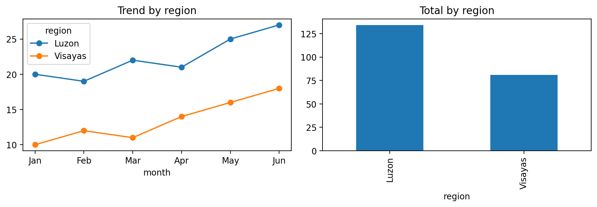
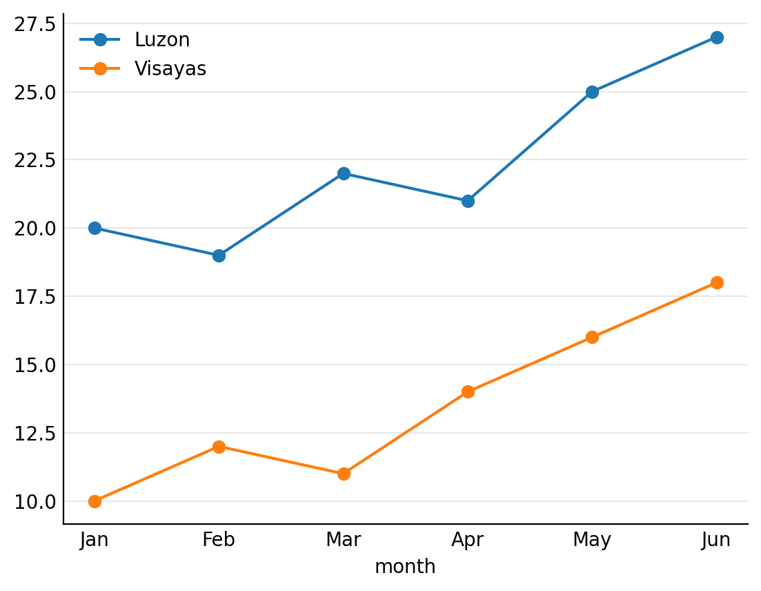
the left panel answers direction: both lines climb, Visayas (orange) from 10 to 18, Luzon (blue) from 20 to 27. The right panel answers level: Luzon's bar (134) stands well above Visayas's (81). The sideways region names under the bars are pandas' default.
Trend and total answer different halves
The lab's pair: a line chart shows direction (Visayas climbing fast), a bar chart shows level (Luzon still far ahead). Either alone tells half a truth.
Only the line
"Visayas is winning!" — it grew 80% (10 → 18) vs Luzon's 35% (20 → 27). True, and misleading alone.
Only the bars
"Luzon dominates, 134 vs 81." Also true, also misleading alone — Visayas went from half of Luzon's monthly sales (10 vs 20) to two-thirds (18 vs 27).
Together
"Luzon leads; Visayas is growing more than twice as fast." Now the reader knows what's actually happening.
Pick the chart from the question, not from the menu
| The reader's question | Chart that answers it | Why |
|---|---|---|
| How did it change over time? | Line chart | The eye follows a line left to right, like time |
| Which group is biggest? | Bar chart, sorted | Bars start at zero, so their lengths compare fairly |
| How are the values spread out? | Histogram or box plot (week 7) | Shows the shape: the bulk, the tail, the outliers |
| Do two numbers move together? | Scatter plot (week 8) | One dot per record; a pattern in the cloud is a relationship |
| What is one headline number? | A big number tile (KPI) | A chart of one number is just a slower way to read it |
Chart choice means starting from what the reader asks. The lab pairs a line (the trend question) with bars (the size question) because the dashboard asks both.
Pie charts?
Only for two or three parts of one whole. Eyes compare lengths far better than angles, so a sorted bar usually wins.
Readers scan; layout is your steering wheel
Left-to-right, top-to-bottom — the Z-path, the zig-zag route a reader's eye takes across a page. Whatever sits top-left gets read; whatever sits bottom-right gets skipped. And within a chart, sorting does the same job.
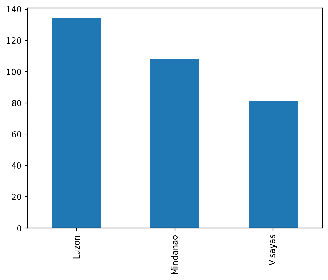
totals.sort_values(ascending=False)reorder the values;ascending=Falsemeans biggest first\at the end of a line"this line continues on the next one".plot.bar(ax=ax)draw the sorted values as bars on the panelax- The bars on the righta text sketch of the chart's order, not printed output; the lab adds a third region, Mindanao (108)
Sorted beats alphabetical
Alphabetical order makes the reader do the ranking in their head. Sorted order is the ranking — read at a glance.
Biggest first: the order is the ranking
the bars step down from left to right, Luzon 134, Mindanao 108, Visayas 81, so the reader gets the ranking without comparing anything. This uses the lab's three-region totals and a blank fig, ax = plt.subplots(); it has no title or axis names yet, which the lab adds.
Placing the panels
Headline top-left
The single most important chart goes where the scan starts. Everything else supports it.
Group what belongs together
Related panels adjacent; unrelated ones separated by space. Proximity implies relationship.
Let it breathe
White space isn't wasted space — it's punctuation. A cramped dashboard reads like a run-on sentence.
The lab's stretch is a 2×2: trend, totals, a distribution, one comparison — each with its own finding-title, assembled in exactly this spirit.
Print test
If the 2×2 still makes its point printed in grayscale on one page, the layout is doing its job.
Big numbers, filters and interactivity
KPI tile
A KPI (key performance indicator) is one headline number the dashboard tracks, printed large: "₱1.60T, 11 years". It answers "how much?" before any chart is read.
Filter
A filter is a control, such as a drop-down or a date slider, that narrows the data every panel shows. Pick "Region VII" and all charts redraw for Region VII only.
Interactivity
Interactivity means the chart responds to the reader: hover to see an exact value, click a bar to filter, zoom into a period. Tools such as Tableau, Power BI or Looker Studio add it without code.
A car dashboard is the model: a few gauges (speed, fuel, warning lights), each read in a glance, all serving one job: driving safely. Nobody wants the engine's full sensor log on it.
The default view must tell the story
Most readers never touch a filter. Whatever shows before anyone clicks is the dashboard for them, so it needs the headline, the finding-titles and the caveats.
The Craft
Titles, ink and color — where good charts are actually won.
You now have the panels and their order. This part is the finishing: the words, the lines and the colours on each single chart.
The title states the finding, not the variable
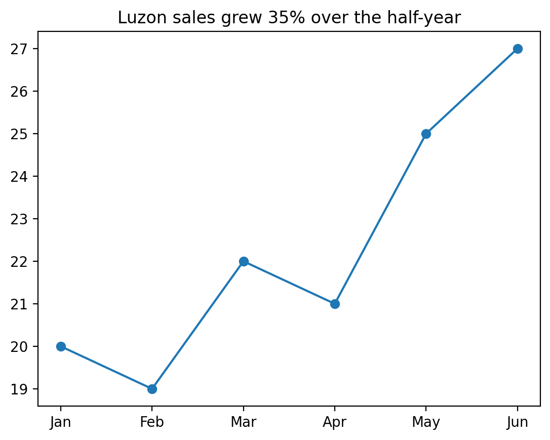
"Sales over time" describes the axes. "Luzon sales grew 35% over the half-year" delivers the story — and the busy reader gets it even if they read nothing else. That sentence is a headline (a finding-title): a title that states what the chart shows, with its number.
ax.set_title("...")axis one chart panel;.set_title()writes the text above it# not: ...a comment: Python ignores everything after#on a line- 35%from the chart: (27 − 20) ÷ 20 = 0.35
The verifiability rule
A finding-title must be checkable from the chart below it. If the line shows 20 → 27, "grew 35%" verifies; "will dominate next year" does not belong in a title.
A title you can check against the line
the title's claim can be checked on the line below it: Jan 20, Jun 27, and (27 − 20) ÷ 20 = 35%. This is the lab's Luzon line (ax.plot(months, luzon, marker="o")) plus the title. The y axis starts at 19, not 0, because matplotlib zooms to the data, so the rise looks steeper than it is (week 9).
A title is a sentence, not a label
"Budget vs Duration" names the axes, which the axes already do. Use the most-read text on the chart to say what the chart shows.
Test: can the title stand alone?
If someone screenshots only your title, do they learn something true? If not, it is a label.
Consistency is what makes a dashboard readable
Pick the mapping once
Region III is the same colour in every panel. A reader learns it in the first chart and reuses it in the rest.
Grey is a decision
Colour the one series you are talking about; make everything else grey. Emphasis is subtraction, not addition.
Never re-map between charts
If Region III is blue on panel 1 and orange on panel 3, the reader has to re-learn the legend and will stop trying.
Colour meaning is colour used on purpose. The rule that makes it automatic: define the colour mapping as a dict at the top of the notebook (a dictionary, a lookup of name → value such as {"Luzon": "#2563eb", "Visayas": "#d97706"}) and pass it to every chart. Never let the library choose per-figure.
Remove until only the message is left
Gridlines, borders, tick marks, legends, background fills and drop shadows all consume attention. None of them is the finding. Decluttering is deleting them.
The subtraction pass
After the chart is right, delete one element at a time. If the message survives, it stays deleted.
ax.spines[["top", "right"]]spines are the four border lines of a chart; hide the top and right onesax.grid(axis="y", alpha=0.3)faint horizontal grid lines only;alphais see-through-ness, 0 (invisible) to 1 (solid)ax.tick_params(length=0)remove the little dashes (tick marks) beside the axis numbersax.legend(frameon=False)keep the legend (the colour key) but drop the box around it
Before and after the four lines
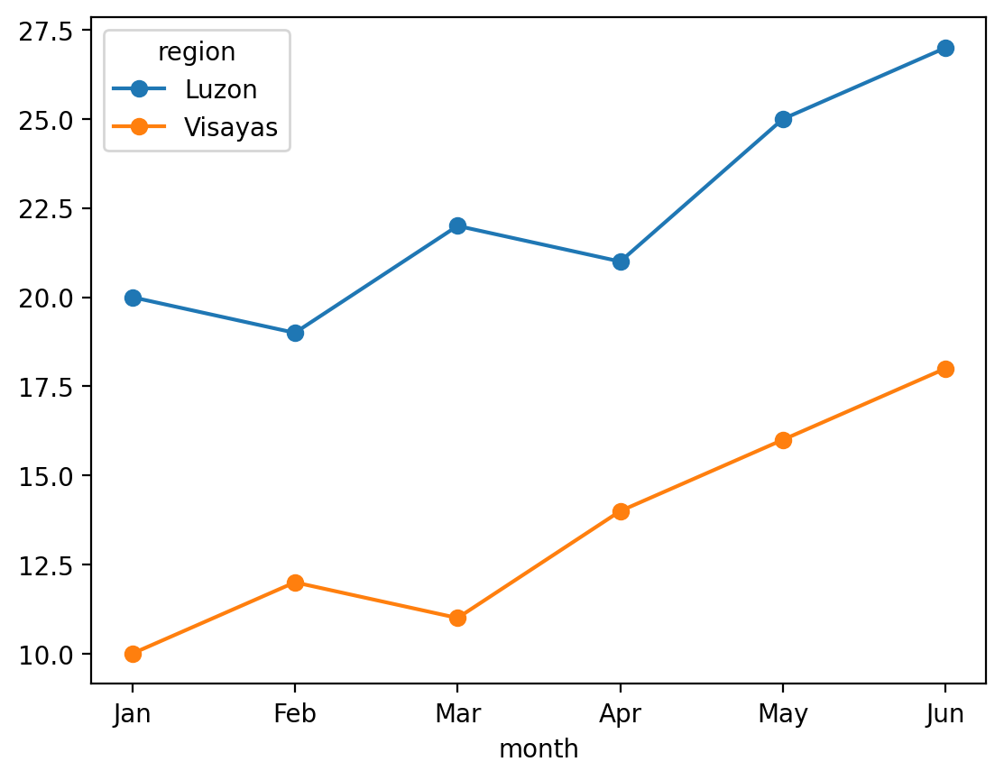
left, the default line chart (wide.plot(ax=ax, marker="o")); right, the same chart after the four lines: no top or right border, faint horizontal gridlines, no tick marks, no legend box. One surprise from the real run: calling ax.legend() again also dropped the legend's region heading.
Precision the reader cannot use is noise
₱267,688,008,746.34 (Region III's total) is accurate and unreadable. ₱267.7B is accurate enough and lands instantly.
Keep full precision in the data
Round at the point of display only. Your calculation stays exact; your label stays legible.
df.budget.sum()add up the whole budget column: 1.6 trillion pesos, printed with every digit1e121 followed by 12 zeros (a trillion);1e9is a billionf"PHP {total/1e12:.2f}T"an f-string: the value in{ }is dropped into the text;:.2fmeans "2 decimal places"'PHP 1.60T'the label a human reads; the quotes mean it is now text, not a number
Everything on the chart competes with the data
Cut
Heavy gridlines, chart borders, redundant legends, 3-D effects, background colors. If removing it loses nothing, it was noise.
Label directly
Put "Luzon" at the end of Luzon's line instead of a legend the eye must shuttle to and from.
Emphasize one thing
Bold color for the line that carries the story; gray for everything that's context.
This is Edward Tufte's data-ink idea in practice: the ink that actually draws numbers should be most of the ink on the chart. Every decoration taxes the thirty seconds you were given.
Decluttering a chart is editing an email: delete every word that does not change the meaning, and the message gets louder.
Quick pass
For each element ask: if I delete this, does the reader lose information? No → delete it.
Write the conclusion onto the chart
An annotation is a short note written on the chart, next to the mark it explains. The reader should not have to locate your point among the marks.
One per chart
Two annotations usually means the chart carries two messages, which is a signal to split it.
ax.annotate("48 firms = ...",the note's textxy=(48, 0.276)the point the arrow touches: x = 48 firms, y = 0.276 (27.6%)xytext=(400, 0.45)where the text sits, away from the dataarrowprops=dict(...)the arrow's look: shape"->", grey colourax.axhline(0.276, ls="--", ...)a dashed horizontal reference line at 27.6%;lwis line width
Data, then emphasis, then explanation
1 · The data layer
Every mark, in one neutral colour. Get the shape right before anything else.
2 · The emphasis layer
Colour or darken only what the sentence is about. Everything else goes grey.
3 · The explanation layer
Title, annotation, reference line, source note. The words that make it stand alone.
Built in this order, a chart is finished when you stop. Built in the other order — styling first — you end up decorating something that was never the right chart.
The eye finds some things before you read
A pre-attentive attribute is a visual property the eye picks out in a split second, before any conscious reading: colour, size, position, length, shape. The emphasis layer uses exactly this.
One red apple in a bowl of green ones: you do not search for it, it finds you. Make your finding the red apple and everything else the green ones.
Count the 3s
65173660142313703557
37934077201250735105
16818148078587695220
05916888934153173373
27920935253003725755
Now count them again
65173660142313703557
37934077201250735105
16818148078587695220
05916888934153173373
27920935253003725755
Same digits, same 15 threes
The first block needs a careful scan, line by line. In the second, colour does the searching for you. That is what one highlighted bar does on a grey chart.
One color per thing, everywhere
If Visayas is amber in panel one, it's amber in every panel. Consistent color lets the reader learn the mapping once — then read the rest of the dashboard for free.
Inconsistent color
Every panel re-teaches the legend; the reader spends their attention re-decoding instead of understanding.
Decorative color
Rainbow bars where color encodes nothing teach the reader to ignore color — right before you need it to mean something.
And check accessibility
Red–green pairs fail for many readers. Prefer palettes that survive grayscale, or double-encode with position and labels.
Roughly 1 in 12 men cannot distinguish red from green
In a class of 40 that is two or three people. On a public dashboard it is thousands. Red-green is both the most common deficiency and the most common default palette.
Words in the code
- sns
- seaborn, a plotting library built on matplotlib
- palette
- the list of colours charts use, in order
- cmap
- colour map: colours for a range of numbers
- sequential
- light to dark for low to high
- diverging
- two colours meeting at a neutral middle
Encode twice
Colour plus shape, or colour plus direct labels. Then the chart survives greyscale printing too — which is the same problem in disguise.
The chart that works on your laptop and fails in the room
Default matplotlib text is sized for a notebook viewed at arm’s length. Projected, it is unreadable from the third row.
One line fixes most of it
context="talk" scales every text element at once — titles, labels, ticks and legend together.
A dashboard multiplies whatever it carries
"A misleading chart in a notebook fools one analyst. The same chart on a dashboard, refreshed daily and trusted by default, fools an organization on a schedule."Zero-based bars, full windows, rates over raw counts — now with compound interest
Nothing new to learn here — the week-9 honesty rules apply verbatim. What changes is the blast radius when they're broken.
Design for the skimmer
Assume the reader sees only titles and shapes. If that reading is honest, the dashboard is honest.
Including the mistakes
A dashboard is not a report with more charts. It is a thing someone checks repeatedly, without you present to explain it.
The elapsed-time trap, automated
Spend per year drops from ₱369.3B (2024) to ₱196.2B (2025), and 2026 has one project. A year still being filled in when the file was exported looks like a collapse: week 8’s progress-vs-year lesson (less time, not less work). In a report you catch it once. On a dashboard it redraws every day, and every viewer draws the same wrong conclusion.
latest = df.year.max()the most recent year in the datadf[df.year == latest].shape[0]keep only that year's rows, then count them (shape[0]= number of rows)if ... < expected:if fewer rows than a full year normally has (you chooseexpected, e.g. last year's count)…ax.axvspan(...),ax.annotate(...)…shade that stretch of the x-axis light grey and write the note on it;...marks arguments left out
If it answers three, it is three dashboards
The question goes in the title
"Where does flood control money go?" not "Flood Control Dashboard". The title constrains what belongs on it.
Every panel earns its place
If a chart does not help answer the title question, it belongs somewhere else. Interesting is not the bar; relevant is.
Top-left is the headline
Readers scan in an F (across the top, then down the left side), much like the Z-path. The most important number goes where the eye lands first, not wherever the grid had space.
The commonest dashboard failure is a collection of everything measurable. That is a data dump with a grid layout — it looks thorough and communicates nothing.
Big number, then trend, then breakdown, then detail
Four zones, in reading order: the KPI tile (the big number), the trend, the breakdown, the detail table. It works because it moves from "what" to "why" the way a reader’s questions arrive.
Detail last, and optional
The table nobody reads should be at the bottom, where nobody has to scroll past it to reach the point.
The slide is not the talk
If every word is on the slide, the audience reads ahead and stops listening. The chart carries the evidence; you carry the argument.
Say the title, then be quiet
Give people four or five seconds to read a new chart before you talk over it. It feels endless to you and is barely enough for them.
The three words that protect your credibility
You will be asked something the data cannot answer. Guessing is the only response that actually costs you.
"I don't know" is a complete answer
Followed by what it would take to find out. That answer demonstrates you know where your evidence ends — which is the whole skill.
Everything that goes wrong, and it is always one of these
| Failure | Looks like | Fix |
|---|---|---|
| No audience chosen | Method-heavy and also shallow | Name the reader before writing |
| Everything included | Fifteen charts, no argument | Three beats, three charts |
| Labels as titles | "Budget vs Duration" | Make the title a sentence with the finding |
| Buried lead | Conclusion on the last slide | Lead with it; method underneath |
| Unmarked caveats | A partial year drawn as a collapse | Put the limit on the chart, not in the notes |
| Talking over the chart | Audience reading while you speak | Title, pause, point, bridge |
Every one of these is a decision made by default rather than on purpose. The whole discipline is choosing deliberately — which reader, which three charts, which sentence, which limit.
Build the three-beat story
1 · Choose your finding
Any verified result from weeks 4–9. It must be one you can state in a sentence with a number in it.
2 · Write three titles
Setup, tension, resolution — as full sentences. Do this before making any chart.
3 · Make exactly three charts
One per title. If you need a fourth, your story has two points; pick one.
4 · Hand it over silently
Give it to someone without speaking. Whatever you feel the urge to explain out loud is what the chart is failing to say.
Step 4 is the real test. Every sentence you had to add aloud is a missing title, label or annotation.
Tap to reveal
Your dashboard shows spend per year and the latest bar is half the previous one. The export was taken mid-year. What is the right fix?
Tap to reveal
Which chart title is doing its job?
Tap to reveal
Same chart, four titles. Which one earns its place on a dashboard?
C — it does the reader's work for them.
A and B label; D decorates; C reports — and a reader can verify it against the lines below. The title is the one part of a chart everyone reads. Spend it on the finding.
If all your titles were pasted into a document with no charts, they should read like a summary of the analysis. That's the bar.
Habit
Write the title last — after you know what the chart proved.
Build a narrative dashboard
Six months of sales, two regions. You'll pivot the data, pair a trend panel with a totals panel, sort for the eye, and write finding-titles a stranger could verify. ~45 minutes.
You'll practise
pivot_table, plt.subplots(1, 2), sorted
plot.bar(), tight_layout(), and finding-titles.
Stretch, if you're quick
A full 2×2 dashboard, and one consistent color per region across every panel.
Four things to carry out
1 · One dashboard, one question
Write it first; every panel serves it or gets cut.
2 · Small multiples, one point each
Trend + level together beat either alone; layout follows the Z-path.
3 · Titles report findings
"Grew 35%" beats "Sales" — verifiable from the chart, every time.
4 · Declutter and keep color honest
Data-ink up, decoration out, one color per meaning throughout.
One sentence: design the thirty-second read — because that's the only read most people will give you.
Almost there
You can find, verify and tell a story. Week 11 asks the last question: should you?
This week's words, one line each
Words for today
- audience
- the particular reader you are writing for; decide first
- narrative arc
- the story's order: context → contrast → consequence
- headline (finding-title)
- a title that states the finding, with its number
- annotation
- a note on the chart, next to the mark it explains
- chart choice
- picking the chart from the question: line for time, bars to compare
- pre-attentive attribute
- colour, size, position, length: seen before reading
- decluttering
- deleting everything that does not help the message
- colour meaning
- one colour per thing, the same everywhere; grey for the rest
- dashboard
- one screen of a few charts that answers one question
- KPI (key performance indicator)
- the big headline number a dashboard tracks
- small multiples
- a grid of small charts, one point each
- filter
- a control that narrows what every panel shows
- interactivity
- charts that respond: hover, click, zoom
- pivot table
- rows = one column's values, columns = another's
- figure & axes
- the whole picture & one chart panel inside it
- legend
- the key saying which colour is which
Also new today
- curse of knowledge
- forgetting the reader does not know what you know
- n
- how many things were counted
- long / wide table
- one row per month-and-region / one row per month
- Z-path / F-pattern
- how eyes scan a page: from the top-left
- data-ink
- the ink that actually draws numbers
- spines
- the four border lines around a chart
- alpha
- see-through-ness, 0 (invisible) to 1 (solid)
- f-string
f"...{x}...": text with a value dropped in- 1e12
- scientific notation: 1 followed by 12 zeros
- palette / colour map
- the colours used for groups / for a range of numbers
- sequential / diverging
- light-to-dark / two colours meeting in the middle
- partial period
- a year or month not yet over; mark it or drop it
Before next week
Primary
Cole Nussbaumer Knaflic, Storytelling with Data — chapters on decluttering
and focusing attention. The library has it; the blog
(storytellingwithdata.com) covers the same ground free.
Skim
Any summary of Tufte's data-ink ratio — then delete something from a chart you made this term and see if anyone would miss it.
Both are linked on the course page beside this deck and the lab.
Do the lab first
Decluttering advice lands differently once you've fought tight_layout()
yourself.
Ethics & Privacy
In data and analytics — consent, anonymity, bias and the law: what you may do with what you can do.
DS 227 · Knowledge Discovery in Data